- New to JMP? Let the Data Analysis Director guide you through selecting an analysis task, an analysis goal, and a data type. Available now in the JMP Marketplace!
- See how to install JMP Marketplace extensions to customize and enhance JMP.
- Subscribe to RSS Feed
- Mark Topic as New
- Mark Topic as Read
- Float this Topic for Current User
- Bookmark
- Subscribe
- Mute
- Printer Friendly Page
Discussions
Solve problems, and share tips and tricks with other JMP users.- JMP User Community
- :
- Discussions
- :
- Re: Suggestions/thoughts/ideas on how to best display data graphic
- Mark as New
- Bookmark
- Subscribe
- Mute
- Subscribe to RSS Feed
- Get Direct Link
- Report Inappropriate Content
Suggestions/thoughts/ideas on how to best display data graphic
Hi All,
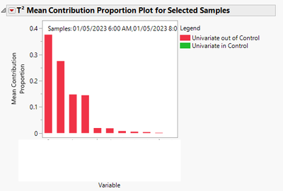
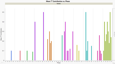
I have some production data that I'm analyzing with the MDMVCC platform. Specifically, after running the analysis and selecting those rows that have the most extreme T^2 values -- those which are likely the most out of control -- I can use the platform to plot the T^2 Mean Contribution Portion Plot for Selected Samples. This produces a graph that looks something like this:
What this graph represents is the mean contribution to the T^2 value from the different factors (Variable) on the x-axis for the samples that have been selected. Each bar corresponds to a single Variable (factor).
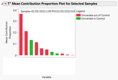
I can repeat this analysis for several different production phases throughout the year to see how these factors might come and go, increase/decrease, or simply change their relative importance for out of control events during the different phases. For example, the above graph is the result for phase 1. The below graph is the result for phase 2.
You'll just have to trust me that the Variables on the x-axis are different -- I can't show what they actually are. It's this kind of change that I'm trying to figure out what the best visualization is to share with others that summarizes how the factors influencing the T^2 change from phase to phase, as this might help production figure out what's going on with their process.
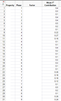
I can gather all the data together -- e.g. which phase, what the mean contribution is for a given factor, and what the factor is into a separate data table. What I'd like to know from the JMP collective is, how might you present the data? Below are a couple of examples that I've come up with, but I'm not particularly satisfied with them -- they're just too busy and don't really convey well the message I'd like to get across. The second graph is maybe a bit better. What are you're thoughts, which one do you like better (if you even prefer one of these!)? Would you graph it differently? If so, how?
Here's an example of what the collected data table looks like (censored because of sensitive info).
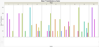
And here are a couple graph ideas I have in mind (I'm not fond of either, just hoping to get some thoughts on more visually appealing ways to display the data for others).
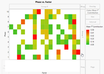
This graph shows the Mean T^2 Contribution on Y, Factor on X, and Phase on Group X. This kind of graph shows how each factor is contributing within a Phase, but it's harder to see how a particular factor changes from Phase to Phase (Phase 1 is older, Phase 10 is newer).
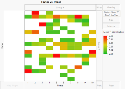
This graph is similar, but has swapped the X axis and Group X, so Phase is now on the X axis and Factor for Group X. This graph shows a little better the concept that I want -- how do the factors change with each Phase (as time goes on), but it's still busy and I think could be better.
So, what are your thoughts? How might you go about displaying this kind of data? What/how would you do different?
Looking forward to hearing people's ideas and thoughts!
Thanks!,
DS
- Tags:
- windows
- Mark as New
- Bookmark
- Subscribe
- Mute
- Subscribe to RSS Feed
- Get Direct Link
- Report Inappropriate Content
Re: Suggestions/thoughts/ideas on how to best display data graphic
I would try a heatmap: phase vs factor. You often have to play with the color gradient (linear may not be best).
- Mark as New
- Bookmark
- Subscribe
- Mute
- Subscribe to RSS Feed
- Get Direct Link
- Report Inappropriate Content
Re: Suggestions/thoughts/ideas on how to best display data graphic
Hi @dlehman1 ,
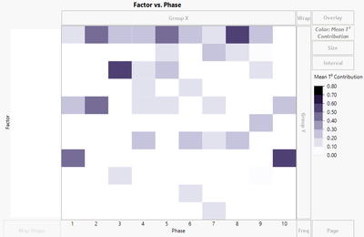
Good suggestion, and thanks for the quick feedback. Just to give you an idea of what it looks like, there are two versions below, one with Phase vs Factor and the other with Factor vs Phase. Both are colored by the Mean T^2 Contribution. To me, the Factor vs Phase makes a little more sense because the Phase # corresponds with time. I can mess with the color scheme some more, but overall from the previous examples and these two, is there one that is more "readable"/"understandable" than another?
I REALLY appreciate the feedback and thoughts on this, as I'm trying to convey the message in the simplest way possible.
Thanks!,
DS
- Mark as New
- Bookmark
- Subscribe
- Mute
- Subscribe to RSS Feed
- Get Direct Link
- Report Inappropriate Content
Re: Suggestions/thoughts/ideas on how to best display data graphic
I agree with your 2nd one and the reasoning that phase is associated with time and makes more sense on the x axis. Regarding color, I'd suggest a monochrome color scheme (black-white works, but if you insist on color, try the blue gradation scheme) - in this case, diverging colors don't convey any useful information since the measure is just a measure of strength of effect. Also, if the gradations don't show sufficient detail, you can try a quantile gradient. It will show lots of variability, but perhaps invites misunderstanding about the actual strengths of the effects.
- Mark as New
- Bookmark
- Subscribe
- Mute
- Subscribe to RSS Feed
- Get Direct Link
- Report Inappropriate Content
Re: Suggestions/thoughts/ideas on how to best display data graphic
Hi @dlehman1 ,
Thanks for your thoughts and feedback, I appreciate it. I also came to a similar conclusion about the color, the monochrome color scheme is better and not as busy to look at, which really helps. I think the other thing that helps is to change the gradient to discrete as this helps to delineate the changes better.
Thanks!,
DS
- Mark as New
- Bookmark
- Subscribe
- Mute
- Subscribe to RSS Feed
- Get Direct Link
- Report Inappropriate Content
Re: Suggestions/thoughts/ideas on how to best display data graphic
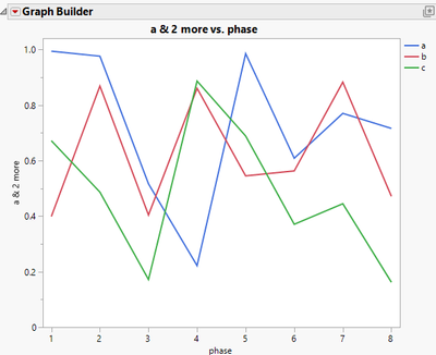
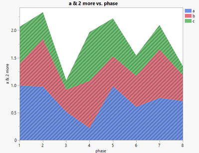
Would simple overlay lines and stacked lines be relevant?
In the following, different colors represent factors, and phase is on x-axis.
- Mark as New
- Bookmark
- Subscribe
- Mute
- Subscribe to RSS Feed
- Get Direct Link
- Report Inappropriate Content
Re: Suggestions/thoughts/ideas on how to best display data graphic
Hi @peng_liu ,
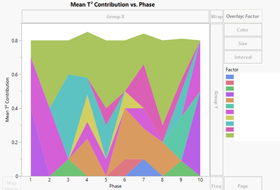
Thanks for your suggestion, and I like it. Unfortunately for me, I have several factors that end up making a simple line or stacked line plot a bit "messy". As a result, it doesn't really show as well how a property might change. If it were only a few, say 3 or 4, I could see this working well. For my case, it ends up looking something like this:
Even changing it to a monochromatic scheme doesn't help much. At present, I'm partial to a monochromatic heat map style with discrete color levels. This style ends up looking like this, which I find to be simple and able to show how a factor (y-axis) changes with Phase/time (x-axis). It also helps to show which factors come and go from Phase to Phase.
That being said, I'm always open to other ways to represent the data so I can make it as easily understood by my audience as possible. I've tried a bubble plot, which did not look good, but I thought that could be an interesting way to illustrate the changes, but it's not so good in this case.
Thanks!,
DS
Recommended Articles
- © 2026 JMP Statistical Discovery LLC. All Rights Reserved.
- Terms of Use
- Privacy Statement
- Contact Us

