- New to JMP? Let the Data Analysis Director guide you through selecting an analysis task, an analysis goal, and a data type. Available now in the JMP Marketplace!
- See how to install JMP Marketplace extensions to customize and enhance JMP.
- Subscribe to RSS Feed
- Mark Topic as New
- Mark Topic as Read
- Float this Topic for Current User
- Bookmark
- Subscribe
- Mute
- Printer Friendly Page
Discussions
Solve problems, and share tips and tricks with other JMP users.- JMP User Community
- :
- Discussions
- :
- Re: Solution to sorting bar charts single by category count
- Mark as New
- Bookmark
- Subscribe
- Mute
- Subscribe to RSS Feed
- Get Direct Link
- Report Inappropriate Content
Solution to sorting bar charts single by category count
I banged my head against the wall figuring out how to sort a simple bar chart of a category (which graph builder can automatically count and display the proper bar heights for, but gives no sorting abillity by that count...). All the articles out there talk about sorting by some other continuous variable dropped into the merge zone of the graph builder http://www.jmp.com/support/notes/42/770.html But I just want it sorted by the count of each category (you know, the ones that Graph Builder already counted! This is something matplotlib in python does automatically, btw, when you give it categories and counts). One solution out there is to make a summary table of that category...ugh, why make more tables to do such a simple thing!?
So the easiest and most intuitive solution for me is to create a new column of 1's in your data table. Then whenever you chart a category, you drop the 1's (i called it count) column into the merge zone of the axis and choose sum as the statistic for sorting. Now all your categories can be bar charted and sorted by count.
Yes, you could add ANY continuous column to the merge zone and choose N as your sort statistic, but I think this is odd because the chart then says "category sorted by 'unrelated continuous variable'" when it's really sorted by the counts (hence calling my column of 1's count). Yes, you could edit that text but holy cow, we are just applying band-aid after band-aid here. Also you would want to make sure your column you are sorting by has data in every row or the count's will be wrong. So again, I think the most intuitive solution is a column of 1's. It's elegant and ridiculous, just like JMP!
Why graph buidler can't just do this on it's own is another wtf moment for JMP but hey I'm on 12, so maybe 13 can do this?
Hope this helps, and please do enlighten me if I am missing something that makes this all easier/irrelevant.
- Mark as New
- Bookmark
- Subscribe
- Mute
- Subscribe to RSS Feed
- Get Direct Link
- Report Inappropriate Content
Re: Solution to sorting bar charts single by category count
Hi Jason,
This is an improvement that is available JMP 13 and later. There is an Order By option that appears if you right click on the Axis, and you should be able to order by Counts, ascending or descending.
You're in JMP 12, though. Some of the creative items you have described such as sorting by another column of 1s are tricks i have heard suggested before in order to solve this need.
- Mark as New
- Bookmark
- Subscribe
- Mute
- Subscribe to RSS Feed
- Get Direct Link
- Report Inappropriate Content
Re: Solution to sorting bar charts single by category count
thanks for the reply, Audrey. I'm glad to hear JMP 13 has a fix for this. I'm not sure when my organization (Intel) is going to upgrade us to 13 though, and I see 14 is coming out now...
- Mark as New
- Bookmark
- Subscribe
- Mute
- Subscribe to RSS Feed
- Get Direct Link
- Report Inappropriate Content
Re: Solution to sorting bar charts single by category count
Hi @rossjason,
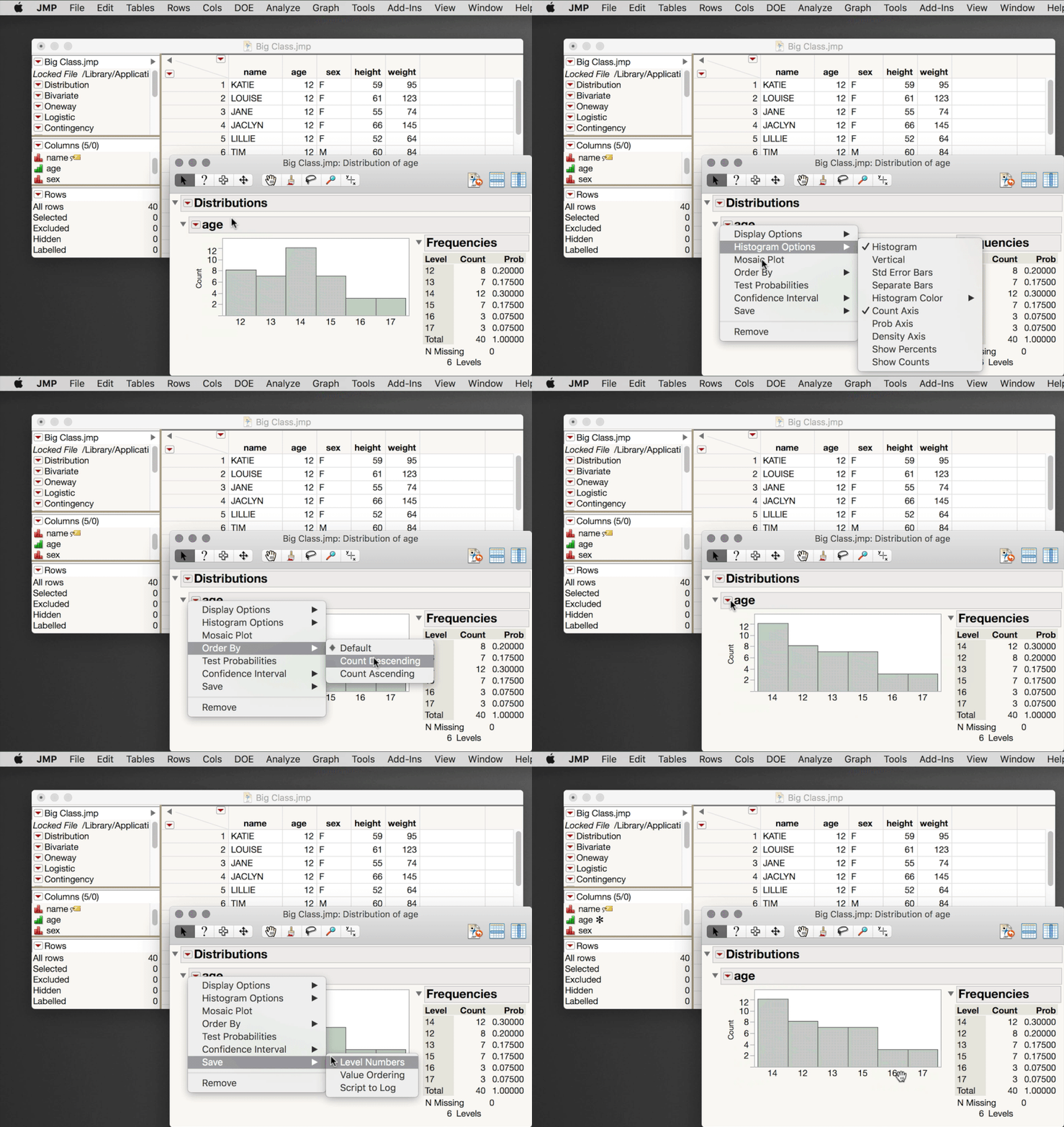
As @Audrey_Shull mentioned, improvements in JMP 13 make this easier. But, there is perhaps an easier way in JMP 12 and earlier you might be interested to know about. Graph Builder (like all platforms in JMP) respect the Value Ordering property set for a column. So, if you had an easy way to set the value ordering property for a variable based on counts you could make your plot in Graph Builder without having to worry about sorting by count. It turns out there is that exact capability from Analyze > Distribution. First, launch Analyze > Distribution with whatever variable will be your X axis in your final plot. Then, go to the Red Triangle > Order By > Count Descending (or Ascending). Return to the Red Triangle > Save > Value Ordering. This will set the value ordering property for that column, and now Graph Builder will automatically arrange your X levels honoring the count.
I hope this helps!
Recommended Articles
- © 2026 JMP Statistical Discovery LLC. All Rights Reserved.
- Terms of Use
- Privacy Statement
- Contact Us


