- New to JMP? Let the Data Analysis Director guide you through selecting an analysis task, an analysis goal, and a data type. Available now in the JMP Marketplace!
- See how to install JMP Marketplace extensions to customize and enhance JMP.
- Subscribe to RSS Feed
- Mark Topic as New
- Mark Topic as Read
- Float this Topic for Current User
- Bookmark
- Subscribe
- Mute
- Printer Friendly Page
Discussions
Solve problems, and share tips and tricks with other JMP users.- JMP User Community
- :
- Discussions
- :
- Re: Simple line plots
- Mark as New
- Bookmark
- Subscribe
- Mute
- Subscribe to RSS Feed
- Get Direct Link
- Report Inappropriate Content
Simple line plots
This seems like it should be pretty easy, but it's not, and it's something I often run into and wonder if there's an easier way.
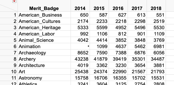
Here's an example dataset from https://blog.scoutingmagazine.org/2019/02/11/2018-merit-badge-rankings-a-deep-dive-into-the-official...
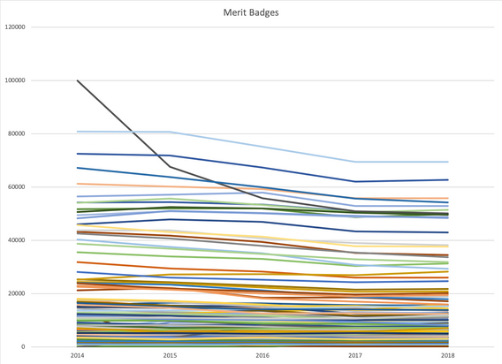
I would like to build a single plot with a line for each merit badge. There will be a bunch on top of each other, but suppose I'm interested in the standouts, the lines at the top and bottom.
I went through the hassle of making it in Excel to show what I'm trying to do:
Is there a good way to do this with JMP?
Accepted Solutions
- Mark as New
- Bookmark
- Subscribe
- Mute
- Subscribe to RSS Feed
- Get Direct Link
- Report Inappropriate Content
Re: Simple line plots
I've managed to make this happen.
First, I simply copied and pasted the table from the article into a JMP table using Edit > Paste with Column Names.
Second, I had to change a couple of columns to be Numeric, Continuous because they had some character data within it.
I then stacked the data table and used Graphbuilder to create the graph.
I put it all in a script (except the changing the column attributes - though I could have scripted that too). See attached.
- Mark as New
- Bookmark
- Subscribe
- Mute
- Subscribe to RSS Feed
- Get Direct Link
- Report Inappropriate Content
Re: Simple line plots
Wow, okay -- that's fantastic!
The key was making the badges an overlay, which never entered my mind. I thought I'd have to put intermediate lines between the sections with "." in all the columns to make the lines break. What is overlay supposed to be anyway? (I'll just read the manual, but it's never made a lot of sense to me.)
The stacking was also important. Fundamentally it seems there are two ways of storing data in a table: (1) column and row headers are inputs, and cells are outputs (which is the data we started with here), and (2) inputs are in some columns and outputs are in other columns (which is what we ended up with here). JMP seems to naturally work with data like #2, and you can convert #1 into #2 using "stack". But #2 seems to be far less efficient in terms of RAM usage. Am I thinking about that right? Is that something I should be concerned with?
Thank you!!
- Mark as New
- Bookmark
- Subscribe
- Mute
- Subscribe to RSS Feed
- Get Direct Link
- Report Inappropriate Content
Re: Simple line plots
I'm glad that Wayne's solution worked for you. Graph Builder is very powerful, but it takes some study to master it. This time is well worth it.
See Help > Books > Essential Graphing. There a general principals and specific examples to guide you next time.
- Mark as New
- Bookmark
- Subscribe
- Mute
- Subscribe to RSS Feed
- Get Direct Link
- Report Inappropriate Content
Re: Simple line plots
I've been through it, but some parts of it aren't terribly clear -- for example, "Overlay" says that it "subgroups and colors", but "Color" seems to do the same thing (except for subgrouping??). Even after reading that section I would not have known to do what Wayne did, but thanks to him I understand it better.
Recommended Articles
- © 2026 JMP Statistical Discovery LLC. All Rights Reserved.
- Terms of Use
- Privacy Statement
- Contact Us


