- New to JMP? Let the Data Analysis Director guide you through selecting an analysis task, an analysis goal, and a data type. Available now in the JMP Marketplace!
- See how to install JMP Marketplace extensions to customize and enhance JMP.
- Subscribe to RSS Feed
- Mark Topic as New
- Mark Topic as Read
- Float this Topic for Current User
- Bookmark
- Subscribe
- Mute
- Printer Friendly Page
Discussions
Solve problems, and share tips and tricks with other JMP users.- JMP User Community
- :
- Discussions
- :
- Showing Quantile Statistics Associated with Boxplots
- Mark as New
- Bookmark
- Subscribe
- Mute
- Subscribe to RSS Feed
- Get Direct Link
- Report Inappropriate Content
Showing Quantile Statistics Associated with Boxplots
Hi
I just started using JMP. When I create a boxplot through the graph builder it does not show the quantiles as shown in this example: https://www.jmp.com/content/dam/jmp/documents/en/academic/learning-library/02-box-plots-se.pdf
It only shows the boxplot. Where do I find the quantiles?
Thank you.
Accepted Solutions
- Mark as New
- Bookmark
- Subscribe
- Mute
- Subscribe to RSS Feed
- Get Direct Link
- Report Inappropriate Content
Re: graph builder: boxplot, how to show quantiles
If you want the values for the quantiles you will have to use a different platform in JMP. Graph Builder is great for visual analysis. For statistics look in the Analyze menu.
Again, I would refer you to the one-page guide that you mentioned in your post. This shows you how to get the quantiles using Analyze > Distribution. If you want quantiles for the variable for different levels of some other variable(s) you can use the "By" role in the launch dialogue or the local data filter.
Alternatively you could try Tables > Summary.
- Mark as New
- Bookmark
- Subscribe
- Mute
- Subscribe to RSS Feed
- Get Direct Link
- Report Inappropriate Content
Re: graph builder: boxplot, how to show quantiles
Hi,
As the one-page guide shows, those box plots were created with other platforms in JMP: Analyze > Distribution, Analyze > Fit Y by X.
You can create box plots with quantiles in Graph Builder by changing the box plot type (lower left in the Graph Builder window).
I hope this helps.
Regards,
Phil
- Mark as New
- Bookmark
- Subscribe
- Mute
- Subscribe to RSS Feed
- Get Direct Link
- Report Inappropriate Content
Re: graph builder: boxplot, how to show quantiles
Thank you for your answer, Phil.
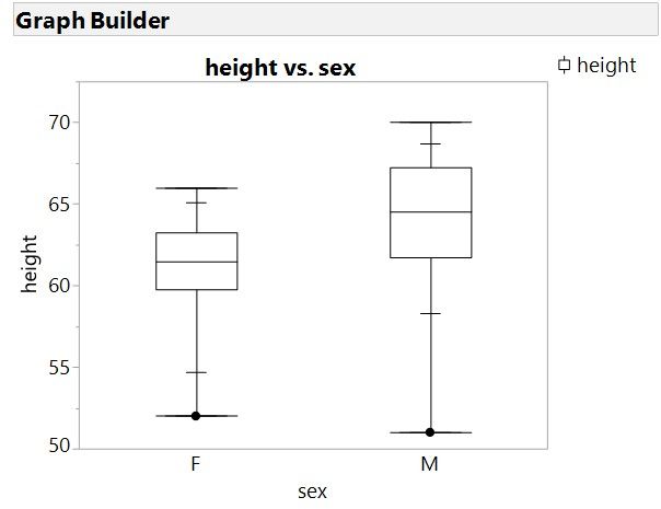
I dont have problems creating a boxplot (see my boxplot attached). I dont know how to show the quantiles (the acutal numbers, I mean). I dont get a box with numbers. Where do I find this?
Thank you!
- Mark as New
- Bookmark
- Subscribe
- Mute
- Subscribe to RSS Feed
- Get Direct Link
- Report Inappropriate Content
Re: graph builder: boxplot, how to show quantiles
If you want the values for the quantiles you will have to use a different platform in JMP. Graph Builder is great for visual analysis. For statistics look in the Analyze menu.
Again, I would refer you to the one-page guide that you mentioned in your post. This shows you how to get the quantiles using Analyze > Distribution. If you want quantiles for the variable for different levels of some other variable(s) you can use the "By" role in the launch dialogue or the local data filter.
Alternatively you could try Tables > Summary.
- Mark as New
- Bookmark
- Subscribe
- Mute
- Subscribe to RSS Feed
- Get Direct Link
- Report Inappropriate Content
Re: Showing Quantile Statistics Associated with Boxplots
I would say Distribution and then show Quantile Box Plots. The table comes from Distrubiton platform
Data Scientist, Life Sciences - Global Technical Enablement
JMP Statistical Discovery, LLC. - Denver, CO
Tel: +1-919-531-9927 ▪ Mobile: +1-303-378-7419 ▪ E-mail: chris.kirchberg@jmp.com
www.jmp.com
- Mark as New
- Bookmark
- Subscribe
- Mute
- Subscribe to RSS Feed
- Get Direct Link
- Report Inappropriate Content
Re: Showing Quantile Statistics Associated with Boxplots
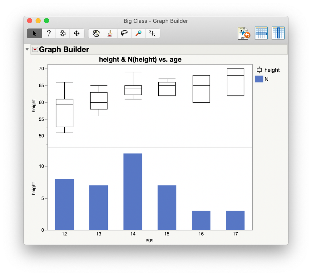
I wish the "5 Number Summary" were actually a "6 Number Summary". I would include N, the number of data points. When presenting box plot data, this is the most common question I get, "how many data points are represented by that box?" It's a more common question than the p-value or anything else.
- Mark as New
- Bookmark
- Subscribe
- Mute
- Subscribe to RSS Feed
- Get Direct Link
- Report Inappropriate Content
Re: Showing Quantile Statistics Associated with Boxplots
The '5 number summary' was originally developed by John Tukey as part of his regular data analysis in the days before computer graphics. He later developed the 'box and whiskers plot' as the graphical representation of the same summary. So JMP is merely following the historical practice that is used by many analysts.
Your situation might be addressed by adding a plot of N for each group. That result is easily accomplished with Graph Builder:
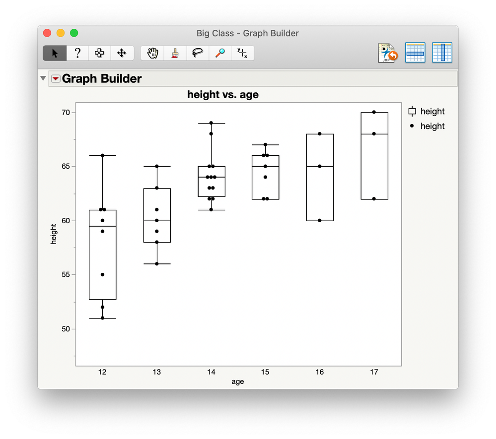
Or perhaps include the markers for the data to get a sense of the group sizes.
The best solution depends on the particular details of your data, of course.
Recommended Articles
- © 2026 JMP Statistical Discovery LLC. All Rights Reserved.
- Terms of Use
- Privacy Statement
- Contact Us


