- New to JMP? Let the Data Analysis Director guide you through selecting an analysis task, an analysis goal, and a data type. Available now in the JMP Marketplace!
- See how to install JMP Marketplace extensions to customize and enhance JMP.
- Subscribe to RSS Feed
- Mark Topic as New
- Mark Topic as Read
- Float this Topic for Current User
- Bookmark
- Subscribe
- Mute
- Printer Friendly Page
Discussions
Solve problems, and share tips and tricks with other JMP users.- JMP User Community
- :
- Discussions
- :
- Show means on box plot in graph builder
- Mark as New
- Bookmark
- Subscribe
- Mute
- Subscribe to RSS Feed
- Get Direct Link
- Report Inappropriate Content
Show means on box plot in graph builder
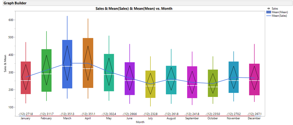
Is there any way to show and connect means on a box plot in graph builder? Is there also a way to show the diamonds that point to the mean without bottom and top 5% of outliers?
- Mark as New
- Bookmark
- Subscribe
- Mute
- Subscribe to RSS Feed
- Get Direct Link
- Report Inappropriate Content
Re: Show means on box plot in graph builder
Thank you, Dan. I never investigated Float bar type. Your post got me thinking of alternative methods to add the means and hav them appear at the bottom or the top of the graph.
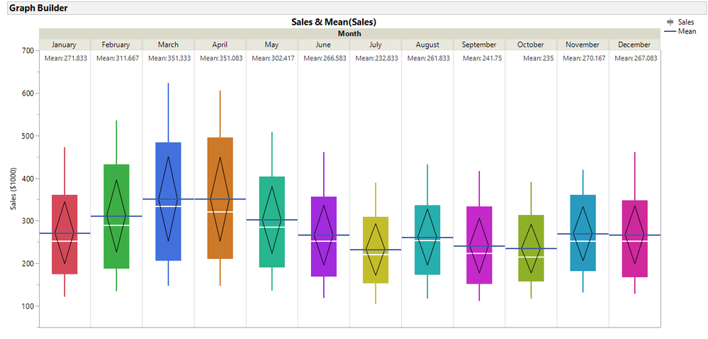
One method was interesting but messy and changed the original table. [See *** below]. Then I notoced that JMP has a new element called a Caption Box. It is very cool, but each Caption Box seems to allow only one caption per FrameBox. This can be easy by making the categorical X-axis the X Group variable. See the picture and script. However, now the connected means gets tough. This might be a nice wish list item for future versions: add a caption box option for nominal X-axis plots. So for boxplots, one option could be the Five number Summary another N, Mean, Std dev.
gb2 = dt << Graph Builder(
	Size( 1065, 516 ),
	Show Control Panel( 0 ),
	Variables( Y( :Sales ), Group X( :Month ) ),
	Elements(
		Box Plot( Y, Legend( 6 ), Box Style( "Solid" ) ),
		Line( Y, Legend( 7 ) ),
		Caption Box( Y, Legend( 9 ) )
	),
	SendToReport(
		Dispatch(
			{},
			"Sales",
			ScaleBox,
			{Min( 50 ), Max( 700 ), Inc( 100 ), Minor Ticks( 1 )}
		),

	)
);
bpseg = gb2 << Xpath("//BoxPlotSeg");
bpseg << {Box Style( "Solid" ), Confidence Diamond( 1 ), Fences( 0 )};

//if you want to color each by month
for(i=1, i<=nitems(bpseg), i++,
 bpseg[i] << Fill Color(Color Of(As Row State(cc[i])))
);
The full script is attached.
***Method takes some work all UI. I might do this once. Scripting seems easier, especially if the Caption Box wish
- Concatenate the original table and the table summary.
- Add a column called Means that is really the positon where you want the means to appear.
- Make the Mean(Sales) column a label.
- Plot both Sales and Means versus Month
- Move Mean sales to the right and align tick marks
- Make the changes as shown previously for the left axis (chaging points to the boxplot, add a line)
- Change the Points on the right to a bar style single and Label ("Label by Row")
- Mark as New
- Bookmark
- Subscribe
- Mute
- Subscribe to RSS Feed
- Get Direct Link
- Report Inappropriate Content
Re: Show means on box plot in graph builder
@gzmorgan0 wrote:Thank you, Dan. I never investigated Float bar type. Your post got me thinking of alternative methods to add the means and hav them appear at the bottom or the top of the graph.
One method was interesting but messy and changed the original table. [See *** below]. Then I notoced that JMP has a new element called a Caption Box. It is very cool, but each Caption Box seems to allow only one caption per FrameBox. This can be easy by making the categorical X-axis the X Group variable. See the picture and script. However, now the connected means gets tough. This might be a nice wish list item for future versions: add a caption box option for nominal X-axis plots. So for boxplots, one option could be the Five number Summary another N, Mean, Std dev.
gb2 = dt << Graph Builder(
	Size( 1065, 516 ),
	Show Control Panel( 0 ),
	Variables( Y( :Sales ), Group X( :Month ) ),
	Elements(
		Box Plot( Y, Legend( 6 ), Box Style( "Solid" ) ),
		Line( Y, Legend( 7 ) ),
		Caption Box( Y, Legend( 9 ) )
	),
	SendToReport(
		Dispatch(
			{},
			"Sales",
			ScaleBox,
			{Min( 50 ), Max( 700 ), Inc( 100 ), Minor Ticks( 1 )}
		),

	)
);
bpseg = gb2 << Xpath("//BoxPlotSeg");
bpseg << {Box Style( "Solid" ), Confidence Diamond( 1 ), Fences( 0 )};

//if you want to color each by month
for(i=1, i<=nitems(bpseg), i++,
 bpseg[i] << Fill Color(Color Of(As Row State(cc[i])))
);
The full script is attached.
***Method takes some work all UI. I might do this once. Scripting seems easier, especially if the Caption Box wish
- Concatenate the original table and the table summary.
- Add a column called Means that is really the positon where you want the means to appear.
- Make the Mean(Sales) column a label.
- Plot both Sales and Means versus Month
- Move Mean sales to the right and align tick marks
- Make the changes as shown previously for the left axis (chaging points to the boxplot, add a line)
- Change the Points on the right to a bar style single and Label ("Label by Row")
You can add as much caption boxes as you want by drag & drop. By default they are displaying the mean. This however can be changed to Std Dev, N etc.
However, in case of the mean, I prefer to show him at the box plot.
gb2 = dt << Graph Builder(
	Size( 1065, 516 ),
	Show Control Panel( 0 ),
	Variables( Y( :Sales ), Group X( :Month ) ),
	Elements(
		Box Plot( Y, Legend( 6 ), Box Style( "Solid" ) ),
		Line( Y, Legend( 7 ) ),
		Caption Box( Y, Legend( 9 ) )
	),
	SendToReport(
		Dispatch(
			{},
			"Sales",
			ScaleBox,
			{Min( 50 ), Max( 700 ), Inc( 100 ), Minor Ticks( 1 )}
		),

	)
);
bpseg = gb2 << Xpath("//BoxPlotSeg");
bpseg << {Box Style( "Solid" ), Confidence Diamond( 1 ), Fences( 0 )};

//if you want to color each by month
for(i=1, i<=nitems(bpseg), i++,
 bpseg[i] << Fill Color(Color Of(As Row State(cc[i])))
);
The full script is attached.
***Method takes some work all UI. I might do this once. Scripting seems easier, especially if the Caption Box wish
- Concatenate the original table and the table summary.
- Add a column called Means that is really the positon where you want the means to appear.
- Make the Mean(Sales) column a label.
- Plot both Sales and Means versus Month
- Move Mean sales to the right and align tick marks
- Make the changes as shown previously for the left axis (chaging points to the boxplot, add a line)
- Change the Points on the right to a bar style single and Label ("Label by Row")
- Mark as New
- Bookmark
- Subscribe
- Mute
- Subscribe to RSS Feed
- Get Direct Link
- Report Inappropriate Content
Re: Show means on box plot in graph builder
Hi, I'm having a trouble with making a line connecting all those middle value of each of box plots. What do I do?
Thanks in advance
- Mark as New
- Bookmark
- Subscribe
- Mute
- Subscribe to RSS Feed
- Get Direct Link
- Report Inappropriate Content
Re: Show means on box plot in graph builder
@DANN, please specify which version of JMP you are using. Also, if you could use the Graphbuilder menu pull down, and select Save Script, Copy script or save to Script Window and save it and attach in a reply, I can look to see if you missed something.
- Mark as New
- Bookmark
- Subscribe
- Mute
- Subscribe to RSS Feed
- Get Direct Link
- Report Inappropriate Content
Re: Show means on box plot in graph builder
- Mark as New
- Bookmark
- Subscribe
- Mute
- Subscribe to RSS Feed
- Get Direct Link
- Report Inappropriate Content
Re: Show means on box plot in graph builder
Okay, describe your steps. Hopefully, I can see what might be missing.
- Mark as New
- Bookmark
- Subscribe
- Mute
- Subscribe to RSS Feed
- Get Direct Link
- Report Inappropriate Content
Re: Show means on box plot in graph builder
There's four column and each has twenty different values.
ex) Design 1 2 3 4
1 a .. .. ..
2 b .. .. ..
3 c
4 ..
5
6
...
20
First, I opend Graph Builder.
Second, I dragged those four columns into x-axis( default box plot ). As a result, I got four different box plots.
at this point, I want to get the line connecting the median of each box plot. What should I do?
Thanks in advance.
- Mark as New
- Bookmark
- Subscribe
- Mute
- Subscribe to RSS Feed
- Get Direct Link
- Report Inappropriate Content
Re: Show means on box plot in graph builder
@DANN, are the 4 columns responses (results) of the experiment or factors (input) for the design?
As your table is setup, it would take a custom function to connect the box medians, since you have no Y variable. I am going to use the JMP sample data Iris.JMP to emulate your data and the steps.
If using the UI (point and click):
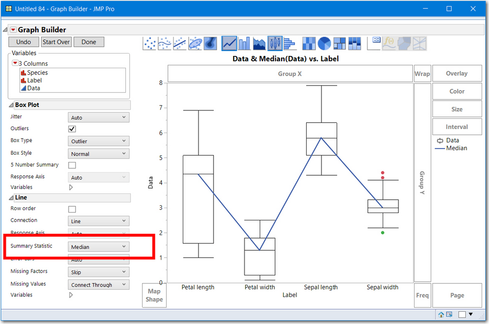
- Select Tables > Stack choose your 4 columns as the Stack Columns, change the names (Data and Label) if you like and select OK. Data will be the values of the 4 columns and Values will be the column names. For your example a better name than label might be Factors or Responses.
- Now select Graphs > Graphbuilder and drag Data to the Y column and Label to the X column.
- Right Click and select Box Plots and Line and select the Summary Statistics to be Median
Here is a picture of the Iris data table after following the instructions above
Without stacking the data, I can only provide a JSL solution. My earlier post/example had one or multiple columns for Y and and a categorical X (Months). The elements Line or Smoother need both and X and Y. There is another graph called the parallel plot that would be appropriate if your 4 columns were responses to an experiment. Each of the 20 lines would represent a "profile" of each experimental trial's results.
Hope that helps.
- Mark as New
- Bookmark
- Subscribe
- Mute
- Subscribe to RSS Feed
- Get Direct Link
- Report Inappropriate Content
Re: Show means on box plot in graph builder
@gzmorgan0 Oh My Gosh, It just was A perfect solution that I really needed. Now everything's preperly working with no problem. I really appreciate your kindness and expertise. Thank you so much! Have a great day.
- Mark as New
- Bookmark
- Subscribe
- Mute
- Subscribe to RSS Feed
- Get Direct Link
- Report Inappropriate Content
Re: Show means on box plot in graph builder
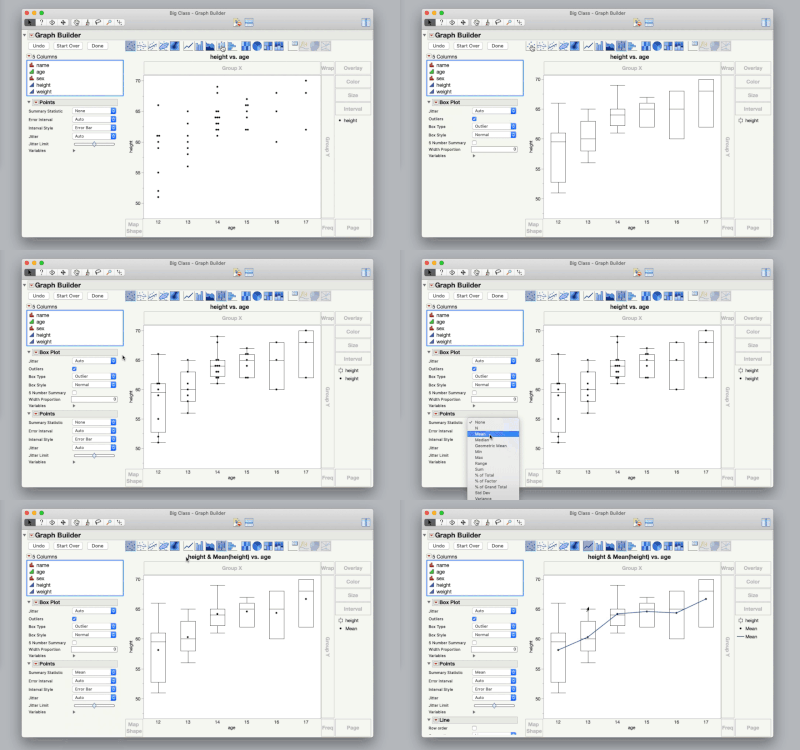
This is easily done interactively.
Start with the box plots turned on. Then click and drag the points element into the graph. Change the summary statistic for the points to mean. Then drag the line element into the graph.
- « Previous
-
- 1
- 2
- Next »
Recommended Articles
- © 2026 JMP Statistical Discovery LLC. All Rights Reserved.
- Terms of Use
- Privacy Statement
- Contact Us


