- New to JMP? Let the Data Analysis Director guide you through selecting an analysis task, an analysis goal, and a data type. Available now in the JMP Marketplace!
- See how to install JMP Marketplace extensions to customize and enhance JMP.
- Subscribe to RSS Feed
- Mark Topic as New
- Mark Topic as Read
- Float this Topic for Current User
- Bookmark
- Subscribe
- Mute
- Printer Friendly Page
Discussions
Solve problems, and share tips and tricks with other JMP users.- JMP User Community
- :
- Discussions
- :
- Scripting help for Table Box() within a List Box()
- Mark as New
- Bookmark
- Subscribe
- Mute
- Subscribe to RSS Feed
- Get Direct Link
- Report Inappropriate Content
Scripting help for Table Box() within a List Box()
Hi All,
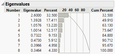
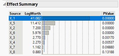
I am trying to write some JSL code that takes data from a data table and graphically displays it for the user to choose from for further analysis. What I'd like to get is something like a mix between the Eigenvalue report from the PCA platform and the Effect Summary report from the Fit Model Platform. I'd like the visual to look like the PCA report, but the functionality (i.e. being able to select a row) of the Effect Summary report.
PCA Eigenvalue report (how I want it to look):
Fit Model Effect Summary report (the functionality I'd like). In this platform one can select a row in the List Box() and choose to "remove" or "add". I don't want to remove or add, but I do want the user to be able to select the row (from the above output):
I've attached the data table I'm working with, this is the "Current Data Table()" in the JSL code below. The JSL code below can get me part of the way, but not exactly what I want.
Names Default To Here( 1 );

PC_dt = Current Data Table();


PC_n = {};
PC_eigv = {};
PC_per = {};
PC_cump = {};
For( i = 1, i <= N Rows( PC_dt ), i++,
	Insert Into( PC_n, PC_dt:"Number"n[i] );
	Insert Into( PC_eigv, Round( PC_dt:"Eigenvalue"n[i], 5 ) );
	Insert Into( PC_per, Round( PC_dt:"Percent"n[i], 5 ) );
	Insert Into( PC_cump, Round( PC_dt:"cumulative Percent"n[i], 5 ) );
);
PC_Rpt_win = New Window( "PC Results",
	Outline Box( "Eigenvalues & cumulative Percent",
			//List Box(
		//List Box(
		Table Box(
			Number Col Box( "Number", Eval List( PC_n ) ),
			Number Col Box( "Eigenvalue", Eval List( PC_eigv ), <<Set Format("Fixed Dec", 6,6)  ),
			Number Col Box( "Percent", Eval List( PC_per ), <<Set Format("Fixed Dec", 6,6)  ),
			Plot Col Box( "", Eval List( PC_per ), <<Set Scale(0,100, "Percent") ),
			Number Col Box( "cumulative Percent", Eval List( PC_cump ), <<Set Format("Fixed Dec", 6,6)  )
		)
		//)
		//)
	)
);
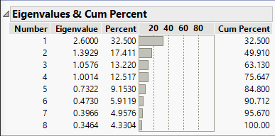
With the commented out sections I get the following output from the code (no row is selectable, though):
I really don't know if I need the whole pre-Outline box portion of the code where I generate lists for the PCs and eigenvalues, etc. But, it seemed like the logical way to do it since I'm dealing with columns in a data table and the functions require lists. It works, even if not necessary.
If I include either or both of the commented-out List Box() calls around the Table Box(), I get the following. Rows are selectable, but nothing shows up:
I'm not sure what I'm doing wrong, and the Scripting Index has limited examples of how to correctly use the List Box() call with a Table Box(). I tried following the tree structure from the Fit Model platform report window, but it's not working.
In summary, I'd like to correct the following in my script:
- Correct the Plot Col Box so that it has the cumulative percent curve like the PC report shows (first image above). This is not as critical as item 2.
- Correct the List Box() call around the Table Box() so that the user can select a row in the List Box that will then get sent on to another function for further analysis.
Thanks for any suggestions and help!,
DS
Accepted Solutions
- Mark as New
- Bookmark
- Subscribe
- Mute
- Subscribe to RSS Feed
- Get Direct Link
- Report Inappropriate Content
Re: Scripting help for Table Box() within a List Box()
Is there a specific need for List Box()? You can use << Set Selectable Rows(); to make rows selectable in Table Box and then use << set row change function(Function({this}, ); to add function to selection.
Example from Scripting Index:
Names Default To Here(1);
New Window("Mountains",
	tb = Table Box(
		String Col Box("Mountain", {"K2", "Delphi", "Kilimanjaro", "Grand Teton"}),
		Number Col Box("Elevation (meters)", {8611, 681, 5895, 4199}),
		Plot Col Box("", {8611, 681, 5895, 4199})
	)
);
tb << Set Selectable Rows();
tb << set row change function(Function({this}, Print(this << get selected rows)));
- Mark as New
- Bookmark
- Subscribe
- Mute
- Subscribe to RSS Feed
- Get Direct Link
- Report Inappropriate Content
Re: Scripting help for Table Box() within a List Box()
For item 1:
I would guess there is some other / better way to do this, but I found << Lower and << Upper (requires Lower to be specified) messages. With << Lower you could get first values from the Cumulative Column and then set those to Plot Col Box with Lower
pcb << Lower(ncb << get as matrix);
With your code it would look something like this (add references and use those):
Names Default To Here( 1 );

PC_dt = Current Data Table();

PC_n = {};
PC_eigv = {};
PC_per = {};
PC_cump = {};
For( i = 1, i <= N Rows( PC_dt ), i++,
	Insert Into( PC_n, PC_dt:"Number"n[i] );
	Insert Into( PC_eigv, Round( PC_dt:"Eigenvalue"n[i], 5 ) );
	Insert Into( PC_per, Round( PC_dt:"Percent"n[i], 5 ) );
	Insert Into( PC_cump, Round( PC_dt:"cumulative Percent"n[i], 5 ) );
);
PC_Rpt_win = New Window( "PC Results",
	Outline Box( "Eigenvalues & cumulative Percent",
			//List Box(
		//List Box(
		Table Box(
			Number Col Box( "Number", Eval List( PC_n ) ),
			Number Col Box( "Eigenvalue", Eval List( PC_eigv ), <<Set Format("Fixed Dec", 6,6)  ),
			Number Col Box( "Percent", Eval List( PC_per ), <<Set Format("Fixed Dec", 6,6)  ),
			pcb = Plot Col Box( "", Eval List( PC_per ), <<Set Scale(0,100, "Percent") ),
			ncb = Number Col Box( "cumulative Percent", Eval List( PC_cump ), <<Set Format("Fixed Dec", 6,6)  )
		)
		//)
		//)
	)
);
wait(2);
pcb << Lower(ncb << get as matrix);
For getting values:
Sometimes it might be enough to use Make into data table (depending on platform and if you are using By variable):
and then checking from the resulting table the table script:
Sometimes that gives quite quick way to get references to correct Display Boxes.
- Mark as New
- Bookmark
- Subscribe
- Mute
- Subscribe to RSS Feed
- Get Direct Link
- Report Inappropriate Content
Re: Scripting help for Table Box() within a List Box()
Is there a specific need for List Box()? You can use << Set Selectable Rows(); to make rows selectable in Table Box and then use << set row change function(Function({this}, ); to add function to selection.
Example from Scripting Index:
Names Default To Here(1);
New Window("Mountains",
	tb = Table Box(
		String Col Box("Mountain", {"K2", "Delphi", "Kilimanjaro", "Grand Teton"}),
		Number Col Box("Elevation (meters)", {8611, 681, 5895, 4199}),
		Plot Col Box("", {8611, 681, 5895, 4199})
	)
);
tb << Set Selectable Rows();
tb << set row change function(Function({this}, Print(this << get selected rows)));
- Mark as New
- Bookmark
- Subscribe
- Mute
- Subscribe to RSS Feed
- Get Direct Link
- Report Inappropriate Content
Re: Scripting help for Table Box() within a List Box()
Hi @jthi ,
Thanks for your quick feedback. I had tried that earlier, but nothing had happened, so I abandoned it for another route, but it wasn't leading anywhere. I went back and tried it, and it works, thank you! The added functionality is helpful. That definitely solved item 2, which was the more important one. If there's any idea how to fix item 1, that would be great, but not essential.
This is related, but maybe another thread (let me know and I'll repost it as another thread).
Do you know how to use JSL to save the DModX and T² values from the PCA platform to the data table? All this is to try and automate this process, or at least take out several of the other steps and just give the user the basics for deciding on the number of PCs to then use for saving the DModX and T² formulas.
Thanks!,
DS
- Mark as New
- Bookmark
- Subscribe
- Mute
- Subscribe to RSS Feed
- Get Direct Link
- Report Inappropriate Content
Re: Scripting help for Table Box() within a List Box()
Hi @jthi ,
Well, forget the part about DModX, the Scripting Index showed me how to do that and it works as expected. It has an example for Save T Square, but that's not working. I'll keep at it. I think I need to reference the right Outline box.
Thanks!,
DS
- Mark as New
- Bookmark
- Subscribe
- Mute
- Subscribe to RSS Feed
- Get Direct Link
- Report Inappropriate Content
Re: Scripting help for Table Box() within a List Box()
For item 1:
I would guess there is some other / better way to do this, but I found << Lower and << Upper (requires Lower to be specified) messages. With << Lower you could get first values from the Cumulative Column and then set those to Plot Col Box with Lower
pcb << Lower(ncb << get as matrix);
With your code it would look something like this (add references and use those):
Names Default To Here( 1 );

PC_dt = Current Data Table();

PC_n = {};
PC_eigv = {};
PC_per = {};
PC_cump = {};
For( i = 1, i <= N Rows( PC_dt ), i++,
	Insert Into( PC_n, PC_dt:"Number"n[i] );
	Insert Into( PC_eigv, Round( PC_dt:"Eigenvalue"n[i], 5 ) );
	Insert Into( PC_per, Round( PC_dt:"Percent"n[i], 5 ) );
	Insert Into( PC_cump, Round( PC_dt:"cumulative Percent"n[i], 5 ) );
);
PC_Rpt_win = New Window( "PC Results",
	Outline Box( "Eigenvalues & cumulative Percent",
			//List Box(
		//List Box(
		Table Box(
			Number Col Box( "Number", Eval List( PC_n ) ),
			Number Col Box( "Eigenvalue", Eval List( PC_eigv ), <<Set Format("Fixed Dec", 6,6)  ),
			Number Col Box( "Percent", Eval List( PC_per ), <<Set Format("Fixed Dec", 6,6)  ),
			pcb = Plot Col Box( "", Eval List( PC_per ), <<Set Scale(0,100, "Percent") ),
			ncb = Number Col Box( "cumulative Percent", Eval List( PC_cump ), <<Set Format("Fixed Dec", 6,6)  )
		)
		//)
		//)
	)
);
wait(2);
pcb << Lower(ncb << get as matrix);
For getting values:
Sometimes it might be enough to use Make into data table (depending on platform and if you are using By variable):
and then checking from the resulting table the table script:
Sometimes that gives quite quick way to get references to correct Display Boxes.
- Mark as New
- Bookmark
- Subscribe
- Mute
- Subscribe to RSS Feed
- Get Direct Link
- Report Inappropriate Content
Re: Scripting help for Table Box() within a List Box()
Hi @jthi ,
Thanks again for your quick feedback and help. Yes, the <<Lower worked fine. There perhaps might be a better way to do it, but this does exactly what I want. So, technically the two questions to my original post are solved, thank you!
Now, my only problem is how to save T². Each time I try to address the outline box in question from the PCA platform, I get a log error that says the display box doesn't recognize <<Save T Square, which is supposed to work. When I look it up in Scripting Index, the examples work as expected, but for some reason they don't with my case, and I can't figure it out. I'll keep trying.
Thanks!,
DS
- Mark as New
- Bookmark
- Subscribe
- Mute
- Subscribe to RSS Feed
- Get Direct Link
- Report Inappropriate Content
Re: Scripting help for Table Box() within a List Box()
This problem arises from a common point of confusion. A JMP platform is composed of the analysis layer and the report layer. The analysis layer is responsible for computation and responds to the commands presented in the red triangle menus. The report layer is responsible for the presentation of information. The report layer is a nested structure of display boxes. You need to send the Save T Square message to the analysis layer, not the report layer. The reference to the analysis layer is the one that is returned when you launch the platform. For example,
biv = Current Data Table() << Bivariate( Y( :weight ), X( :height ), Fit Line );The variable biv stores a reference to the platform or more specifically to the analysis layer. You then obtain a reference to the associated report layer with another message.
bivRep = biv << Report;Hope this explanation clarifies your question.
- Mark as New
- Bookmark
- Subscribe
- Mute
- Subscribe to RSS Feed
- Get Direct Link
- Report Inappropriate Content
Re: Scripting help for Table Box() within a List Box()
Here is another way to get data from tables in a report and the T2 from a PLS report:
Names default to here(1);
dt = Open("$Sample_data/Quality Control/Chemical Reactor Process.jmp");
pls = dt << Run Script("Fit PLS (Pro Only)");

//get values for the first column with the name R²Y by searching for display elements that have a
//child header box containing specific values
(pls << XPath("//NumberColBox[NumberColBoxHeader[text()='R²Y']]"))[1] << get as matrix;

//generalize this into a function and then call it for others column headers
getColumn = function({c},(pls << XPath("//NumberColBox[NumberColBoxHeader[text()='" || c || "']]"))[1] << get as matrix);
getColumn("Q²");
getColumn("Y Responses");

//To get T2, you need to send the message to a specific fit within the platform.  As Mark mentioned this is tricky because you
//need to send the message to the analysis layer (I've been calling it a scriptable object), but to find the right object you
//navigate the report structure.  I like Xpath, so here is how I would get the report (implied with the XPath function),
//navigate to the outline box (picks the first one matching a name), get the scriptable object or analysis layer and then
//send the message to save T2.

firstfit = (((pls << XPath("//OutlineBox[contains(text(),'NIPALS Fit with ')]"))[1]) << Get Scriptable Object) << Save T Square();
firstfit << Save T Square;

//This might better illustrate what is happening
show properties( report(pls)[Outline Box( "Partial Least Squares" )][Outline Box( "NIPALS Fit with 6 Factors Using Fast SVD" )] << get scriptable object );
Recommended Articles
- © 2026 JMP Statistical Discovery LLC. All Rights Reserved.
- Terms of Use
- Privacy Statement
- Contact Us


