- New to JMP? Let the Data Analysis Director guide you through selecting an analysis task, an analysis goal, and a data type. Available now in the JMP Marketplace!
- See how to install JMP Marketplace extensions to customize and enhance JMP.
- Subscribe to RSS Feed
- Mark Topic as New
- Mark Topic as Read
- Float this Topic for Current User
- Bookmark
- Subscribe
- Mute
- Printer Friendly Page
Discussions
Solve problems, and share tips and tricks with other JMP users.- JMP User Community
- :
- Discussions
- :
- Re: Question about generating all possible outcomes and determining CVs
- Mark as New
- Bookmark
- Subscribe
- Mute
- Subscribe to RSS Feed
- Get Direct Link
- Report Inappropriate Content
Question about generating all possible outcomes and determining CVs
Hi, I'm a basic user of JMP using version 15. What I am trying to do is determine the optimal plate layout for a high throughput assay which minimizes the plate location biases. To do this I'm testing the sample dose response curve across 3 plates in all the positions and I have my results. So what I have is 10 reported values for each of the 3 plates and I want to know what plate location combination produces the lowest CVs (ie what I know from my lower throughput designs its best to rotate the samples but this design doesn't allow each sample to be in each position since its 10 samples and 3 plates so is it best to put sample 1 in position 2 on plate 1, position 4 on plate 2 and position 7 on plate 3 for the lowest CV taking into account plate location bias). Instead of going through and literally averaging and finding the CVs of the results from each of the 1000 possible combinations in excel I was wondering if there was a feature in JMP that would allow me to cross them and it would do all the outcomes not just a set of them.
- Mark as New
- Bookmark
- Subscribe
- Mute
- Subscribe to RSS Feed
- Get Direct Link
- Report Inappropriate Content
Re: Question about generating all possible outcomes and determining CVs
Bias and variance are different characteristics of the response. Bias is the systematic error and variance is the random error. Also, the variance requires a much larger sample size in order to be estimated as well as the mean.
Instead of replicating the entire dose-response curve across each plate, why not start with a simpler design. Why not test the same standard that should generate a response near the inflection point of the curve? That response should be most sensitive to effects of position. Run the same sample in all 96 wells on all the plates. You could economize the design by skipping some rows and columns if you expect a smooth continuous, possibly non-linear, change over the plate. You might need more plates, though, as CV estimates across plates will be poor with only three replicates.
- Mark as New
- Bookmark
- Subscribe
- Mute
- Subscribe to RSS Feed
- Get Direct Link
- Report Inappropriate Content
Re: Question about generating all possible outcomes and determining CVs
I do not have enough information to provide specific advice, but adding to Mark's response, perhaps the word to describe the within plate phenomena is variation vs. bias (at least until you understand whether this variation is consistent and there is a mean shift)? I'm not sure why you need every possible combination? I would start with hypotheses (e.g., Why would there be variation in the different locations across the plates? Why do you suspect an interaction between dose curves and plate location?). Perhaps there are a subset of the within plate locations you could test in an experiment (think which locations would be the most different and why). If you can reduce this number, then you can design a more efficient test.
I'm not sure how many assays you run, but could you use sampling (component of variation study) to get estimates of within plate, plate-to-plate and assay-to-assay variation across many plates over time?
- Mark as New
- Bookmark
- Subscribe
- Mute
- Subscribe to RSS Feed
- Get Direct Link
- Report Inappropriate Content
Re: Question about generating all possible outcomes and determining CVs
I want to point out the available of custom shape files to help visualize the bias and the variance across the wells with Graph Builder. You can find a description and the files here: Micro-Titre Shape Files
- Mark as New
- Bookmark
- Subscribe
- Mute
- Subscribe to RSS Feed
- Get Direct Link
- Report Inappropriate Content
Re: Question about generating all possible outcomes and determining CVs
While all those are good ideas in their own right for the plate layout we cannot do many of the recommended assays they wouldn't yield useful results. I think my initial post was confusing. The reason I want to determine the CV is because the reportable for the results of the 3-plate assay is the average of the sample (generation from the assessment of the dose response curve as a whole not a singe point) on each of the plates and the assay acceptance criteria is set by the %CV of the mean. I already know the biases the assay has from the incubator position and sample position and after controlling what what we can I have my results and the last thing is to determine the optimal rotation of a sample across the 3 plates to further mitigate the location biases. Overall I was hoping for a function in JMP that would allow me to calculate all the possible averages, stdev, and CVs because I have all my data and doing it in excel is time consuming but from what I have seen I don't believe it has an add-in or feature.
- Mark as New
- Bookmark
- Subscribe
- Mute
- Subscribe to RSS Feed
- Get Direct Link
- Report Inappropriate Content
Re: Question about generating all possible outcomes and determining CVs
Not sure how your data is organized (maybe you could share an example), but one quick way to create all combinations is the cartesian join option (Tables/Join). It will create an expanded table, and then use Summary (or Tabulate) to calculate all the mean, SD and CV estimates.
- Mark as New
- Bookmark
- Subscribe
- Mute
- Subscribe to RSS Feed
- Get Direct Link
- Report Inappropriate Content
Re: Question about generating all possible outcomes and determining CVs
- Mark as New
- Bookmark
- Subscribe
- Mute
- Subscribe to RSS Feed
- Get Direct Link
- Report Inappropriate Content
Re: Question about generating all possible outcomes and determining CVs
Apologies for hijacking an older thread, but my situation seems to be similar:
- Dose-response curve
- X-axis: range of doses (needs log transformation)
- Y-axis: response
- 2 to 4 measurements per dose
Logistic 4P seems fine, since I do expect asymptotes on both ends.
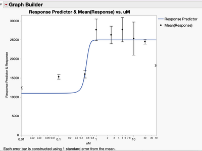
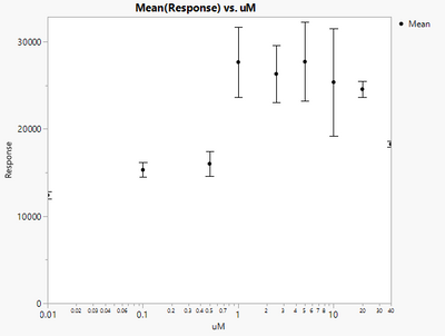
I can get the error bars using Graph Builder.
The problem is with visualization: I'm trying to overlay the error bars onto the fitted curve, as can be done using Prism.
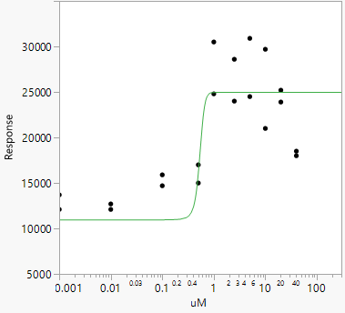
I've tried artificially adding a "Column 3" to group my measurements, but I can't "group" 2 measures when using Logistic 4P (or 3P).
Is there a way to do the same in JMP (JMP16)?
Thanks.
- Mark as New
- Bookmark
- Subscribe
- Mute
- Subscribe to RSS Feed
- Get Direct Link
- Report Inappropriate Content
Re: Question about generating all possible outcomes and determining CVs
Take a look at the attached table with two more saved scripts. The first involves saving the prediction formula from Fit Curve, then using the Formula element in Graph Builder. The second just uses a graphics script that is copied from the Fit Curve report window (right click on the white graphics region and select 'Customize . . . ' to see all the scripts associated with the graph box). Running the first new saved script should give:

(BTW, if you add to an 'old' thread, it can be easy for your question to be overlooked).
Recommended Articles
- © 2026 JMP Statistical Discovery LLC. All Rights Reserved.
- Terms of Use
- Privacy Statement
- Contact Us


