- New to JMP? Let the Data Analysis Director guide you through selecting an analysis task, an analysis goal, and a data type. Available now in the JMP Marketplace!
- See how to install JMP Marketplace extensions to customize and enhance JMP.
- Subscribe to RSS Feed
- Mark Topic as New
- Mark Topic as Read
- Float this Topic for Current User
- Bookmark
- Subscribe
- Mute
- Printer Friendly Page
Discussions
Solve problems, and share tips and tricks with other JMP users.- JMP User Community
- :
- Discussions
- :
- Re: Prediction profiler
- Mark as New
- Bookmark
- Subscribe
- Mute
- Subscribe to RSS Feed
- Get Direct Link
- Report Inappropriate Content
Prediction profiler
Hello,
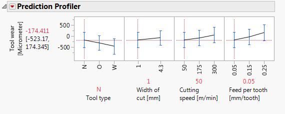
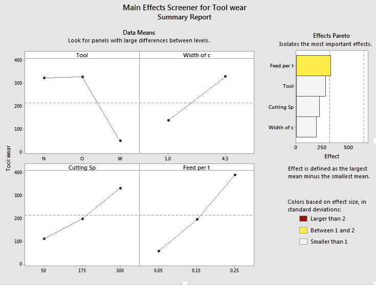
I am writing you because because i found some differents between two graphs. The first graph is done on the JMP and it is a prediction profile and the second one is made in minitab. My question is because i found an odd result in the JMP graph. I found a negative type result value when in fact, i don't have it so i found more coherent the result on Minitab.However, I prefer better the way in which JPM gives the results. Therefore, I would like to know why I have such variance.
JMP 14
Minitab result
Accepted Solutions
- Mark as New
- Bookmark
- Subscribe
- Mute
- Subscribe to RSS Feed
- Get Direct Link
- Report Inappropriate Content
Re: Prediction profiler
Hi @Archy,
As Mark mentioned, the "Main Effects Plot" from Minitab you've shown here is displaying something quite different from the prediction profiler in JMP *when fitting your model with interactions. If you fit a main effects only model, the JMP Prediction Profiler and "Main Effects Plot" from Minitab display essentially the same thing (update: assuming balanced data, an equal number of observations in each cell of the design -- thanks for the note, Mark).
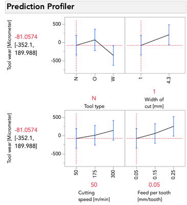
I've arranged the profiler in rows of two in order to most closely match Minitab for you, Prediction Profiler Red Triangle > Appearance > Arrange in Rows:
That said, why these plots match in this particular case (a main effects only model with balanced data), but not in the model you fit before, gets right to the meat of what @Mark_Bailey was explaining, and is a critical thing to understand about the choices we make in models.
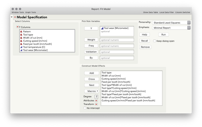
The prediction profiler in JMP displays the conditional relationship between Y and a given predictor, given the level selected of the other predictors, whereas the main effects plot from Minitab is essentially ignoring the other factors and displaying the average relationship between Y and a given predictor. So what does that mean, and why does the output from JMP and Minitab match in the case above, where I fit a main effects only model in JMP? Let's take the initial model that you first showed (and what is saved to your data table).
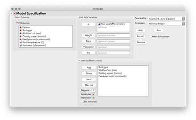
Putting aside for the moment the point Mark made about some of these terms being inestimable (which is certainly important, but is a separate point than this post), this model aims to understand (i.e. statistically estimate) the main effects for each predictor as well as the two-way interactions between each pair of predictors. These interactions are key to the difference between a main-effects plot, and the prediction profiler because the interactions allow our model to capture relationships between Y and each predictor that can be different when the level of another predictor changes. Let's look at the profiler from this model, and I'm going to change the level of Feed per tooth. As I do, look at the relationship between tool wear and tool type at the far left:
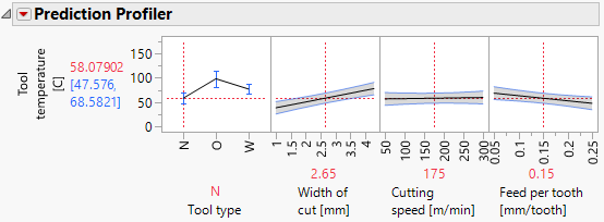
You'll notice the relationship between tool wear (y) and tool type at the far left is different at different levels of feed per tooth. There is an interaction between those variables. There are also interactions among tool type and the other variables. A "main effects only" plot simply averages over those different relationships to arrive at the average, unconditional relationship. That is what minitab shows in the main effects plot, and that is what JMP will show in the prediction profiler if you fit a model with no interactions, like this one:
I'll do the same exercise with the profiler below changing feed per tooth. Again, look at the relationship between tool wear and tool type:
This time you'll notice only the intercept changes -- that is, the relationship between tool wear and tool type is the same pattern, but the prediction for tool wear is only higher or lower by the amount that feed per tooth contributes. These effects are simply additive... there is no possibility for an interaction because we did not give the model the possibility to fit/find one.
I hope this helps clarify the difference you're seeing between the main effects plot in minitab and the prediction profiler in JMP.
- Mark as New
- Bookmark
- Subscribe
- Mute
- Subscribe to RSS Feed
- Get Direct Link
- Report Inappropriate Content
Re: Prediction profiler
First of all, I changed the modeling type of all the quantitative factors from nominal to continuous.
Second, I analyzed the distribution of the factor levels and discovered that Tool Type = O was observed only when Width of Cut = 1, so this design flaw eliminates one of the interaction parameter estimates. See:
Third, I selected a model using stepwise regression in the forward direction. (Note that I substituted back the original Tool Type factor in place of the contrasts created by Stepwise for the final regression analysis.) I get this Prediction Profiler:
These profiles seem reasonable. So I think that there is a problem with your model.
As to the difference between the Prediction Profiler and the main effects plot in MINITAB, you are comparing two completely different plots. The prediction profiler shows the profile of each factor on the response conditioned on the current level of the other factors. Hence, it is a prediction profiler. The main effects plot in MINITAB, on the other hand, shows the unconditional mean response at each factor level. It is the average of the data (and biased when design is not balanced, as in this case). It is not the (unbiased) least squares mean from the model.
- Mark as New
- Bookmark
- Subscribe
- Mute
- Subscribe to RSS Feed
- Get Direct Link
- Report Inappropriate Content
Re: Prediction profiler
Here is the updated data table.
- Mark as New
- Bookmark
- Subscribe
- Mute
- Subscribe to RSS Feed
- Get Direct Link
- Report Inappropriate Content
Re: Prediction profiler
Thanks you so much, but the results of both of them still look difference and it was the tool wear instead of tool temperature. Additionally, I would like to have the x-axis as it was before because i used those values to develop my experiments. What can I do?
Best regards
@Mark_Bailey wrote:Here is the updated data table.
- Mark as New
- Bookmark
- Subscribe
- Mute
- Subscribe to RSS Feed
- Get Direct Link
- Report Inappropriate Content
Re: Prediction profiler
I don't know what you mean.
but the results of both of them still look difference
Which results? What difference? Are you comparing the Prediction Profiler to another type of plot? Are you comparing JMP to MINITAB?
it was the tool wear instead of tool temperature.
Your request was about tool wear. That analysis is what you showed. That is the analysis I did, too.
I would like to have the x-axis as it was before because i used those values to develop my experiments.
I think that you mean by "before" is when you used the nominal modeling type for your quantitative factors. That choice, among other things, will produce a prediction profiler x-axis to only accept the levels in the data column. It also does not allow you to optimize at any factor level other than those that were used in the experiment. (Stuck with 'pick the winner.') It requires twice as many parameters for these factor terms in the model, too.
On the other hand, the way that I did it (use continuous modeling type) shows the continuous response profile (realistic) and still allows you enter any factor level you want, including those levels in the experiment. It also allows you to find an optimal level, even if it was not one of the three levels used in the experiment. (Interpolation)
- Mark as New
- Bookmark
- Subscribe
- Mute
- Subscribe to RSS Feed
- Get Direct Link
- Report Inappropriate Content
Re: Prediction profiler
I don't know what you mean.
but the results of both of them still look difference
Which results? What difference?
R: the lines trend are different between Minitab and both JMP graph
it was the tool wear instead of tool temperature.
Your request was about tool wear. That analysis is what you showed.
I would like to have the x-axis as it was before because i used those values to develop my experiments.
R=Yes, it was but you worked with tool temperature
What x-axis values?
i don't want in the axis from 1 to 4.3, i want 1 and 4.3
Best regards
- Mark as New
- Bookmark
- Subscribe
- Mute
- Subscribe to RSS Feed
- Get Direct Link
- Report Inappropriate Content
Re: Prediction profiler
Hi @Archy,
As Mark mentioned, the "Main Effects Plot" from Minitab you've shown here is displaying something quite different from the prediction profiler in JMP *when fitting your model with interactions. If you fit a main effects only model, the JMP Prediction Profiler and "Main Effects Plot" from Minitab display essentially the same thing (update: assuming balanced data, an equal number of observations in each cell of the design -- thanks for the note, Mark).
I've arranged the profiler in rows of two in order to most closely match Minitab for you, Prediction Profiler Red Triangle > Appearance > Arrange in Rows:
That said, why these plots match in this particular case (a main effects only model with balanced data), but not in the model you fit before, gets right to the meat of what @Mark_Bailey was explaining, and is a critical thing to understand about the choices we make in models.
The prediction profiler in JMP displays the conditional relationship between Y and a given predictor, given the level selected of the other predictors, whereas the main effects plot from Minitab is essentially ignoring the other factors and displaying the average relationship between Y and a given predictor. So what does that mean, and why does the output from JMP and Minitab match in the case above, where I fit a main effects only model in JMP? Let's take the initial model that you first showed (and what is saved to your data table).
Putting aside for the moment the point Mark made about some of these terms being inestimable (which is certainly important, but is a separate point than this post), this model aims to understand (i.e. statistically estimate) the main effects for each predictor as well as the two-way interactions between each pair of predictors. These interactions are key to the difference between a main-effects plot, and the prediction profiler because the interactions allow our model to capture relationships between Y and each predictor that can be different when the level of another predictor changes. Let's look at the profiler from this model, and I'm going to change the level of Feed per tooth. As I do, look at the relationship between tool wear and tool type at the far left:
You'll notice the relationship between tool wear (y) and tool type at the far left is different at different levels of feed per tooth. There is an interaction between those variables. There are also interactions among tool type and the other variables. A "main effects only" plot simply averages over those different relationships to arrive at the average, unconditional relationship. That is what minitab shows in the main effects plot, and that is what JMP will show in the prediction profiler if you fit a model with no interactions, like this one:
I'll do the same exercise with the profiler below changing feed per tooth. Again, look at the relationship between tool wear and tool type:
This time you'll notice only the intercept changes -- that is, the relationship between tool wear and tool type is the same pattern, but the prediction for tool wear is only higher or lower by the amount that feed per tooth contributes. These effects are simply additive... there is no possibility for an interaction because we did not give the model the possibility to fit/find one.
I hope this helps clarify the difference you're seeing between the main effects plot in minitab and the prediction profiler in JMP.
Recommended Articles
- © 2026 JMP Statistical Discovery LLC. All Rights Reserved.
- Terms of Use
- Privacy Statement
- Contact Us
