- JMP will suspend normal business operations for our Winter Holiday beginning on Wednesday, Dec. 24, 2025, at 5:00 p.m. ET (2:00 p.m. ET for JMP Accounts Receivable).
Regular business hours will resume at 9:00 a.m. EST on Friday, Jan. 2, 2026. - We’re retiring the File Exchange at the end of this year. The JMP Marketplace is now your destination for add-ins and extensions.
- Subscribe to RSS Feed
- Mark Topic as New
- Mark Topic as Read
- Float this Topic for Current User
- Bookmark
- Subscribe
- Mute
- Printer Friendly Page
Discussions
Solve problems, and share tips and tricks with other JMP users.- JMP User Community
- :
- Discussions
- :
- Plotting multiple classifier ROC curvers in one plot in JMP Pro

- Mark as New
- Bookmark
- Subscribe
- Mute
- Subscribe to RSS Feed
- Get Direct Link
- Report Inappropriate Content
Plotting multiple classifier ROC curvers in one plot in JMP Pro
I have 4 sets of numeric continuous data that I used for regression analysis.
Now, I performed ROC analysis using "Fit Y by X" option of "JMP Pro" for each set of data which generated me 4 seperate AUC curves and graphs of ROC in the "JMP Pro" program.
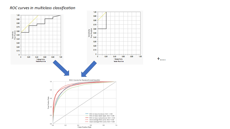
I obtained these curves using the following steps (image 2 and image 3)
My question is, how can I generate all of these graphs in one plot?
What I mean, when I did generated plots, it became like the two in the above of this attached picture. I want something like in the bottom of this picture
For example, the steps required in the software?
.png)
.png)
.png)
- Tags:
- macOS

- Mark as New
- Bookmark
- Subscribe
- Mute
- Subscribe to RSS Feed
- Get Direct Link
- Report Inappropriate Content
Re: Plotting multiple classifier ROC curvers in one plot in JMP Pro
In JMP Pro, you can use Model Comparison to overlay ROC curves for multiple models. Save each prediction formula to the data table (Red Triangle > Save Probability Formula), then launch Model Comparison (Analyze > Predictive Modeling > Model Comparison) and put the new prediction formula columns into the Y Predictors role. In the Model Comparison window, the ROC option under the red triangle will produce a plot like the one in your first example image.
JMP Academic Ambassador
Recommended Articles
- © 2026 JMP Statistical Discovery LLC. All Rights Reserved.
- Terms of Use
- Privacy Statement
- Contact Us