- Instantly extract effect sizes, F-ratios, and FDR-adjusted p-values from your models with the Calculate Effects Sizes extension, available now in the JMP Marketplace!
- New to JMP? Join us Sept. 23-24 for the Early User Edition of Discovery Summit, tailor-made for new users. Register now for free!
- Your voice matters! Tell us how you prefer to receive JMP updates, so we can tailor our communication to your needs. Take short survey.
- Subscribe to RSS Feed
- Mark Topic as New
- Mark Topic as Read
- Float this Topic for Current User
- Bookmark
- Subscribe
- Mute
- Printer Friendly Page
Discussions
Solve problems, and share tips and tricks with other JMP users.- JMP User Community
- :
- Discussions
- :
- Plotting lower / upper limits and average in a control chart

- Mark as New
- Bookmark
- Subscribe
- Mute
- Subscribe to RSS Feed
- Get Direct Link
- Report Inappropriate Content
Plotting lower / upper limits and average in a control chart
Hi guys,
I would like to know if it is possible to plot the lower , upper and average values direct in the control chart (created by control chart builder) instead of Show Limit Summaries table.
Thanks.

- Mark as New
- Bookmark
- Subscribe
- Mute
- Subscribe to RSS Feed
- Get Direct Link
- Report Inappropriate Content
Re: Plotting lower / upper limits and average in a control chart
I have neither the access to JMP 11 or to a Mac, so I will need your help. The message is pointing to a piece of code that is attemping to read the LCL from the displayed output table. Can you please provide the image of the table that was generated by the control chart that has the limits in it?

- Mark as New
- Bookmark
- Subscribe
- Mute
- Subscribe to RSS Feed
- Get Direct Link
- Report Inappropriate Content
Re: Plotting lower / upper limits and average in a control chart
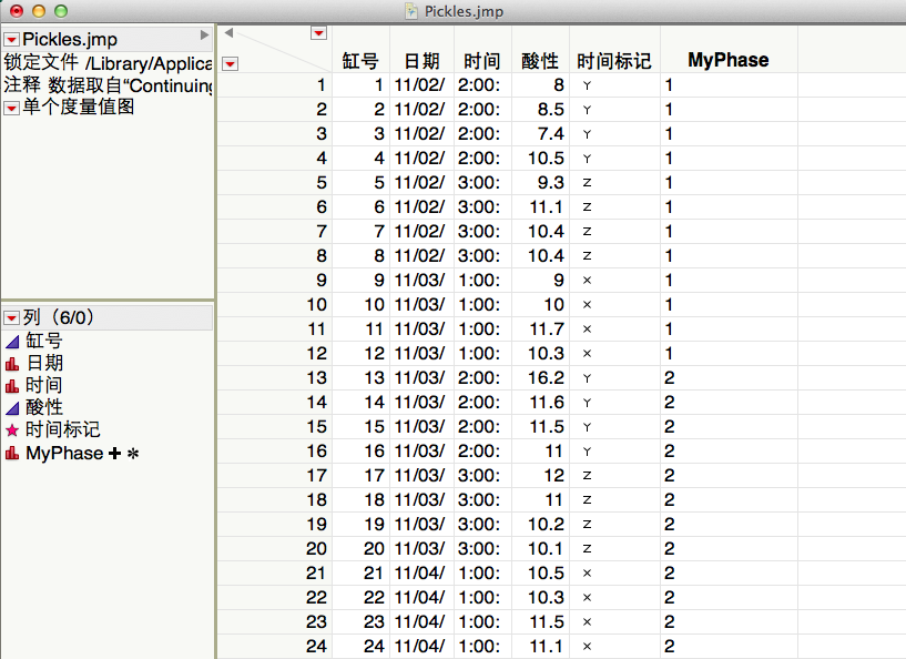
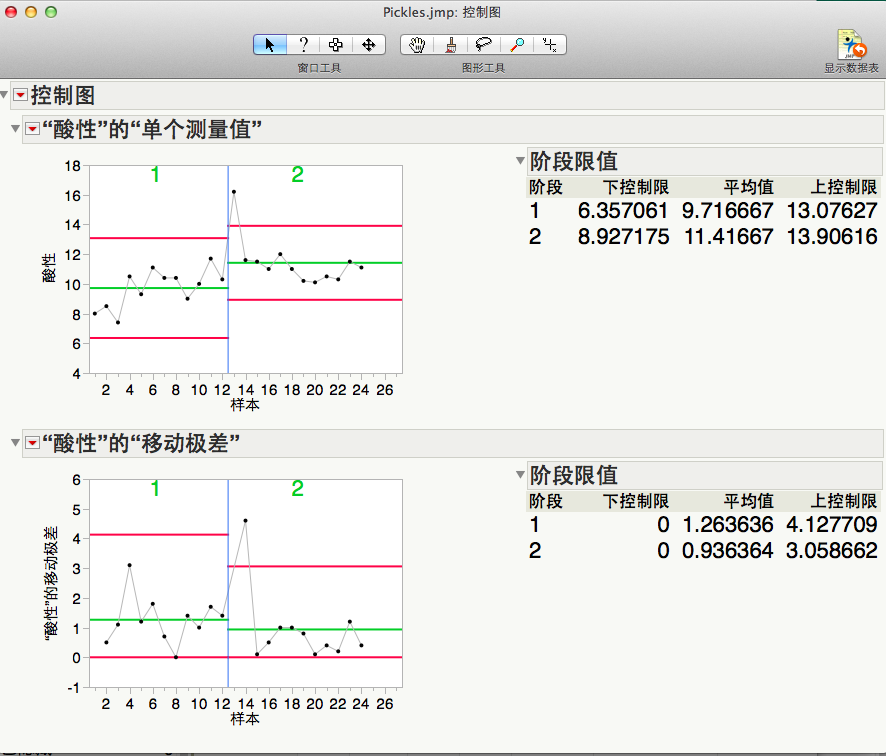
The JSL is the same as you posted before. You can find the table image here. As you see that the text for LCL, UCL and Average have not been added.
Thanks.
- Mark as New
- Bookmark
- Subscribe
- Mute
- Subscribe to RSS Feed
- Get Direct Link
- Report Inappropriate Content
Re: Plotting lower / upper limits and average in a control chart
The script is looking for a specific Outline Box with the title, in English, of "Individual Measurement of Acid". Your output is obviously not in English. The below script changes the reference to Outline Box(2). This is an absolute reference to the outline box, while "Individual Measurement of Acid" is a relative reference. You could also try replacing "Individual Measurement of Acid" with

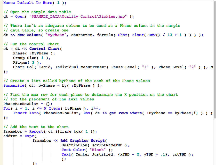
Names Default To Here( 1 );
// Open the sample data table
dt = Open( "$SAMPLE_DATA\Quality Control\Pickles.jmp" );
// There isn't an adequate column to be used as a Phase column in the sample
// data table, so create one
dt << New Column( "MyPhase", character, formula( Char( Floor( Row() / 13 + 1 ) ) ) );
// Run the control Chart
ct = dt << Control Chart(
Phase( :MyPhase ),
Group Size( 1 ),
KSigma( 3 ),
Chart Col( :Acid, Individual Measurement( Phase Level( "1" ), Phase Level( "2" ) ), Moving Range( Phase Level( "1" ), Phase Level( "2" ) ) )
);
// Create a list called byPhase of the each of the Phase values
Summarize( dt, byPhase = by( :MyPhase ) );
// Find the max row for each phase to determine the X position on the chart
// for the placement of the text values
PhaseMaxRowList = {};
For( i = 1, i <= N Items( byPhase ), i++,
Insert Into( PhaseMaxRowList, Max( dt << get rows where( :MyPhase == byPhase[i] ) ) )
);
// Add the text to the chart
framebox = Report( ct )[frame box( 1 )];
addTxt = Expr(
framebox << Add Graphics Script(
Description( scriptNameTBD ),
Text Color( "Black" );
Text( Center Justified, {xTBD - 2, yTBD + .1}, txtTBD );
);
);
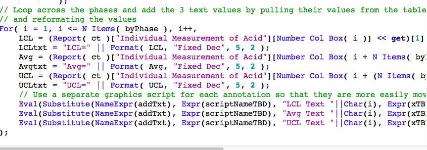
// Loop across the phases and add the 3 text values by pulling their values from the table
// and reformating the values
For( i = 1, i <= N Items( byPhase ), i++,
LCL = (Report( ct )[Outline Box(2)][Number Col Box( i )] << get)[1];
LCLtxt = "LCL=" || Format( LCL, "Fixed Dec", 5, 2 );
Avg = (Report( ct )[Outline Box(2)][Number Col Box( i + N Items( byPhase ) )] << get)[1];
Avgtxt = "Avg=" || Format( Avg, "Fixed Dec", 5, 2 );
UCL = (Report( ct )[Outline Box(2)][Number Col Box( i + (N Items( byPhase ) * 2) )] << get)[1];
UCLtxt = "UCL=" || Format( UCL, "Fixed Dec", 5, 2 );
// Use a separate graphics script for each annotation so that they are more easily moved 'by hand'
Eval(Substitute(NameExpr(addTxt), Expr(scriptNameTBD), "LCL Text "||Char(i), Expr(xTBD), PhaseMaxRowList[i], Expr(yTBD), LCL, Expr(txtTBD), LCLtxt));
Eval(Substitute(NameExpr(addTxt), Expr(scriptNameTBD), "Avg Text "||Char(i), Expr(xTBD), PhaseMaxRowList[i], Expr(yTBD), Avg, Expr(txtTBD), Avgtxt));
Eval(Substitute(NameExpr(addTxt), Expr(scriptNameTBD), "UCL Text "||Char(i), Expr(xTBD), PhaseMaxRowList[i], Expr(yTBD), UCL, Expr(txtTBD), UCLtxt));
);- Mark as New
- Bookmark
- Subscribe
- Mute
- Subscribe to RSS Feed
- Get Direct Link
- Report Inappropriate Content
Re: Plotting lower / upper limits and average in a control chart
必须是赋值运算符 正在访问或计算“dt”, dt/*###*/
Must use assignment operator in visiting "dt"
在以下脚本中,使用 /*###*/ 标记错误
in the following script, use /*###*/ to mark error
- Mark as New
- Bookmark
- Subscribe
- Mute
- Subscribe to RSS Feed
- Get Direct Link
- Report Inappropriate Content
Re: Plotting lower / upper limits and average in a control chart
The syntax of the "Summarize()" function has changed in the recent versions of JMP. It seems that might be the issue. Change the statement
Summarize( dt, byPhase = by( :MyPhase ) );
to
Summarize( byPhase = by( :MyPhase ) );
- Mark as New
- Bookmark
- Subscribe
- Mute
- Subscribe to RSS Feed
- Get Direct Link
- Report Inappropriate Content
Re: Plotting lower / upper limits and average in a control chart
- « Previous
-
- 1
- 2
- Next »
Recommended Articles
- © 2026 JMP Statistical Discovery LLC. All Rights Reserved.
- Terms of Use
- Privacy Statement
- Contact Us