- Subscribe to RSS Feed
- Mark Topic as New
- Mark Topic as Read
- Float this Topic for Current User
- Bookmark
- Subscribe
- Mute
- Printer Friendly Page
Discussions
Solve problems, and share tips and tricks with other JMP users.- JMP User Community
- :
- Discussions
- :
- Plotting lower / upper limits and average in a control chart
- Mark as New
- Bookmark
- Subscribe
- Mute
- Subscribe to RSS Feed
- Get Direct Link
- Report Inappropriate Content
Plotting lower / upper limits and average in a control chart
Hi guys,
I would like to know if it is possible to plot the lower , upper and average values direct in the control chart (created by control chart builder) instead of Show Limit Summaries table.
Thanks.
Accepted Solutions
- Mark as New
- Bookmark
- Subscribe
- Mute
- Subscribe to RSS Feed
- Get Direct Link
- Report Inappropriate Content
Re: Plotting lower / upper limits and average in a control chart
Very nice Jim!
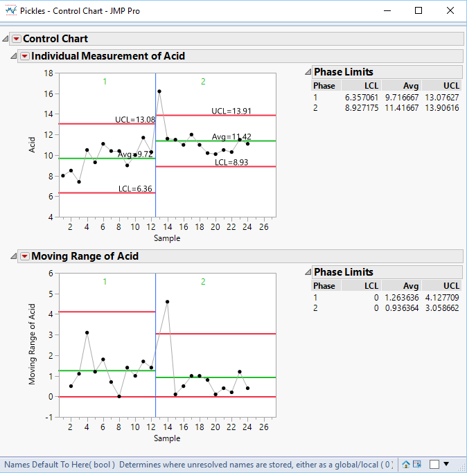
I took the liberty of adding to your code so that there is a separate graphics script for each annotation:
This makes it possible to move the annotations 'by hand' to avoid any collisions (Right-click on the graphics box, select 'Customize' and edit the x and y values in the scripts to taste).
Names Default To Here( 1 );

// Open the sample data table
dt = Open( "$SAMPLE_DATA\Quality Control\Pickles.jmp" );

// There isn't an adequate column to be used as a Phase column in the sample
// data table, so create one
dt << New Column( "MyPhase", character, formula( Char( Floor( Row() / 13 + 1 ) ) ) );

// Run the control Chart
ct = dt << Control Chart(
	Phase( :MyPhase ),
	Group Size( 1 ),
	KSigma( 3 ),
	Chart Col( :Acid, Individual Measurement( Phase Level( "1" ), Phase Level( "2" ) ), Moving Range( Phase Level( "1" ), Phase Level( "2" ) ) )
);

// Create a list called byPhase of the each of the Phase values
Summarize( dt, byPhase = by( :MyPhase ) );

// Find the max row for each phase to determine the X position on the chart
// for the placement of the text values
PhaseMaxRowList = {};
For( i = 1, i <= N Items( byPhase ), i++,
	Insert Into( PhaseMaxRowList, Max( dt << get rows where( :MyPhase == byPhase[i] ) ) )
);

// Add the text to the chart
framebox = Report( ct )[frame box( 1 )];
addTxt = Expr(
			framebox << Add Graphics Script(
						Description( scriptNameTBD ),
						Text Color( "Black" );
						Text( Center Justified, {xTBD - 2, yTBD + .1}, txtTBD );
						);
			);
// Loop across the phases and add the 3 text values by pulling their values from the table
// and reformating the values
For( i = 1, i <= N Items( byPhase ), i++,
	LCL = (Report( ct )["Individual Measurement of Acid"][Number Col Box( i )] << get)[1];
	LCLtxt = "LCL=" || Format( LCL, "Fixed Dec", 5, 2 );
	Avg = (Report( ct )["Individual Measurement of Acid"][Number Col Box( i + N Items( byPhase ) )] << get)[1];
	Avgtxt = "Avg=" || Format( Avg, "Fixed Dec", 5, 2 );
	UCL = (Report( ct )["Individual Measurement of Acid"][Number Col Box( i + (N Items( byPhase ) * 2) )] << get)[1];
	UCLtxt = "UCL=" || Format( UCL, "Fixed Dec", 5, 2 );
	// Use a separate graphics script for each annotation so that they are more easily moved 'by hand'
	Eval(Substitute(NameExpr(addTxt), Expr(scriptNameTBD), "LCL Text "||Char(i), Expr(xTBD), PhaseMaxRowList[i], Expr(yTBD), LCL, Expr(txtTBD), LCLtxt));
	Eval(Substitute(NameExpr(addTxt), Expr(scriptNameTBD), "Avg Text "||Char(i), Expr(xTBD), PhaseMaxRowList[i], Expr(yTBD), Avg, Expr(txtTBD), Avgtxt));
	Eval(Substitute(NameExpr(addTxt), Expr(scriptNameTBD), "UCL Text "||Char(i), Expr(xTBD), PhaseMaxRowList[i], Expr(yTBD), UCL, Expr(txtTBD), UCLtxt));
);
- Mark as New
- Bookmark
- Subscribe
- Mute
- Subscribe to RSS Feed
- Get Direct Link
- Report Inappropriate Content
Re: Plotting lower / upper limits and average in a control chart
You could double-click on the vertical axis and add refernece lines, or add a custom graphics script to the graph box by right-clicking on this. For the second option, do 'Help > Scripting Index' and search for 'H Line'.
- Mark as New
- Bookmark
- Subscribe
- Mute
- Subscribe to RSS Feed
- Get Direct Link
- Report Inappropriate Content
Re: Plotting lower / upper limits and average in a control chart
Hi, thanks for quick answer.
I think I'm not so clear in my explanation. I need to plot the values for lower, upper and average lines.
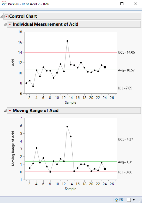
See below the example that I'm looking for. In the left, the software that I used in the past.
If I can plot the values from Show Summaries Limits table, I can remove the table to report (the best layout to put in a presentation).
- Mark as New
- Bookmark
- Subscribe
- Mute
- Subscribe to RSS Feed
- Get Direct Link
- Report Inappropriate Content
Re: Plotting lower / upper limits and average in a control chart
I'm the one who mis-understood. This topic has come up before.
- Mark as New
- Bookmark
- Subscribe
- Mute
- Subscribe to RSS Feed
- Get Direct Link
- Report Inappropriate Content
Re: Plotting lower / upper limits and average in a control chart
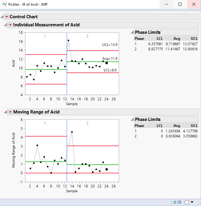
The values can be added to the chart. If there are not phases, the values are displayed as part of the chart
But if the data has phases, the values, as you are pointing out are in a table next to the chart, and you want them on the chart. If your old software allowed you to manually add the values, then you can do the same within JMP by just annotating the chart
If you need this programatically done, then a script could be used to simply read the values from the displayed table and placed onto the IR chart.
I noticed in your example from your old software, that only one set of limits were displayed, even though it appeared that there were different phases. Was that because the limits were the same for all phases?
- Mark as New
- Bookmark
- Subscribe
- Mute
- Subscribe to RSS Feed
- Get Direct Link
- Report Inappropriate Content
Re: Plotting lower / upper limits and average in a control chart
Hi again,
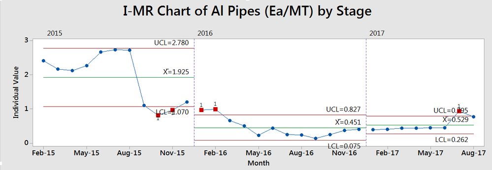
So, the old software that I used in the past is Minitab.
Answering your question, the values are ploted automatically from the software and also by phase (see the picture below).
In the example that I shared before, there isn't phases.
I know I've assked too much but could you give me direction about how to include these actions (remove table and plot values in the charts) using script?
Thanks again.
- Mark as New
- Bookmark
- Subscribe
- Mute
- Subscribe to RSS Feed
- Get Direct Link
- Report Inappropriate Content
Re: Plotting lower / upper limits and average in a control chart
Here is a very rough script that will pull the values from the limits table, and place them on the chart. I suggest that you take the time to read the Scripting Guide using the code below to learn exactly how the code does what it does.
Help==>Books==>Scripting Guide
Names Default To Here( 1 );

// Open the sample data table
dt = Open( "$SAMPLE_DATA\Quality Control\Pickles.jmp" );

// There isn't an adequate column to be used as a Phase column in the sample
// data table, so create one
dt << New Column( "MyPhase", character, formula( Char( Floor( Row() / 13 + 1 ) ) ) );

// Run the control Chart
ct = dt << Control Chart(
	Phase( :MyPhase ),
	Group Size( 1 ),
	KSigma( 3 ),
	Chart Col( :Acid, Individual Measurement( Phase Level( "1" ), Phase Level( "2" ) ), Moving Range( Phase Level( "1" ), Phase Level( "2" ) ) )
);

// Create a list called byPhase of the each of the Phase values
Summarize( dt, byPhase = by( :MyPhase ) );

// Find the max row for each phase to determine the X position on the chart
// for the placement of the text values
PhaseMaxRowList = {};
For( i = 1, i <= N Items( byPhase ), i++,
	Insert Into( PhaseMaxRowList, Max( dt << get rows where( :MyPhase == byPhase[i] ) ) )
);

// Add the text to the chart
framebox = Report( ct )[frame box( 1 )];
framebox << Add Graphics Script(
	Text Color( "Black" );

	// Loop across the phases and add the 3 text values by pulling their values from the table
	// and reformating the values
	For( i = 1, i <= N Items( byPhase ), i++,
		LCL = (Report( ct )["Individual Measurement of Acid"][Number Col Box( i )] << get)[1];
		LCLtxt = "LCL=" || Format( LCL, "Fixed Dec", 5, 2 );
		Avg = (Report( ct )["Individual Measurement of Acid"][Number Col Box( i + N Items( byPhase ) )] << get)[1];
		Avgtxt = "Avg=" || Format( Avg, "Fixed Dec", 5, 2 );
		UCL = (Report( ct )["Individual Measurement of Acid"][Number Col Box( i + (N Items( byPhase ) * 2) )] << get)[1];
		UCLtxt = "UCL=" || Format( UCL, "Fixed Dec", 5, 2 );

		Text( Center Justified, {PhaseMaxRowList[i] - 2, LCL + .1}, LCLtxt );
		Text( Center Justified, {PhaseMaxRowList[i] - 2, Avg + .1}, Avgtxt );
		Text( Center Justified, {PhaseMaxRowList[i] - 2, UCL + .1}, UCLtxt );
	);
);- Mark as New
- Bookmark
- Subscribe
- Mute
- Subscribe to RSS Feed
- Get Direct Link
- Report Inappropriate Content
Re: Plotting lower / upper limits and average in a control chart
Very nice Jim!
I took the liberty of adding to your code so that there is a separate graphics script for each annotation:
This makes it possible to move the annotations 'by hand' to avoid any collisions (Right-click on the graphics box, select 'Customize' and edit the x and y values in the scripts to taste).
Names Default To Here( 1 );

// Open the sample data table
dt = Open( "$SAMPLE_DATA\Quality Control\Pickles.jmp" );

// There isn't an adequate column to be used as a Phase column in the sample
// data table, so create one
dt << New Column( "MyPhase", character, formula( Char( Floor( Row() / 13 + 1 ) ) ) );

// Run the control Chart
ct = dt << Control Chart(
	Phase( :MyPhase ),
	Group Size( 1 ),
	KSigma( 3 ),
	Chart Col( :Acid, Individual Measurement( Phase Level( "1" ), Phase Level( "2" ) ), Moving Range( Phase Level( "1" ), Phase Level( "2" ) ) )
);

// Create a list called byPhase of the each of the Phase values
Summarize( dt, byPhase = by( :MyPhase ) );

// Find the max row for each phase to determine the X position on the chart
// for the placement of the text values
PhaseMaxRowList = {};
For( i = 1, i <= N Items( byPhase ), i++,
	Insert Into( PhaseMaxRowList, Max( dt << get rows where( :MyPhase == byPhase[i] ) ) )
);

// Add the text to the chart
framebox = Report( ct )[frame box( 1 )];
addTxt = Expr(
			framebox << Add Graphics Script(
						Description( scriptNameTBD ),
						Text Color( "Black" );
						Text( Center Justified, {xTBD - 2, yTBD + .1}, txtTBD );
						);
			);
// Loop across the phases and add the 3 text values by pulling their values from the table
// and reformating the values
For( i = 1, i <= N Items( byPhase ), i++,
	LCL = (Report( ct )["Individual Measurement of Acid"][Number Col Box( i )] << get)[1];
	LCLtxt = "LCL=" || Format( LCL, "Fixed Dec", 5, 2 );
	Avg = (Report( ct )["Individual Measurement of Acid"][Number Col Box( i + N Items( byPhase ) )] << get)[1];
	Avgtxt = "Avg=" || Format( Avg, "Fixed Dec", 5, 2 );
	UCL = (Report( ct )["Individual Measurement of Acid"][Number Col Box( i + (N Items( byPhase ) * 2) )] << get)[1];
	UCLtxt = "UCL=" || Format( UCL, "Fixed Dec", 5, 2 );
	// Use a separate graphics script for each annotation so that they are more easily moved 'by hand'
	Eval(Substitute(NameExpr(addTxt), Expr(scriptNameTBD), "LCL Text "||Char(i), Expr(xTBD), PhaseMaxRowList[i], Expr(yTBD), LCL, Expr(txtTBD), LCLtxt));
	Eval(Substitute(NameExpr(addTxt), Expr(scriptNameTBD), "Avg Text "||Char(i), Expr(xTBD), PhaseMaxRowList[i], Expr(yTBD), Avg, Expr(txtTBD), Avgtxt));
	Eval(Substitute(NameExpr(addTxt), Expr(scriptNameTBD), "UCL Text "||Char(i), Expr(xTBD), PhaseMaxRowList[i], Expr(yTBD), UCL, Expr(txtTBD), UCLtxt));
);
- Mark as New
- Bookmark
- Subscribe
- Mute
- Subscribe to RSS Feed
- Get Direct Link
- Report Inappropriate Content
Re: Plotting lower / upper limits and average in a control chart
- Mark as New
- Bookmark
- Subscribe
- Mute
- Subscribe to RSS Feed
- Get Direct Link
- Report Inappropriate Content
Re: Plotting lower / upper limits and average in a control chart
I tried the JSL on my Mac JMP 11. However it seems still the texts have been successfully added into the chart. In log window, i get the following error information and said that can not caluate out subscript. Can you give me an explantion?
For( i = 1, i <= N Items( byPhase ), i++,
LCL = (Report( ct )[/*###*/"Individual Measurement of Acid"][Number Col Box( i )
] << get)[1];
Recommended Articles
- © 2025 JMP Statistical Discovery LLC. All Rights Reserved.
- Terms of Use
- Privacy Statement
- Contact Us


