- New to JMP? Join us Sept. 23-24 for the Early User Edition of Discovery Summit, tailor-made for new users. Register now for free!
- Your voice matters! Tell us how you prefer to receive JMP updates, so we can tailor our communication to your needs. Take short survey.
- See how to access JMP Marketplace - and - find, create & share add-ins to extend your JMP. Watch video.
- Subscribe to RSS Feed
- Mark Topic as New
- Mark Topic as Read
- Float this Topic for Current User
- Bookmark
- Subscribe
- Mute
- Printer Friendly Page
Discussions
Solve problems, and share tips and tricks with other JMP users.- JMP User Community
- :
- Discussions
- :
- Plotting UCL/LCL defined in columns in the row

- Mark as New
- Bookmark
- Subscribe
- Mute
- Subscribe to RSS Feed
- Get Direct Link
- Report Inappropriate Content
Plotting UCL/LCL defined in columns in the row
Hi,
Can someone share how to script adding LCL/UCL to any type of plot when these limits are defined in a column in that specific row. The table has several parameters being plotted (identified by column Label), so each chart has a different set of limits defined for each of the chart types in that row.
For example(attached), if we had two columns of UCL/LCL in the big class example with stacked data table.
can someone write a short script to produce an overlay plot for height with LCL and UCL as defined for height in the respective column.
Hope the question makes sense.
Thanks!!
Accepted Solutions

- Mark as New
- Bookmark
- Subscribe
- Mute
- Subscribe to RSS Feed
- Get Direct Link
- Report Inappropriate Content
Re: Plotting UCL/LCL defined in columns in the row
Here is a starter script tat will produce what you want for the sample data table. It generates an Overlay Plot. To do the same for your variability charts, it will take some modifications, since each of the platforms has different options, etc.
Names Default To Here( 1 );
dt = Current Data Table();

// Get all of the by values, since separate code will have to be added for each
Summarize( dt, byVals = by( :Label ) );

// Generate the Plot code
op = Overlay Plot( X( :name ), Y( :Data ), by( :label ) );

For( i = 1, i <= N Items( byVals ), i++,

// Get the LCL and UCL values for this by group
	LCL = :LCL[(dt << get rows where( :Label == byVals[i] ))[1]];
	UCL = :UCL[(dt << get rows where( :Label == byVals[i] ))[1]];

// Generate the code to produce the LCL and UCL reference lines
	Eval(
		Substitute(
				Expr(
					op << SendToByGroup(
						{:Label == __byVals__},
						Y Axis[1] << {{Add Ref Line( __LCL__, "Solid", "Medium Dark Red", "LCL", 1 ),
						Add Ref Line( __UCL__, "Solid", "Medium Dark Red", "UCL", 1 )}}
					)
				),
			Expr( __byVals__ ), byVals[i],
			Expr( __UCL__ ), UCL,
			Expr( __LCL__ ), LCL
		)
	);
);- Mark as New
- Bookmark
- Subscribe
- Mute
- Subscribe to RSS Feed
- Get Direct Link
- Report Inappropriate Content
Re: Plotting UCL/LCL defined in columns in the row
The best way to learn about what charts are available, is to look through the document, Essential Graphing
Help==>Essential Graphing
Then, after you have run a graph, you can select from the red triangle in the graphical output, to save the script. It is from there you will get the code on what you need to use to generate the graphs.
Below is a modification to the script that was previously provided. I have modified it to check to make sure the reference lines are displayed.
Names Default To Here( 1 );
dt = Current Data Table();

// Get all of the by values, since separate code will have to be added for each
Summarize( dt, byVals = by( :Label ) );

// Generate the Plot code
op = Overlay Plot( X( :name ), Y( :Data ), by( :label ) );

For( i = 1, i <= N Items( byVals ), i++,

	// Get the LCL and UCL values for this by group
	LCL = :LCL[(dt << get rows where( :Label == byVals[i] ))[1]];
	UCL = :UCL[(dt << get rows where( :Label == byVals[i] ))[1]];

	// Make sure the UCL and LCL values are displayed
	chartMin = Min( :data[dt << get rows where( :Label == byVals[i])]);
	chartMax = Max( :data[dt << get rows where( :Label == byVals[i])]);

	If(LCL < chartMin, chartMin = LCL );
	If(UCL > chartMax, chartMax = UCL );

	chartRange5% = (chartMax - ChartMin)/20;

	chartMin = chartMin - chartRange5%;
	chartMax = chartMax + chartRange5%;


	// Generate the code to produce the LCL and UCL reference lines
	Eval(
		Substitute(
				Expr(
					op << SendToByGroup(
						{:Label == __byVals__},
						Y Axis[1] << {{Min( __min__ ), Max( __max__ ),
						Add Ref Line( __LCL__, "Solid", "Medium Dark Red", "LCL", 1 ),
						Add Ref Line( __UCL__, "Solid", "Medium Dark Red", "UCL", 1 )}}
					)
				),
			Expr( __byVals__ ), byVals[i],
			Expr( __UCL__ ), UCL,
			Expr( __LCL__ ), LCL,
			Expr( __min__ ), chartMin,
			Expr( __max__ ), chartMax
		)
	);
);- Mark as New
- Bookmark
- Subscribe
- Mute
- Subscribe to RSS Feed
- Get Direct Link
- Report Inappropriate Content
Re: Plotting UCL/LCL defined in columns in the row
1. I assume that column Name is the X axis
2. Your LCL and UCL values are all the same for each of the rows where for the rows defined as "Height". Will this be the case, or with a real data table, the LCL and UCL values will change?
3. When you say "Overlay Plot" are you specifically referring to the Overlay Platform in JMP or are you just indicating that the data value is overlayed with the LCL and UCL and the Graph Builder Platform could be used?
- Mark as New
- Bookmark
- Subscribe
- Mute
- Subscribe to RSS Feed
- Get Direct Link
- Report Inappropriate Content
Re: Plotting UCL/LCL defined in columns in the row
1. I assume that column Name is the X axis
- I used overlay plot as an example, any plot which has numeric value on y axis (for example height or weight). X axis can be name as you suggested.
2. Your LCL and UCL values are all the same for each of the rows where for the rows defined as "Height". Will this be the case, or with a real data table, the LCL and UCL values will change?
- Limits can change for different category in tha label category. (for to clarify: One LCL/UCL for height, some other UCL/LCL for weight)
3. When you say "Overlay Plot" are you specifically referring to the Overlay Platform in JMP or are you just indicating that the data value is overlayed with the LCL and UCL and the Graph Builder Platform could be used?
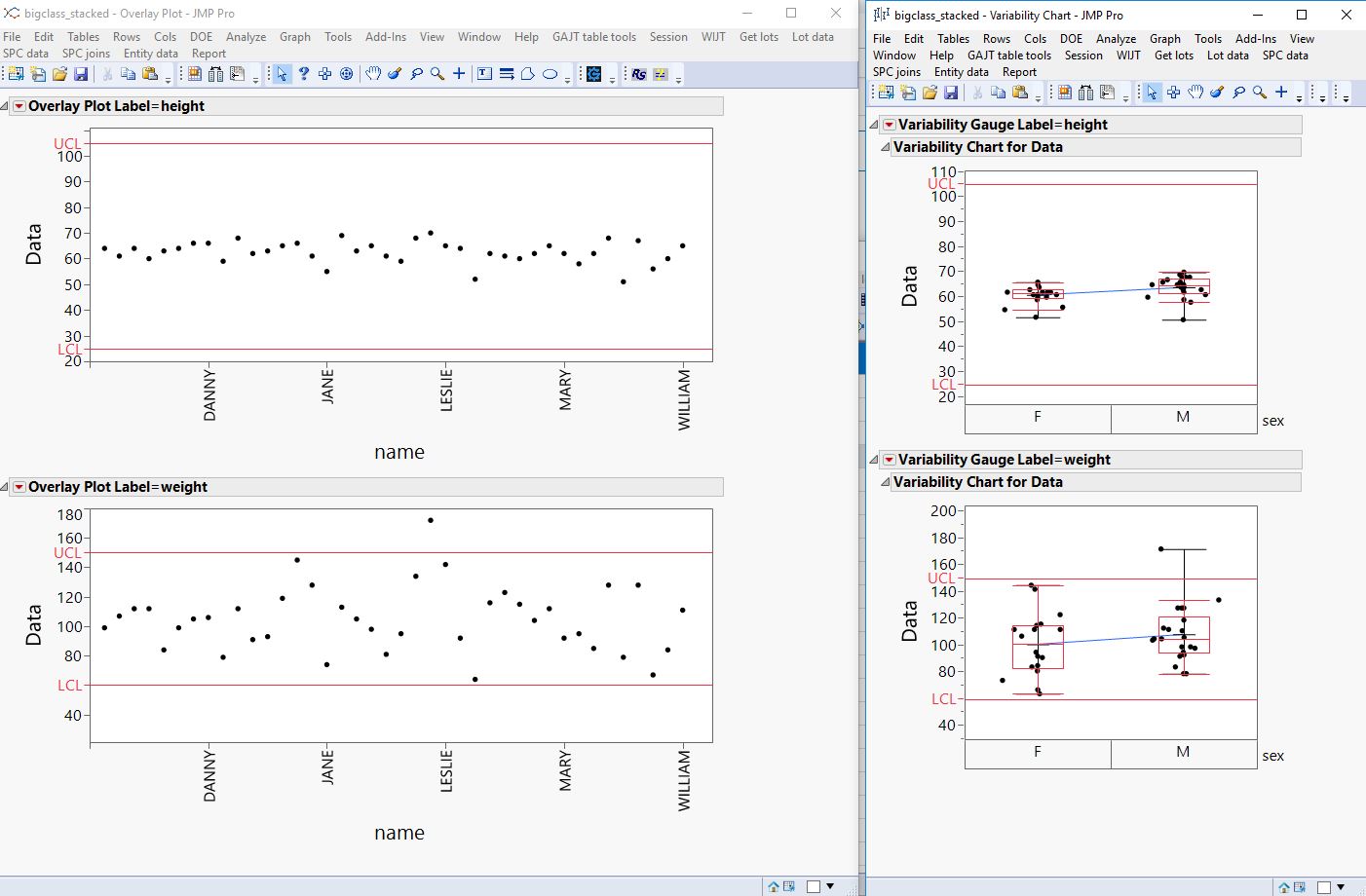
- Iam attaching plot as an example, that has overlay plot and a variability plot with limits in it. (this was generated manually by adding lines in the plot), I am looking for similar plots.
Thanks a lot for your time!!
- Mark as New
- Bookmark
- Subscribe
- Mute
- Subscribe to RSS Feed
- Get Direct Link
- Report Inappropriate Content
Re: Plotting UCL/LCL defined in columns in the row
Here is a starter script tat will produce what you want for the sample data table. It generates an Overlay Plot. To do the same for your variability charts, it will take some modifications, since each of the platforms has different options, etc.
Names Default To Here( 1 );
dt = Current Data Table();

// Get all of the by values, since separate code will have to be added for each
Summarize( dt, byVals = by( :Label ) );

// Generate the Plot code
op = Overlay Plot( X( :name ), Y( :Data ), by( :label ) );

For( i = 1, i <= N Items( byVals ), i++,

// Get the LCL and UCL values for this by group
	LCL = :LCL[(dt << get rows where( :Label == byVals[i] ))[1]];
	UCL = :UCL[(dt << get rows where( :Label == byVals[i] ))[1]];

// Generate the code to produce the LCL and UCL reference lines
	Eval(
		Substitute(
				Expr(
					op << SendToByGroup(
						{:Label == __byVals__},
						Y Axis[1] << {{Add Ref Line( __LCL__, "Solid", "Medium Dark Red", "LCL", 1 ),
						Add Ref Line( __UCL__, "Solid", "Medium Dark Red", "UCL", 1 )}}
					)
				),
			Expr( __byVals__ ), byVals[i],
			Expr( __UCL__ ), UCL,
			Expr( __LCL__ ), LCL
		)
	);
);- Mark as New
- Bookmark
- Subscribe
- Mute
- Subscribe to RSS Feed
- Get Direct Link
- Report Inappropriate Content
Re: Plotting UCL/LCL defined in columns in the row
Thanks a lot Jim, this works for the overlay charts. Can you point a reference where I can plot other charts too. The scripting guide is not very helpful.
Also, one more thing, can you add a line which will make sure the limit lines are visible. At present they are not visible.
Thanks again for your time.
- Mark as New
- Bookmark
- Subscribe
- Mute
- Subscribe to RSS Feed
- Get Direct Link
- Report Inappropriate Content
Re: Plotting UCL/LCL defined in columns in the row
Thanks a lot Jim, this works for the overlay charts. Can you point a reference where I can (learn about the settings of other charts ) and plot other charts too. The scripting guide is not very helpful.
Also, one more thing, can you add a line which will make sure the limit lines are visible. At present they are not visible.
Thanks again for your time.
- Mark as New
- Bookmark
- Subscribe
- Mute
- Subscribe to RSS Feed
- Get Direct Link
- Report Inappropriate Content
Re: Plotting UCL/LCL defined in columns in the row
The best way to learn about what charts are available, is to look through the document, Essential Graphing
Help==>Essential Graphing
Then, after you have run a graph, you can select from the red triangle in the graphical output, to save the script. It is from there you will get the code on what you need to use to generate the graphs.
Below is a modification to the script that was previously provided. I have modified it to check to make sure the reference lines are displayed.
Names Default To Here( 1 );
dt = Current Data Table();

// Get all of the by values, since separate code will have to be added for each
Summarize( dt, byVals = by( :Label ) );

// Generate the Plot code
op = Overlay Plot( X( :name ), Y( :Data ), by( :label ) );

For( i = 1, i <= N Items( byVals ), i++,

	// Get the LCL and UCL values for this by group
	LCL = :LCL[(dt << get rows where( :Label == byVals[i] ))[1]];
	UCL = :UCL[(dt << get rows where( :Label == byVals[i] ))[1]];

	// Make sure the UCL and LCL values are displayed
	chartMin = Min( :data[dt << get rows where( :Label == byVals[i])]);
	chartMax = Max( :data[dt << get rows where( :Label == byVals[i])]);

	If(LCL < chartMin, chartMin = LCL );
	If(UCL > chartMax, chartMax = UCL );

	chartRange5% = (chartMax - ChartMin)/20;

	chartMin = chartMin - chartRange5%;
	chartMax = chartMax + chartRange5%;


	// Generate the code to produce the LCL and UCL reference lines
	Eval(
		Substitute(
				Expr(
					op << SendToByGroup(
						{:Label == __byVals__},
						Y Axis[1] << {{Min( __min__ ), Max( __max__ ),
						Add Ref Line( __LCL__, "Solid", "Medium Dark Red", "LCL", 1 ),
						Add Ref Line( __UCL__, "Solid", "Medium Dark Red", "UCL", 1 )}}
					)
				),
			Expr( __byVals__ ), byVals[i],
			Expr( __UCL__ ), UCL,
			Expr( __LCL__ ), LCL,
			Expr( __min__ ), chartMin,
			Expr( __max__ ), chartMax
		)
	);
);
- Mark as New
- Bookmark
- Subscribe
- Mute
- Subscribe to RSS Feed
- Get Direct Link
- Report Inappropriate Content
Re: Plotting UCL/LCL defined in columns in the row
Hi,
As a JSL newby I copied your approach and works perfectly for single columns of plotted data (Thanks!). However, I want to include 2 more columns (and a needle between them) in the plot. This currently results in a plot with the 3 colums, but without the UCL/LCL.
I changed the "op = Overlay Plot( Y( :data ), by( :label ) ); "
to
"op = Overlay Plot( Y( :data1, :data2, :data3 ), by( :label ) , needle (1) ); "
Do you know why this is and how to fix it? Thanks!
- Mark as New
- Bookmark
- Subscribe
- Mute
- Subscribe to RSS Feed
- Get Direct Link
- Report Inappropriate Content
Re: Plotting UCL/LCL defined in columns in the row
I am not sure of what exactly you are trying to make the Overlay Plot do. I suggest you run the plot interactively to get it to the form you want, and then just simply go to the red triangle and select to have JMP save the script. But for what JSL you have have shown:
You are missing an X() element in your Overlay specification. The sample you indicated you changed from
op = Overlay Plot( Y( :data ), by( :label ) );
was not the correct form. The correct example was
op = Overlay Plot( X( :name ), Y( :Data ), by( :label ) );Therefore, the specification you need to use is:
op = Overlay Plot( Y( :data1, :data2), X(:data3 ), by( :label ) , needle (1) );

- Mark as New
- Bookmark
- Subscribe
- Mute
- Subscribe to RSS Feed
- Get Direct Link
- Report Inappropriate Content
Re: Plotting UCL/LCL defined in columns in the row
Anyone has any ideal how to plot this, when UCL/LCL is changing with time?
The method proposed by JIM @txnelson works great for static UCL/LCL limits. but with changing limits not sure how to do it?
Recommended Articles
- © 2026 JMP Statistical Discovery LLC. All Rights Reserved.
- Terms of Use
- Privacy Statement
- Contact Us