- New to JMP? Let the Data Analysis Director guide you through selecting an analysis task, an analysis goal, and a data type. Available now in the JMP Marketplace!
- See how to install JMP Marketplace extensions to customize and enhance JMP.
- Subscribe to RSS Feed
- Mark Topic as New
- Mark Topic as Read
- Float this Topic for Current User
- Bookmark
- Subscribe
- Mute
- Printer Friendly Page
Discussions
Solve problems, and share tips and tricks with other JMP users.- JMP User Community
- :
- Discussions
- :
- Plotting Multiple linear regression line on one graph
- Mark as New
- Bookmark
- Subscribe
- Mute
- Subscribe to RSS Feed
- Get Direct Link
- Report Inappropriate Content
Plotting Multiple linear regression line on one graph
Hi There!
I have 10 Y measurements all against one X, how do I compare the responses on one graph using the linear regression lines (on the scatterplots)? The Y are in triplicates. I have attached the Excel file with the data.
Accepted Solutions
- Mark as New
- Bookmark
- Subscribe
- Mute
- Subscribe to RSS Feed
- Get Direct Link
- Report Inappropriate Content
Re: Plotting Multiple linear regression line on one graph
There are three ways that you use to 'compare' the 10 regressions. You need to stack the ten Y columns first for all ten of them to work.(Select Tables > Stack) Try these methods with the stacked data table:
- Bivariate: Select Analyze > Fit Y by X. Enter the column of stacked measurements in Y role and predictor in X role. Click OK. Click the red triangle at the top of Bivariate and select Group by. Select the label column to identify the groups and click OK. Now click the red triangle again and select Fit Line.
- Fit Least Squares: Select Analyze > Fit Model. Enter the column of stacked measurements in Y role. Select the predictor X column and the label column. Click Macros and select Full Factorial. Click Run.
- Graph Builder: Select Graph > Graph Builder. Drag column of stacked measurements to Y drop zone and the predictor X column to the X zone. Drag the label column to the Overlay zone. Remove the smooth element and add the regression element (use element buttons above the canvas or right-click the canvas and use menu commands).
- Mark as New
- Bookmark
- Subscribe
- Mute
- Subscribe to RSS Feed
- Get Direct Link
- Report Inappropriate Content
Re: Plotting Multiple linear regression line on one graph
- 1. Select File > Preferences > Fonts.
- It depends on your method.
- Bivariate: the equation for each group is provided in separate reports below the plot.
- See Help > Books > Basic Analysis > chapter 5.
- Fit Least Squares: this model is more complex so there isn't a separate equation for each group. Instead, there are separate parameters for each group. It should be clear from the Parameter Estimates report but you can also see it in the column formula is you click the red triangle next to Response and select Save Columns > Prediction Formula.
- See Help > Books > Fitting Linear Models > chapter 3.
- Graph Builder: the equations for the linear trend lines are available in the properties on the left side below the list of columns.
- See Help > Books > Essential Graphing > Line of Fit in chapter 3.
- Bivariate: the equation for each group is provided in separate reports below the plot.
- Mark as New
- Bookmark
- Subscribe
- Mute
- Subscribe to RSS Feed
- Get Direct Link
- Report Inappropriate Content
Re: Plotting Multiple linear regression line on one graph
There are three ways that you use to 'compare' the 10 regressions. You need to stack the ten Y columns first for all ten of them to work.(Select Tables > Stack) Try these methods with the stacked data table:
- Bivariate: Select Analyze > Fit Y by X. Enter the column of stacked measurements in Y role and predictor in X role. Click OK. Click the red triangle at the top of Bivariate and select Group by. Select the label column to identify the groups and click OK. Now click the red triangle again and select Fit Line.
- Fit Least Squares: Select Analyze > Fit Model. Enter the column of stacked measurements in Y role. Select the predictor X column and the label column. Click Macros and select Full Factorial. Click Run.
- Graph Builder: Select Graph > Graph Builder. Drag column of stacked measurements to Y drop zone and the predictor X column to the X zone. Drag the label column to the Overlay zone. Remove the smooth element and add the regression element (use element buttons above the canvas or right-click the canvas and use menu commands).
- Mark as New
- Bookmark
- Subscribe
- Mute
- Subscribe to RSS Feed
- Get Direct Link
- Report Inappropriate Content
Re: Plotting Multiple linear regression line on one graph
Thank you very much both methods have worked very well. I have two more questions,
1. How do I format the Y and X axis titles, I have been able to change the naming but not able to bold or increase the font size. Formaing the Y and X axis scale I have managed.
2. Is it possible to obtain the Equation of each of the line fitted in the model? How do I do that?
- Mark as New
- Bookmark
- Subscribe
- Mute
- Subscribe to RSS Feed
- Get Direct Link
- Report Inappropriate Content
Re: Plotting Multiple linear regression line on one graph
- 1. Select File > Preferences > Fonts.
- It depends on your method.
- Bivariate: the equation for each group is provided in separate reports below the plot.
- See Help > Books > Basic Analysis > chapter 5.
- Fit Least Squares: this model is more complex so there isn't a separate equation for each group. Instead, there are separate parameters for each group. It should be clear from the Parameter Estimates report but you can also see it in the column formula is you click the red triangle next to Response and select Save Columns > Prediction Formula.
- See Help > Books > Fitting Linear Models > chapter 3.
- Graph Builder: the equations for the linear trend lines are available in the properties on the left side below the list of columns.
- See Help > Books > Essential Graphing > Line of Fit in chapter 3.
- Bivariate: the equation for each group is provided in separate reports below the plot.
- Mark as New
- Bookmark
- Subscribe
- Mute
- Subscribe to RSS Feed
- Get Direct Link
- Report Inappropriate Content
Re: Plotting Multiple linear regression line on one graph
- Mark as New
- Bookmark
- Subscribe
- Mute
- Subscribe to RSS Feed
- Get Direct Link
- Report Inappropriate Content
Re: Plotting Multiple linear regression line on one graph
- Mark as New
- Bookmark
- Subscribe
- Mute
- Subscribe to RSS Feed
- Get Direct Link
- Report Inappropriate Content
Re: Plotting Multiple linear regression line on one graph
Hi Jim,
There really isn't a graphic, it's just equations. If you run your example with the first method and get the graph, each set of x,y pairs gets its own LSQ fit line. Instead I want to fit a line to each set of data but the lines have the same slope. There are cases where this makes sense physically. The slope corresponds to the population standard deviation of which there can only be one value.
The resulting graph would show a fit line through each set of x,y pairs but the slopes are the identical. There is one LSQ fit that minimizes the error given this constraint. (The error is larger than letting each line have it's own optimal slope of course.)
In matlab, you specify a linear equation for each set but the slope variable is the same for both sets. Instead of 4 degrees of freedom you have only 3. Intercept 1, intercept 2 and the slope. But it's very tedious getting data from a datatable, into Matlab and reformatting it so it can be processed by the lsqcurvefit function.
- Mark as New
- Bookmark
- Subscribe
- Mute
- Subscribe to RSS Feed
- Get Direct Link
- Report Inappropriate Content
Re: Plotting Multiple linear regression line on one graph
Hi Jim,
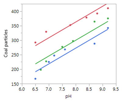
I found an image of what it would look like in JMP in the cleansing example in the help on regression. See how the fit lines for each data set all have the same slope. However,
I can't find any way to get the actual equations of the lines from this analysis and it doesn't explicitly say the slope chosen minimizes the error over all three sets of data. If I had that then this would serve and is quite easy to obtain.
- Mark as New
- Bookmark
- Subscribe
- Mute
- Subscribe to RSS Feed
- Get Direct Link
- Report Inappropriate Content
Re: Plotting Multiple linear regression line on one graph
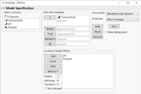
I think what you really want to do is create a more complicated model that will allow you to see this plot. I will use the Cleansing data, to illustrate.
Choose Fit Model.
Specify Coal particles as the Y.
Select pH and Polymer and click Add.
Click Run.
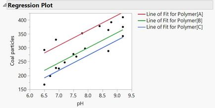
The first graph you see is the picture that you want.
As for the slope of the lines, you can get that from the Parameter Estimates, but I think it is easier to see by going to the red triangle by Response Coal particles and select Estimates > Show prediction expression.
The common slope is 54.294. The estimates for each Polymer are the adjustment that needs to be made to the overall intercept.
Oh, and this is one model, so it minimizes the error across all three polymers and the pH.
- Mark as New
- Bookmark
- Subscribe
- Mute
- Subscribe to RSS Feed
- Get Direct Link
- Report Inappropriate Content
Re: Plotting Multiple linear regression line on one graph
Thank you. The model you suggest is the one in the example and I saw the parameter estimates at the bottom of the example but it didn't make sense to me because I'm used to an output where the third parameter (polymer in the example) labels the dataset but is not used as offset. So, I think what you are saying is, by adding the estimate for each polymer to the intercept estimate, I will get the explicit intercepts I am used to seeing. Thus polymer A has an intercept of -122.84 + 50.94 = -71.90 and polymer C has an intercept of -122.84 + 0 = -122.84.
Luckily I can quickly check this with my own data and compare the result to that from Matlab. It will be so much more convenient to do it all in one tool! A sentence or two explaining this in the help example might benefit a lot of users. Thanks again.
Recommended Articles
- © 2026 JMP Statistical Discovery LLC. All Rights Reserved.
- Terms of Use
- Privacy Statement
- Contact Us


