- New to JMP? Let the Data Analysis Director guide you through selecting an analysis task, an analysis goal, and a data type. Available now in the JMP Marketplace!
- See how to install JMP Marketplace extensions to customize and enhance JMP.
- Subscribe to RSS Feed
- Mark Topic as New
- Mark Topic as Read
- Float this Topic for Current User
- Bookmark
- Subscribe
- Mute
- Printer Friendly Page
Discussions
Solve problems, and share tips and tricks with other JMP users.- JMP User Community
- :
- Discussions
- :
- Plot time dependent nominal character data with graph builder
- Mark as New
- Bookmark
- Subscribe
- Mute
- Subscribe to RSS Feed
- Get Direct Link
- Report Inappropriate Content
Plot time dependent nominal character data with graph builder
Initial conditions:
- Using JMP 16.0
- Scripting suggestions are ok
- I have tried things with Graph Builder, but I have nothing worth showing...
My question:
I have time-dependent character data (I can make its modeling type "ordinal") that I am trying to visualize with Graph Builder without modifying it's data type. As an example: I monitor the state of some equipment in my lab, and it reports that it is found in one of three states (Idle, Faulted, Running) while it is in use as time goes on. Can Graph Builder be made to "plot" these three states without me having to give each state a numerical value...?
BTW @jthi, thanks for your 10-point suggestions on how to get helpful answers :)
Accepted Solutions
- Mark as New
- Bookmark
- Subscribe
- Mute
- Subscribe to RSS Feed
- Get Direct Link
- Report Inappropriate Content
Re: Plot time dependent nominal character with graph builder
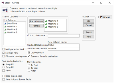
The problem is the structure of the data. You want to plot a variable called "Machine" that is not in the table. Stack your three machine columns so that you have a variable identifying the machines
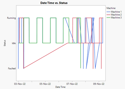
(completed data table attached). I put the data into a column called "Status". Now drag status to the Y-axis. Time goes to the X-axis. Choose the line plot and click on the "Row Order" checkbox. Now drag Machine to the Overlay field. The results of your example file are below.
This has another advantage of allowing you put the Machine into a Local Data Filter role rather than the Overlay. You can then select each machine to see them individually on the plot or use the Shift key to put multiple machines on the graph. This was easier for me to see since there is so much overlap on the three machines.
- Mark as New
- Bookmark
- Subscribe
- Mute
- Subscribe to RSS Feed
- Get Direct Link
- Report Inappropriate Content
Re: Plot time dependent nominal character with graph builder
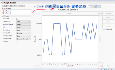
If I'm understanding you correctly, the Line tool in Graph builder will connect categorical items to make a plot. Example below:
- Mark as New
- Bookmark
- Subscribe
- Mute
- Subscribe to RSS Feed
- Get Direct Link
- Report Inappropriate Content
Re: Plot time dependent nominal character with graph builder
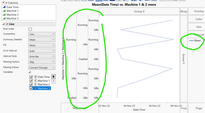
This looks great as a start... thank you very much! I am, however, having problems when adding multiple columns of these types on the same graph. The axes do not merge, even though the axis values are the same for all data points. Also, the plotted line seems to be a statistical quantity of the three columns I'm using in the graph.
This is what I'm getting:
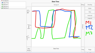
This is what I would like to see as a plot (example below doesn't necessarily match my dummy data):
I've included dummy data to aid in this discussion. Any help would be greatly appreciated.
- Mark as New
- Bookmark
- Subscribe
- Mute
- Subscribe to RSS Feed
- Get Direct Link
- Report Inappropriate Content
Re: Plot time dependent nominal character with graph builder
The problem is the structure of the data. You want to plot a variable called "Machine" that is not in the table. Stack your three machine columns so that you have a variable identifying the machines
(completed data table attached). I put the data into a column called "Status". Now drag status to the Y-axis. Time goes to the X-axis. Choose the line plot and click on the "Row Order" checkbox. Now drag Machine to the Overlay field. The results of your example file are below.
This has another advantage of allowing you put the Machine into a Local Data Filter role rather than the Overlay. You can then select each machine to see them individually on the plot or use the Shift key to put multiple machines on the graph. This was easier for me to see since there is so much overlap on the three machines.
- Mark as New
- Bookmark
- Subscribe
- Mute
- Subscribe to RSS Feed
- Get Direct Link
- Report Inappropriate Content
Re: Plot time dependent nominal character with graph builder
As I looked at my picture I did notice a few issues with your dummy data which could be real artifacts in your data.
I noticed that the plot for machine 1 "went backwards" on the x-axis. That is because of the change of daylight savings time as the 1:00 am hour on November 6 is repeated. It does not obviously affect Machine 3 because it was always idle at that time and Machine 2 had missing data there.
I also noticed that in the data on row 522,001 you have an issue. On row 522000, the date/time is 8-NOV-22, 23:59:59. Row 522001 is 9-NOV-22 00:00:00. And Row 522002 is 08-NOV-22-00:00:00. Something there cannot be right.
You will need to watch for issues like this when plotting data over time.
- Mark as New
- Bookmark
- Subscribe
- Mute
- Subscribe to RSS Feed
- Get Direct Link
- Report Inappropriate Content
Re: Plot time dependent nominal character with graph builder
Thanks for pointing out the problems the data has with time... but that wasn't too important for me compared to the plotting issue.
Plotting character type data takes a different way of thinking, it seems, compared to numerical data... that's interesting. I wouldn't have wanted to modify my data in the way you suggested, but it does solve my original question. Thank you for your help!
- Mark as New
- Bookmark
- Subscribe
- Mute
- Subscribe to RSS Feed
- Get Direct Link
- Report Inappropriate Content
Re: Plot time dependent nominal character with graph builder
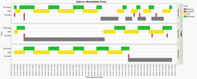
You could try the Heatmap plot mode with machine state as color.
But unfortunately, it's not possible to lock the "binning" - with every change of the x-axis the time interval will bounce back to something way too big :(
On the other hand perhaps not too bad - as it makes the faulted periods easier to detect :)
- Mark as New
- Bookmark
- Subscribe
- Mute
- Subscribe to RSS Feed
- Get Direct Link
- Report Inappropriate Content
Re: Plot time dependent nominal character with graph builder
What an interesting way to see the data... thank you very much for pointing this out! I'm going to try it. I am also interested in witnessing the "binning" problem you detected... Again, thank you for your suggestion!
- Mark as New
- Bookmark
- Subscribe
- Mute
- Subscribe to RSS Feed
- Get Direct Link
- Report Inappropriate Content
Re: Plot time dependent nominal character with graph builder
Concerning the feature/bug with axis rescale:
After running the below code, you will get this plot:
If you want to get rid of the empty area on the right and drag the end of the x axis slightly too far or if you just zoom in to the data),
the graph will flip to this one:
dt = Open( "$DOWNLOADS/Dummy data.jmp" );

stacked = dt << Stack(
	columns( :Machine 1, :Machine 2, :Machine 3 ),
	Source Label Column( "Label" ),
	Stacked Data Column( "Data" )
);

stacked  << Graph Builder(
	Size( 1175, 386 ),
	Show Control Panel( 0 ),
	Summary Statistic( "Median" ),
	Graph Spacing( 4 ),
	Variables( X( :Date Time ), Y( :Data ), Group Y( :Label ), Color( :Data ) ),
	Elements( Heatmap( X, Y, Legend( 5 ) ) ),
	SendToReport(
		Dispatch(
			{},
			"Date Time",
			ScaleBox,
			{Interval( "Hour" ),
			Inc( 1 ), Minor Ticks( 3 )}
		)
	)
);Recommended Articles
- © 2026 JMP Statistical Discovery LLC. All Rights Reserved.
- Terms of Use
- Privacy Statement
- Contact Us

