- New to JMP? Let the Data Analysis Director guide you through selecting an analysis task, an analysis goal, and a data type. Available now in the JMP Marketplace!
- See how to install JMP Marketplace extensions to customize and enhance JMP.
- Subscribe to RSS Feed
- Mark Topic as New
- Mark Topic as Read
- Float this Topic for Current User
- Bookmark
- Subscribe
- Mute
- Printer Friendly Page
Discussions
Solve problems, and share tips and tricks with other JMP users.- JMP User Community
- :
- Discussions
- :
- Re: Plot graph with existing standard deviation
- Mark as New
- Bookmark
- Subscribe
- Mute
- Subscribe to RSS Feed
- Get Direct Link
- Report Inappropriate Content
Plot graph with existing standard deviation
How do I plot the graph with existing standard deviation data table?
For example:
Sample Mean Standard deviation
1 70000 25800
2 45000 19100
3 65000 41200
Thank you!
Accepted Solutions
- Mark as New
- Bookmark
- Subscribe
- Mute
- Subscribe to RSS Feed
- Get Direct Link
- Report Inappropriate Content
Re: Plot graph with existing standard deviation
There are a couple of items that I had to do to make your data work.
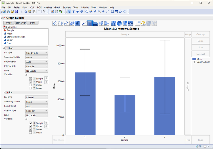
First, in the Columns selection area, I added in 2 new virtual columns, Upper and Lower. They were created to give the upper and lower values for the Mean+- Standard deviation.
Second, after dragging Mean, Upper and Lower to the Y drop area, I changed the points to a bar. Since I only wanted the bar to represent the Mean value, I changed the Variables property and unselected Upper and Lower
Third, I added a second Bar to the graph. I again when to the properties area, and changed the Bar Style to Interval, and since I only wanted Upper and Lower to be included in the Interval Bar, I unselected Mean
Here is the JSL to recreate the graph
Graph Builder(
	Transform Column( "Lower", Formula( :Mean - :Standard deviation ) ),
	Transform Column( "Upper", Formula( :Mean + :Standard deviation ) ),
	Size( 744, 627 ),
	Variables(
		X( :Sample ),
		Y( :Mean ),
		Y( :Upper, Position( 1 ) ),
		Y( :Lower, Position( 1 ) )
	),
	Elements(
		Bar( X, Y( 1 ), Legend( 4 ) ),
		Bar( X, Y( 2 ), Y( 3 ), Legend( 6 ), Bar Style( "Interval" ) )
	),
	SendToReport(
		Dispatch( {"Bar"}, "", OutlineBox, {Close( 0 )} ),
		Dispatch( {"Bar"[2]}, "", OutlineBox, {Close( 0 )} ),
		Dispatch( {}, "Y title", TextEditBox, {Set Text( "Mean" )} )
	)
)
Note: It would be much simpler to use the raw data to create the chart you want. JMP would generate the mean, upper and lower values for you.
- Mark as New
- Bookmark
- Subscribe
- Mute
- Subscribe to RSS Feed
- Get Direct Link
- Report Inappropriate Content
Re: Plot graph with existing standard deviation
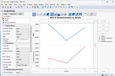
Here is one way to do this:
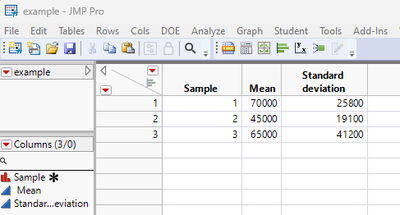
Give the data table
You can graph it:
Names Default To Here( 1 );

New Table( "example",
	Add Rows( 3 ),
	New Column( "Sample",
		Numeric,
		"Nominal",
		Format( "Best", 12 ),
		Set Property( "Value Order", {Numerical Order( 0 )} ),
		Set Selected,
		Set Values( [1, 2, 3] ),
		Set Display Width( 97 )
	),
	New Column( " Mean", Numeric, "Continuous", Format( "Best", 12 ), Set Values( [70000, 45000, 65000] ) ),
	New Column( "Standard deviation", Numeric, "Continuous", Format( "Best", 12 ), Set Values( [25800, 19100, 41200] ) )
);

Graph Builder(
	Variables( X( :Sample ), Y( :" Mean"n ), Y( :Standard deviation ) ),
	Elements(
		Position( 1, 1 ),
		Points( X, Y, Legend( 5 ) ),
		Line( X, Y, Legend( 7 ) )
	),
	Elements(
		Position( 1, 2 ),
		Points( X, Y, Legend( 6 ) ),
		Line( X, Y, Legend( 8 ) )
	),
	SendToReport(
		Dispatch(
			{},
			"400",
			ScaleBox,
			{Legend Model( 5, Base( 0, 0, 0, Item ID( " Mean", 1 ) ) ),
			Legend Model( 6, Base( 0, 0, 0, Item ID( "Standard deviation", 1 ) ) )}
		),
		Dispatch(
			{},
			"400",
			LegendBox,
			{Legend Position( {5, [0], 7, [2], 6, [1], 8, [3]} )}
		)
	)
)
Do you have a graphical format that is different than what I demonstrated? If so, please provide it, and the Community will jump in to help you with that.
Note: The creation of the data table and the graph was first done interactively, and then upon completion, I requested to JMP to provide me with the script.
Note 2: I suggest you take the time to read the document intitled: Discovering JMP available under the Help pull down menu.
- Mark as New
- Bookmark
- Subscribe
- Mute
- Subscribe to RSS Feed
- Get Direct Link
- Report Inappropriate Content
Re: Plot graph with existing standard deviation
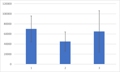
Anyway to graph it similar to below:
Thank you!
- Mark as New
- Bookmark
- Subscribe
- Mute
- Subscribe to RSS Feed
- Get Direct Link
- Report Inappropriate Content
Re: Plot graph with existing standard deviation
There are a couple of items that I had to do to make your data work.
First, in the Columns selection area, I added in 2 new virtual columns, Upper and Lower. They were created to give the upper and lower values for the Mean+- Standard deviation.
Second, after dragging Mean, Upper and Lower to the Y drop area, I changed the points to a bar. Since I only wanted the bar to represent the Mean value, I changed the Variables property and unselected Upper and Lower
Third, I added a second Bar to the graph. I again when to the properties area, and changed the Bar Style to Interval, and since I only wanted Upper and Lower to be included in the Interval Bar, I unselected Mean
Here is the JSL to recreate the graph
Graph Builder(
	Transform Column( "Lower", Formula( :Mean - :Standard deviation ) ),
	Transform Column( "Upper", Formula( :Mean + :Standard deviation ) ),
	Size( 744, 627 ),
	Variables(
		X( :Sample ),
		Y( :Mean ),
		Y( :Upper, Position( 1 ) ),
		Y( :Lower, Position( 1 ) )
	),
	Elements(
		Bar( X, Y( 1 ), Legend( 4 ) ),
		Bar( X, Y( 2 ), Y( 3 ), Legend( 6 ), Bar Style( "Interval" ) )
	),
	SendToReport(
		Dispatch( {"Bar"}, "", OutlineBox, {Close( 0 )} ),
		Dispatch( {"Bar"[2]}, "", OutlineBox, {Close( 0 )} ),
		Dispatch( {}, "Y title", TextEditBox, {Set Text( "Mean" )} )
	)
)
Note: It would be much simpler to use the raw data to create the chart you want. JMP would generate the mean, upper and lower values for you.
Recommended Articles
- © 2026 JMP Statistical Discovery LLC. All Rights Reserved.
- Terms of Use
- Privacy Statement
- Contact Us


