- Subscribe to RSS Feed
- Mark Topic as New
- Mark Topic as Read
- Float this Topic for Current User
- Bookmark
- Subscribe
- Mute
- Printer Friendly Page
Discussions
Solve problems, and share tips and tricks with other JMP users.- JMP User Community
- :
- Discussions
- :
- Re: Pie of Pie chart
- Mark as New
- Bookmark
- Subscribe
- Mute
- Subscribe to RSS Feed
- Get Direct Link
- Report Inappropriate Content
Pie of Pie chart
Hi,
is there a way to generate a pie chart (pie or bar of pie chart) like the following one?
https://www.officetooltips.com/excel_2016/tips/creating_pie_of_pie_and_bar_of_pie_charts.html
Thanks
Accepted Solutions
- Mark as New
- Bookmark
- Subscribe
- Mute
- Subscribe to RSS Feed
- Get Direct Link
- Report Inappropriate Content
Re: Pie of Pie chart
I don't think that these composite plots are built-in to JMP, but you can create something similar by combining reports. It might be helpful to create an ID column to designate which rows should be combined together. For the effect of pie-in-pie, this could mean copying your category column and changing some of them to "Other", or it could be more general if there are other meaningful groups.
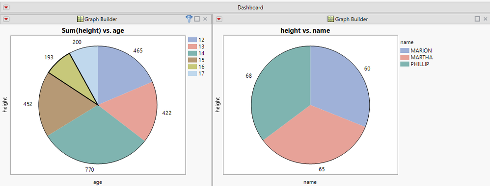
Once you create two graphs (one using the ID column, one using the full category columns), you can use Combine Windows to merge them together, and choose the ID column as a Selection Filter. Below is what I get using age as the grouping column with the Big Class sample data. With 16-year-olds selected on the left, the individual 16's are shown on the right.
One advantage of using selection filters is that the behavior is dynamic - you can select any category on the left and the plot on the right will update. You can also select multiple categories, so if you want to see 12- and 13-year-olds in one plot, you can select them both. You are also not limited to Pies and Bars - you can use any JMP reports that work for your data.
There are more selection filter examples in Using Selection Filters in JMP 12 . This article uses Application Builder to create the report, but starting in JMP 13 the functionality is built directly into Combine Windows.
- Mark as New
- Bookmark
- Subscribe
- Mute
- Subscribe to RSS Feed
- Get Direct Link
- Report Inappropriate Content
Re: Pie of Pie chart
- Mark as New
- Bookmark
- Subscribe
- Mute
- Subscribe to RSS Feed
- Get Direct Link
- Report Inappropriate Content
Re: Pie of Pie chart
Question: how did you get the thicker line around the one segment (to highlight)?
- Mark as New
- Bookmark
- Subscribe
- Mute
- Subscribe to RSS Feed
- Get Direct Link
- Report Inappropriate Content
Re: Pie of Pie chart
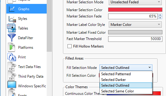
The pie segment is outlined based on the preference for how to draw selected areas:
I have attached PieFilter.jmpapp if you would like to try it out. The app is configured to automatically run on $SAMPLE_DATA/Big Class.jmp.
- Mark as New
- Bookmark
- Subscribe
- Mute
- Subscribe to RSS Feed
- Get Direct Link
- Report Inappropriate Content
Re: Pie of Pie chart
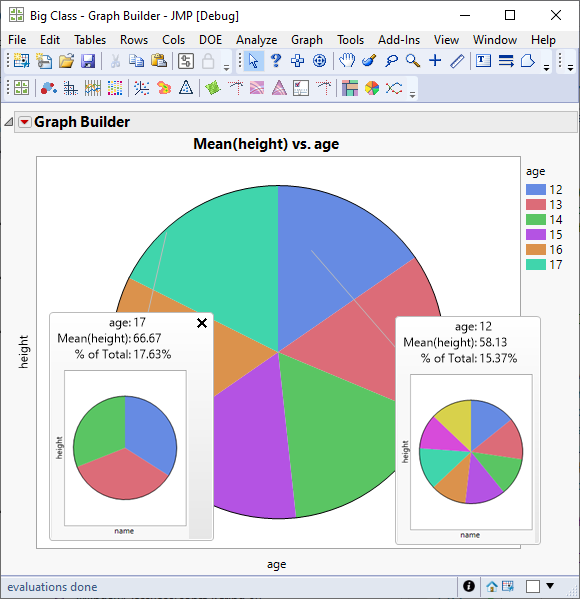
Since JMP 15.0, you can accomplish the same task using Graphlets and their pre-configured presets.
By pinning the hover labels with pie charts for different slices, you can also compare the result of different paths of your drill-down analysis (and you can launch these pie charts as new graphs for an even better comparison).
The screenshot below shows an example:
Recommended Articles
- © 2026 JMP Statistical Discovery LLC. All Rights Reserved.
- Terms of Use
- Privacy Statement
- Contact Us


