- New to JMP? Let the Data Analysis Director guide you through selecting an analysis task, an analysis goal, and a data type. Available now in the JMP Marketplace!
- See how to install JMP Marketplace extensions to customize and enhance JMP.
- Subscribe to RSS Feed
- Mark Topic as New
- Mark Topic as Read
- Float this Topic for Current User
- Bookmark
- Subscribe
- Mute
- Printer Friendly Page
Discussions
Solve problems, and share tips and tricks with other JMP users.- JMP User Community
- :
- Discussions
- :
- Percentual plot

- Mark as New
- Bookmark
- Subscribe
- Mute
- Subscribe to RSS Feed
- Get Direct Link
- Report Inappropriate Content
Percentual plot
Hello everybody,
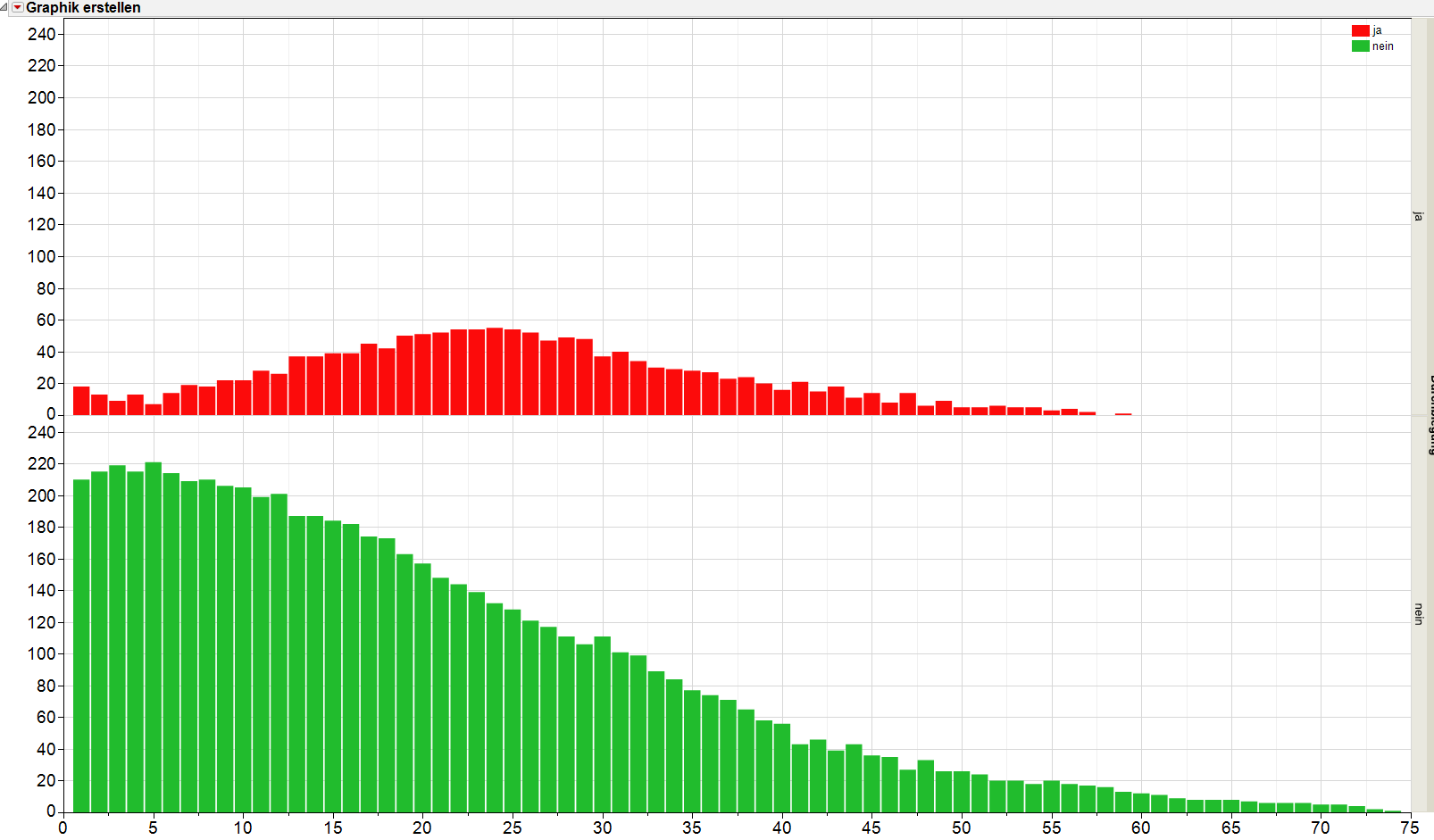
I plotted some data and divided the plot into two parts. One for "good" and one for "bad" - green and red columns.
Is there a possibility to add a third part in the plot which displays the percentual "bad" values for the total values of the x-axis? See Images attached.
Thank you.
Accepted Solutions

- Mark as New
- Bookmark
- Subscribe
- Mute
- Subscribe to RSS Feed
- Get Direct Link
- Report Inappropriate Content
Re: Percentual plot
You can do what you want, but you will need to change your data a little. You need to split your data into ji and nein columns
Tables=>Split
and then bring up Graph Builder. In the Graph Builder, right click on the new ji or nein column and create a new transform formula column. Use the following formula to create the percent values for the transform column
( ji + nein ) / neinThen in the Graph Builder window drag in your X column. Then drag in the nein column to the Y axis. Next drag in the ji column to the bottom of the Y axis, adding it in as a separate graph, and finally, drag in the percent column to the bottom of the Y axis. You can adjust each of the Y axes as you want.
Below is a simple example using the supplied Big Class sample data table.

and the JSL to produce the graph
Graph Builder(
	Size( 534, 450 ),
	Show Control Panel( 0 ),
	Variables(
		X( :age ),
		Y( :height ),
		Y( :weight ),
		Y(
			Transform Column(
				"Percent",
				Formula( ((:weight + :height) / :weight) * 1 )
			)
		)
	),
	Elements( Position( 1, 1 ), Bar( X, Y, Legend( 35 ) ) ),
	Elements( Position( 1, 2 ), Bar( X, Y, Legend( 34 ) ) ),
	Elements( Position( 1, 3 ), Bar( X, Y, Legend( 33 ) ) ),
	SendToReport(
		Dispatch(
			{},
			"height",
			ScaleBox,
			{Min( 0 ), Max( 125 ), Inc( 20 ), Minor Ticks( 0 )}
		),
		Dispatch(
			{},
			"Percent",
			ScaleBox,
			{Format( "Percent", 9, 1 ), Min( 0 ), Max( 4 ), Inc( 0.5 ),
			Minor Ticks( 1 )}
		),
		Dispatch(
			{},
			"400",
			ScaleBox,
			{Legend Model(
				35,
				Properties( 0, {Fill Color( 19 )}, Item ID( "Mean(height)", 1 ) )
			), Legend Model(
				34,
				Properties( 0, {Fill Color( 20 )}, Item ID( "Mean(weight)", 1 ) )
			), Legend Model(
				33,
				Properties( 0, {Fill Color( 9 )}, Item ID( "Mean(Percent)", 1 ) )
			)}
		),
		Dispatch(
			{},
			"400",
			LegendBox,
			{Legend Position( {35, [2], 34, [1], 33, [0]} ), Position( {2, 1, 0} )}
		)
	)
)- Mark as New
- Bookmark
- Subscribe
- Mute
- Subscribe to RSS Feed
- Get Direct Link
- Report Inappropriate Content
Re: Percentual plot
You can do what you want, but you will need to change your data a little. You need to split your data into ji and nein columns
Tables=>Split
and then bring up Graph Builder. In the Graph Builder, right click on the new ji or nein column and create a new transform formula column. Use the following formula to create the percent values for the transform column
( ji + nein ) / neinThen in the Graph Builder window drag in your X column. Then drag in the nein column to the Y axis. Next drag in the ji column to the bottom of the Y axis, adding it in as a separate graph, and finally, drag in the percent column to the bottom of the Y axis. You can adjust each of the Y axes as you want.
Below is a simple example using the supplied Big Class sample data table.
and the JSL to produce the graph
Graph Builder(
	Size( 534, 450 ),
	Show Control Panel( 0 ),
	Variables(
		X( :age ),
		Y( :height ),
		Y( :weight ),
		Y(
			Transform Column(
				"Percent",
				Formula( ((:weight + :height) / :weight) * 1 )
			)
		)
	),
	Elements( Position( 1, 1 ), Bar( X, Y, Legend( 35 ) ) ),
	Elements( Position( 1, 2 ), Bar( X, Y, Legend( 34 ) ) ),
	Elements( Position( 1, 3 ), Bar( X, Y, Legend( 33 ) ) ),
	SendToReport(
		Dispatch(
			{},
			"height",
			ScaleBox,
			{Min( 0 ), Max( 125 ), Inc( 20 ), Minor Ticks( 0 )}
		),
		Dispatch(
			{},
			"Percent",
			ScaleBox,
			{Format( "Percent", 9, 1 ), Min( 0 ), Max( 4 ), Inc( 0.5 ),
			Minor Ticks( 1 )}
		),
		Dispatch(
			{},
			"400",
			ScaleBox,
			{Legend Model(
				35,
				Properties( 0, {Fill Color( 19 )}, Item ID( "Mean(height)", 1 ) )
			), Legend Model(
				34,
				Properties( 0, {Fill Color( 20 )}, Item ID( "Mean(weight)", 1 ) )
			), Legend Model(
				33,
				Properties( 0, {Fill Color( 9 )}, Item ID( "Mean(Percent)", 1 ) )
			)}
		),
		Dispatch(
			{},
			"400",
			LegendBox,
			{Legend Position( {35, [2], 34, [1], 33, [0]} ), Position( {2, 1, 0} )}
		)
	)
)Recommended Articles
- © 2026 JMP Statistical Discovery LLC. All Rights Reserved.
- Terms of Use
- Privacy Statement
- Contact Us