- New to JMP? Let the Data Analysis Director guide you through selecting an analysis task, an analysis goal, and a data type. Available now in the JMP Marketplace!
- See how to install JMP Marketplace extensions to customize and enhance JMP.
- Subscribe to RSS Feed
- Mark Topic as New
- Mark Topic as Read
- Float this Topic for Current User
- Bookmark
- Subscribe
- Mute
- Printer Friendly Page
Discussions
Solve problems, and share tips and tricks with other JMP users.- JMP User Community
- :
- Discussions
- :
- Re: Pareto Plot Per Unit Rates error message
- Mark as New
- Bookmark
- Subscribe
- Mute
- Subscribe to RSS Feed
- Get Direct Link
- Report Inappropriate Content
Pareto Plot Per Unit Rates error message
I am trying to use the Pareto Plot Platform to perform per unit analysis.
I've tried to set up my data in the same structure as what I find in the example: Help > Sample Data Folder and open Quality Control/Failuressize.jmp
I've followed the example instructions in "Example of a Non-Constant Sample Size across Groups" I'm successfully using the sample data and get results as expected.
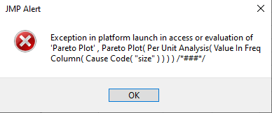
When I try this same setup and method using my own data I'm not successful and receive an error message
I'm using JMP17.
What does the error message describe? I've checked the column properties of the JMP example data and my own data have the same column properties. Please advise.
- Tags:
- windows
Accepted Solutions
- Mark as New
- Bookmark
- Subscribe
- Mute
- Subscribe to RSS Feed
- Get Direct Link
- Report Inappropriate Content
Re: Pareto Plot Per Unit Rates error message
Hi All,
Thank you all for your suggestions. I appreciate you taking the time to read this and try to help.
Here is the solution I came up with today after playing more with the data.
In my "Y, Cause" column, labeled "Type" in my data table, one of the defects was "Stain". I replaced "Stain" with a different word and then the Analyze > Quality and Process > Pareto Plot, Per Unit Analysis, runs just fine. I don't know why, but it appears that it didn't like the text "Stain".
I didn't change anything else in my data table. I'm puzzled as to why this fixed the error problem I was having.
If anyone can explain why this is happening to me I'd appreciate it, because we do have an actual visual inspection defect called "Stain", so we do have factory data we would like to continue to analyze.
- Mark as New
- Bookmark
- Subscribe
- Mute
- Subscribe to RSS Feed
- Get Direct Link
- Report Inappropriate Content
Re: Pareto Plot Per Unit Rates error message
It would be really helpful if you attached the data set you are getting the error from. Without that, I would only be able to guess. Perhaps you have causes with no data? Or your data type is wrong? I'm sure some of our community experts on JSL will have a more definitive answer.
- Mark as New
- Bookmark
- Subscribe
- Mute
- Subscribe to RSS Feed
- Get Direct Link
- Report Inappropriate Content
Re: Pareto Plot Per Unit Rates error message
Here is a portion of the file I'm having the error message with.
Thank you in advance for the help
- Mark as New
- Bookmark
- Subscribe
- Mute
- Subscribe to RSS Feed
- Get Direct Link
- Report Inappropriate Content
Re: Pareto Plot Per Unit Rates error message
Sorry, I'm not sure what the Cause and Grouping are, but I've attached 2 Pareto plot scripts to your data table. Ran with o errors?
- Mark as New
- Bookmark
- Subscribe
- Mute
- Subscribe to RSS Feed
- Get Direct Link
- Report Inappropriate Content
Re: Pareto Plot Per Unit Rates error message
Hello statman, thank you for taking the time to investigate.
The scripts you provided do not solve the problem I'm having.
The example in the JMP Help describes what I am trying to accomplish.
I've followed the example instructions in "Example of a Non-Constant Sample Size across Groups"
I'm trying to statistically compare the defect rates between the two different designs. The example in JMP Help outlines the steps to take to identify the row in the data table with the sample size for each group. The JMP Help example works well, but when I try the same steps to my file I get the error message.
- Mark as New
- Bookmark
- Subscribe
- Mute
- Subscribe to RSS Feed
- Get Direct Link
- Report Inappropriate Content
Re: Pareto Plot Per Unit Rates error message
Sorry, I don't have the data set that is referred to in the link you provided. Here are some notes though. I see there are steps outlined in the link:
2.Select Analyze > Quality and Process > Pareto Plot.
3.Select Causes and click Y, Cause.
4.Select Process and click X, Grouping.
5.Select Count and click Freq.
6.Select Per Unit Analysis and then select Value in Freq Column.
7.Enter size in Cause Code.
8.Click OK.
9.Click the Pareto Plot red triangle and select Per Unit Rates.
10.Click the Pareto Plot red triangle and select Test Rates Across Groups.
Your data set does not have any of those column labels. I do not see a column called Cause or Process in your attached data table? You have no column labeled Count, so it is impossible to complete the steps as outlined above. I see 3 different identifiers in your Group column (original, design1a and design2a), so what you actually want is confusing to me. I believe you need to "fix" your data table to complete the steps outlined.
Further notes, the sample data shows where data was collected over some time period.
I made a quick attempt and re-attached data table, but I believe your issue is with the data table. Your data table has every little data (defects) in it. On top of that when comparing design1a to design2a, while 2a has less total defects, the type of defects are different. Also, those defects do not appear to be causes, but symptoms...
- Mark as New
- Bookmark
- Subscribe
- Mute
- Subscribe to RSS Feed
- Get Direct Link
- Report Inappropriate Content
Re: Pareto Plot Per Unit Rates error message
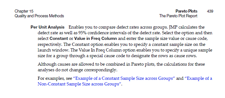
Hi @ted_ellefson Please note in the sample data table there are rows having a "size" value in the Causes column. This allows you to define a unique sample size for the groups. Your data table does not have a "size" value to indicate this sample size per group for the computations. Perhaps the JMP documentation can help shed some light on the subject:
Hope that helps!
- Mark as New
- Bookmark
- Subscribe
- Mute
- Subscribe to RSS Feed
- Get Direct Link
- Report Inappropriate Content
Re: Pareto Plot Per Unit Rates error message
Hi All,
Thank you all for your suggestions. I appreciate you taking the time to read this and try to help.
Here is the solution I came up with today after playing more with the data.
In my "Y, Cause" column, labeled "Type" in my data table, one of the defects was "Stain". I replaced "Stain" with a different word and then the Analyze > Quality and Process > Pareto Plot, Per Unit Analysis, runs just fine. I don't know why, but it appears that it didn't like the text "Stain".
I didn't change anything else in my data table. I'm puzzled as to why this fixed the error problem I was having.
If anyone can explain why this is happening to me I'd appreciate it, because we do have an actual visual inspection defect called "Stain", so we do have factory data we would like to continue to analyze.
Recommended Articles
- © 2026 JMP Statistical Discovery LLC. All Rights Reserved.
- Terms of Use
- Privacy Statement
- Contact Us


