- New to JMP? Let the Data Analysis Director guide you through selecting an analysis task, an analysis goal, and a data type. Available now in the JMP Marketplace!
- See how to install JMP Marketplace extensions to customize and enhance JMP.
- Subscribe to RSS Feed
- Mark Topic as New
- Mark Topic as Read
- Float this Topic for Current User
- Bookmark
- Subscribe
- Mute
- Printer Friendly Page
Discussions
Solve problems, and share tips and tricks with other JMP users.- JMP User Community
- :
- Discussions
- :
- Re: Non Normal Control Chart for SHASH distributed data
- Mark as New
- Bookmark
- Subscribe
- Mute
- Subscribe to RSS Feed
- Get Direct Link
- Report Inappropriate Content
Non Normal Control Chart for SHASH distributed data
Hello,
I would like to revisit the discussion on non-normal control charts, which has already been addressed here.
https://community.jmp.com/t5/Discussions/Control-Chart-builder-Non-Normal-data-Control-Limits/m-p/22...
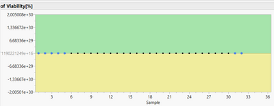
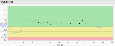
I also have a non-normally distributed data set (see attachment) for which only the SHASH distribution comes into question due to the extreme "skewness". All other distributions are rejected due to a significant goodness of fit test. However, using the Non-normal Control Chart script by Paul Deen (see link above, very helpful script by the way!) and selecting the SHASH distribution, a very questionable graph is displayed (zones too large for sigma boundaries), which is certainly due to the extreme skewness of the data (if you want to recap, my LSL is 0.9, my goal is to maximize)
If, on the other hand, I select a Weilbull distribution, the ControlChart looks much better.
Corresponding tests (Western Electric Rules) can then also be applied more reliably. My question now is whether it is acceptable to assume a different distribution for the creation of the control chart, although this is actually rejected via the goodness of fit test? I have also heard that a SHASH distribution in particular is not appropriate for process analyses (capability, control charts).
On the subject of data transformation: I have also tried to normalise the data using box-cox transformation (using the script from Mark Bailey, https://community.jmp.com/t5/JMP-Scripts/Demonstrate-the-Univariate-Box-Cox-Transform/ta-p/21820), but with little success. The data are simply too " skewed ". In addition I also found that transforming data is not that recommended as you loose certain information (see also https://www.spcforexcel.com/knowledge/variable-control-charts/control-charts-and-non-normal-data)
Do you have an opinion on this?
I would be very happy for any feedback!
Best regards
Johann
Accepted Solutions
- Mark as New
- Bookmark
- Subscribe
- Mute
- Subscribe to RSS Feed
- Get Direct Link
- Report Inappropriate Content
Re: Non Normal Control Chart for SHASH distributed data
Let me start by stating I don't know how you are using control charts or for what purpose. If you are using them as Shewhart intended or in some other fashion.
There is no assumption of normally distributed data to USE control charts effectively. I will suggest you read the following:
1. A quick discussion of Myths regarding control charts (process behavior charts as Wheeler calls them): See Myth 1
https://www.qualitydigest.com/print/18348
2. An excellent paper with discussion:
Woodall, William H. (2000), "Controversies and Contradictions in Statistical Process Control", Journal of Quality Technology, Vol. 32, No.4 October 2000
With respect to your data, you do not actually have a continuous variable being plotted? It looks like you are plotting something like a percent defective or percent defects. These data types are typically plotted on p/np-charts or u/c-charts.
I would ask what do the values actually mean? How is the value calculated? Percent of what? How is 100% determined? Is there another measure that could be used to assess viability?
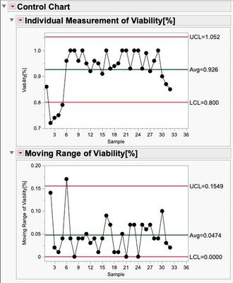
There are times when this type of data can be evaluated with a simple X,MR chart:
- Mark as New
- Bookmark
- Subscribe
- Mute
- Subscribe to RSS Feed
- Get Direct Link
- Report Inappropriate Content
Re: Non Normal Control Chart for SHASH distributed data
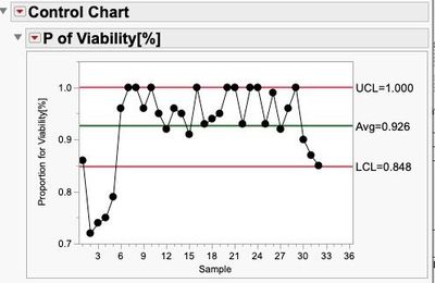
I highly dislike transforming variables as the operators that needs to execute the process control will not be working with units that relate to their process anymore. It is fine from a conceptual mathematical approach...it is bad from a process control system approach. Having said that: you seem to be looking at a proportion and you should explore the p-chart first.
If that does not work for you, then the way to select a distribution is by using the distribution platform. Hit the fit all option, skip all Johnson and SHASH curves as they are rather long-tailed and then just select the next highest one. If that is Weibull then that is the best you have so don't bother looking at goodness of fit anymore.
- Mark as New
- Bookmark
- Subscribe
- Mute
- Subscribe to RSS Feed
- Get Direct Link
- Report Inappropriate Content
Re: Non Normal Control Chart for SHASH distributed data
Let me start by stating I don't know how you are using control charts or for what purpose. If you are using them as Shewhart intended or in some other fashion.
There is no assumption of normally distributed data to USE control charts effectively. I will suggest you read the following:
1. A quick discussion of Myths regarding control charts (process behavior charts as Wheeler calls them): See Myth 1
https://www.qualitydigest.com/print/18348
2. An excellent paper with discussion:
Woodall, William H. (2000), "Controversies and Contradictions in Statistical Process Control", Journal of Quality Technology, Vol. 32, No.4 October 2000
With respect to your data, you do not actually have a continuous variable being plotted? It looks like you are plotting something like a percent defective or percent defects. These data types are typically plotted on p/np-charts or u/c-charts.
I would ask what do the values actually mean? How is the value calculated? Percent of what? How is 100% determined? Is there another measure that could be used to assess viability?
There are times when this type of data can be evaluated with a simple X,MR chart:
- Mark as New
- Bookmark
- Subscribe
- Mute
- Subscribe to RSS Feed
- Get Direct Link
- Report Inappropriate Content
Re: Non Normal Control Chart for SHASH distributed data
First of all, I would like to thank you for all the helpful comments!
@Mark_Bailey : The widening of the lambda scaling via right-click was not familiar to me until now, thank you for this tip!
Regarding the data and my intention, and at this point apologies for not making this clear right at the beginning. The data is about the percentage determination of viable cells within a cultivation process. The determination is made here by quantifying the live cell count and the total cell count (living and dead cells), from which the percentage viability can be determined in the end. This parameter is crucial, as it is decided whether the process can be continued or not depending on the vitality (LSL 90 %). The measurements are individual determinations per batch (one batch, one viability determination, I did not specify the batch number in the sample file), which is why I wanted to use an I-MR chart to check this parameter.
To examine the viability via the control chart, we decided to apply the Western Electric Rules Test 1 (One point is more than 3 standard deviations from the mean), test 2 (Nine (or more) points in a row are on the same side of the mean) and test 5 (Nine (or more) points in a row are on the same side of the mean). The assumption that I need to use non-normal control chart in this investigation finally came from the fact that the data is obviously not normally distributed and one can theoretically also expect that a non-normal distribution is likely, since the parameter operates very close to a natural limit (the cell culture cannot contain more than 100 % viable cells). I was of the assumption that with non-normally distributed data and the application of a "classical" ControlCharts one would receive error messages, which do not actually occur due to special cause variation but are due to the "nature" of the data.
@statman: from your information, however, I understand that the assumption of normal distribution is not mandatory for the application of control charts. unfortunately, I have not yet had a chance to read through all the references, but I will try to do so as soon as possible. In any case, thanks again for this. But if I understand the quality digest source (Myth 1) correctly, Shewart's approach is more about determining outliers and not detecting process shifts?
- Mark as New
- Bookmark
- Subscribe
- Mute
- Subscribe to RSS Feed
- Get Direct Link
- Report Inappropriate Content
Re: Non Normal Control Chart for SHASH distributed data
It is better you read the references I gave (It will be easier than reading Shewhart's book). Shewhart was looking for methods to determine if there was anything assignably different in the process. The control charts he developed accomplish 2 tasks. Ultimately the charts are used to determine causal structure by means of partitioning the potential sources (X's) and comparing their effects. Not through experimentation, but through their natural variation being exposed. The subgroup forms the basis of the comparison. The within subgroup variation is a function of the x's that vary naturally at that "frequency" (Yes, y-f(x)). The selection of the subgroup is an important decision (and is seldom taught).
“The engineer who is successful in dividing his data initially into rational subgroups based on rational theories is therefore inherently better off in the long run”
Shewhart
The time between each subgroup being sampled will capture the natural variation of the x's that change at that sampling frequency.
So the charts answer the question: which sources of variation have greater leverage (the ones changing within or between subgroup) on the response variable(s)? However, Shewhart also realized that in order for such a comparison to be made, first the basis for comparison must be evaluated for consistency. Hence, the range chart which answers the question: is the variation within subgroup consistent, stable, predictable?
So, for example, you have a batch of cells being cultivated (forgive me as I am not specifically familiar with the process). You are using an inspection process to determine live/dead cells. You treat the entire batch as one sample. Is it possible there are areas within the batch that are more conducive to cell growth? Are there temperature gradients within the batch? How homogeneous is the batch? Is the batch agitated? What sources of variation are there within batch? How well distributed is the agar? What is the substrate the cells are attached to? How confident are you in the measurement system regarding living or dead cells? Are there gradations of living cells? Could there be a more precise measurement? The consistency of these variables acting to gather can be evaluated using the range chart. Now, for the next batch (and subsequent batches), what changes? Different lot of agar? Different ambient conditions? Different processing conditions? Different substrate? Raw material changes? Ability to adhere to recipe?...etc. The X-bar chart seeks to compare the multitude of sources to determine which SET of x's (component of variation) has the greatest effect and where should you focus your improvement efforts. Of course, these studies can be done with multiple layers providing greater discrimination.
- Mark as New
- Bookmark
- Subscribe
- Mute
- Subscribe to RSS Feed
- Get Direct Link
- Report Inappropriate Content
Re: Non Normal Control Chart for SHASH distributed data
Is the reason your attempt to use the script I wrote to find a lambda value that linearizes the normal quantile plot is because you can only vary lambda between -2 and +2? If that is the case, then right-click on the slider. You can change the interval for the slider and make it wider.
- Mark as New
- Bookmark
- Subscribe
- Mute
- Subscribe to RSS Feed
- Get Direct Link
- Report Inappropriate Content
Re: Non Normal Control Chart for SHASH distributed data
Not sure what is your purpose for the SPC. Maybe you can use robust method for Individual X control limit? For highly skewed data SPC, normally I would define own UCL using median (for center line - location) + k*IQR (for dispersion/sigma) as control limit.
I've seen published paper using MAD for sigma in control charts.
- Mark as New
- Bookmark
- Subscribe
- Mute
- Subscribe to RSS Feed
- Get Direct Link
- Report Inappropriate Content
Re: Non Normal Control Chart for SHASH distributed data
I highly dislike transforming variables as the operators that needs to execute the process control will not be working with units that relate to their process anymore. It is fine from a conceptual mathematical approach...it is bad from a process control system approach. Having said that: you seem to be looking at a proportion and you should explore the p-chart first.
If that does not work for you, then the way to select a distribution is by using the distribution platform. Hit the fit all option, skip all Johnson and SHASH curves as they are rather long-tailed and then just select the next highest one. If that is Weibull then that is the best you have so don't bother looking at goodness of fit anymore.
- Mark as New
- Bookmark
- Subscribe
- Mute
- Subscribe to RSS Feed
- Get Direct Link
- Report Inappropriate Content
Re: Non Normal Control Chart for SHASH distributed data
Hi @pauldeen,
thanks for the brief and summarizing response! I think this is also the way I will follow!
Kind regards, Johann
Recommended Articles
- © 2026 JMP Statistical Discovery LLC. All Rights Reserved.
- Terms of Use
- Privacy Statement
- Contact Us


