- New to JMP? Let the Data Analysis Director guide you through selecting an analysis task, an analysis goal, and a data type. Available now in the JMP Marketplace!
- See how to install JMP Marketplace extensions to customize and enhance JMP.
- Subscribe to RSS Feed
- Mark Topic as New
- Mark Topic as Read
- Float this Topic for Current User
- Bookmark
- Subscribe
- Mute
- Printer Friendly Page
Discussions
Solve problems, and share tips and tricks with other JMP users.- JMP User Community
- :
- Discussions
- :
- Map shape + contour
- Mark as New
- Bookmark
- Subscribe
- Mute
- Subscribe to RSS Feed
- Get Direct Link
- Report Inappropriate Content
Map shape + contour
Hello,
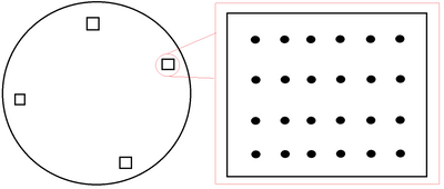
I work in the semiconductor industry. Let's say I have a wafer. This wafer has dies spread around the wafer, as shown. Within each die there are rows / columns each representing gradients of some metric at a specified point. From left to right, for instance, metric A starts at a max value and dwindles to the min on the right. From top to bottom, metric B follows the same pattern.
I've set up a wafer map shape where each shape number is the die. However, the values for any colored metric is averaged within the die because of the map shape. Is there a way to change this averaging behavior into a contour map, within each die? If I click on the contour option in the Graph Builder, the visualization goes blank.
I've been searching for this, but I haven't found answers.
Thank you in advance!
- Tags:
- windows
Accepted Solutions
- Mark as New
- Bookmark
- Subscribe
- Mute
- Subscribe to RSS Feed
- Get Direct Link
- Report Inappropriate Content
Re: Map shape + contour
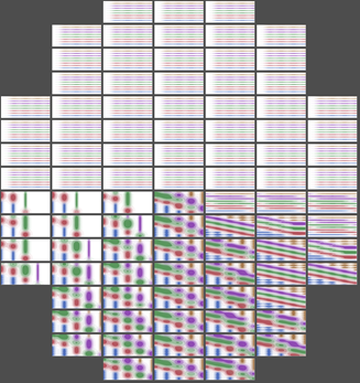
You could use a lineup box to hold a contour plot for each die, something like this
waferRadius = 1; // arbitrary
across = 7;
width = 2 * waferRadius / across;
down = 16;
height = 2 * waferRadius / down;
lub = Lineup Box( N Col( across ), <<backgroundcolor( RGB Color( 0.3, 0.3, 0.3 ) ) );// dark gray
For( row = 0.5, row <= down, row += 1,
	For( col = 0.5, col <= across, col += 1,
		If( Sqrt( (row * height - waferRadius) ^ 2 + (col * width - waferRadius) ^ 2 ) < waferRadius,
			// on the wafer. at this point you need the data for
			// a contour plot. It should be a subset from a table
			// for the wafer's die, most likely, but this is a demo.
			contourDt = New Table( "Untitled",
				invisible,
				Add Rows( 50 ),
				New Column( "x", Formula( Mod( Row()-1, 5 ) ) ), // data range 0..4
				New Column( "y", Formula( Floor( (Row()-1) / 5 ) ) ), // range 0..9
				New Column( "z", Formula(y+x^atan(row-down/2,col-across/2) ) ) // demo
			);
			gb = contourDt << Graph Builder(
				Size( 10*down, 10*across ), // 10: scale it up to minimize the borders
				fittowindow( "off" ),
				Show Control Panel( 0 ),
				Show Legend( 0 ),
				Show Title( 0 ),
				Show Footer( 0 ),
				Show X Axis( 0 ),
				Show Y Axis( 0 ),
				Show X Axis Title( 0 ),
				Show Y Axis Title( 0 ),
				Variables( X( :x ), Y( :y ), Overlay( :z ) ),
				Elements( Contour( X, Y, Legend( 37 ) ) ),
				SendToReport(
					Dispatch( {}, "Graph Builder", OutlineBox, {Set Title( "" ), Image Export Display( Normal )} ),
					// choose the axis range to exactly display all the data, no more, no less
					Dispatch( {}, "x", ScaleBox, {Min( 0 ), Max( 4 ), Inc( 1 ), Minor Ticks( 0 )} ),
					Dispatch( {}, "y", ScaleBox, {Min( 0 ), Max( 9 ), Inc( 2 ), Minor Ticks( 0 )} )
				)
			);
			Report( gb ) << backgroundcolor( RGB Color( 0.3, 0.3, 0.3 ) );// dark gray
			lub << append( Report( gb )[framebox( 1 )] << getpicture );
			gb << closewindow;
			Close( contourDt, nosave );
		,
			// off the edge
			lub << append( Spacer Box() )
		)
	)
);
img = lub<<getpicture;
img<<scale(.3); // .3: scale it down to fit the screen
New Window( "contours on wafer", img );
I took a picture of each contour plot, moderately large, both to be able to close the platform and delete the dummy data and to minimize the appearance of some pixels around the edge of the picture. Later, I scale the big composite picture down. The LineupBox is never displayed (you could, for debugging), but the picture of the lineup is displayed at the end.
I have not thought through the legend and how to make it common across the graphs. I think it is possible to specify the legend ranges.
You can use img<<savepicture to capture the image, or you might want to add some more displayboxes with information about the wafer before capturing the picture.
It does take a couple of minutes to run the example.
- Mark as New
- Bookmark
- Subscribe
- Mute
- Subscribe to RSS Feed
- Get Direct Link
- Report Inappropriate Content
Re: Map shape + contour
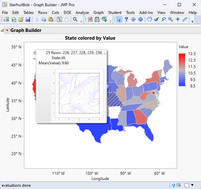
You can do what you want, using Hover Label Graphlets.
The attached data table has a 5x5 grid of values for each state. When the state is hovered over on the map, a Contour Map is generated and displayed for the data in the 5x5 grid for that state. Using the State map for the display was used because I was too lazy to create a wafermap shape data table. But it should work just as well as the state map. Here is the JSL that drives the map display, with the Hover Label definition.
Names Default To Here( 1 );
dt = Data Table("StarfruitBob");
gb = Graph Builder(
	Size( 534, 456 ),
	Show Control Panel( 0 ),
	Variables( X( :Longitude ), Y( :Latitude ), Color( :Value ), Shape( :State ) ),
	Elements( Map Shapes( X, Y, Legend( 22 ) ) )
);
Frame = (gb << Report)[FrameBox( 1 )];
frame << Set Graphlet(
	Picture(
		Contour Plot(
			X( :x, :y ),
			Y( :value ),
			Show Data Points( 1 ),
			Fill Areas( 0 ),
			Label Contours( 0 ),
			Transform( "Range Normalized" ),
			Specify Contours( Min( 6 ), Max( 22 ), N( 9 ) )
		)
	)
);
The documentation on Hover Labels and Graphlets is in the Scripting Guide, found in the JMP Documentation Library, under the Help Menu.
- Mark as New
- Bookmark
- Subscribe
- Mute
- Subscribe to RSS Feed
- Get Direct Link
- Report Inappropriate Content
Re: Map shape + contour
Hi @txnelson. Unfortunately, this would not be useful to most people where I work, as many of the visualizations that are generated end up as screenshots in reports. One or two pins may be okay, but the number that would be needed far exceeds that. The closest I can come is a contour plot with a higher alpha level, but the shapes become too abnormal to be useful, for what I'm looking for.
It seems as though this is a wish list item.
- Mark as New
- Bookmark
- Subscribe
- Mute
- Subscribe to RSS Feed
- Get Direct Link
- Report Inappropriate Content
Re: Map shape + contour
You could use a lineup box to hold a contour plot for each die, something like this

waferRadius = 1; // arbitrary
across = 7;
width = 2 * waferRadius / across;
down = 16;
height = 2 * waferRadius / down;
lub = Lineup Box( N Col( across ), <<backgroundcolor( RGB Color( 0.3, 0.3, 0.3 ) ) );// dark gray
For( row = 0.5, row <= down, row += 1,
	For( col = 0.5, col <= across, col += 1,
		If( Sqrt( (row * height - waferRadius) ^ 2 + (col * width - waferRadius) ^ 2 ) < waferRadius,
			// on the wafer. at this point you need the data for
			// a contour plot. It should be a subset from a table
			// for the wafer's die, most likely, but this is a demo.
			contourDt = New Table( "Untitled",
				invisible,
				Add Rows( 50 ),
				New Column( "x", Formula( Mod( Row()-1, 5 ) ) ), // data range 0..4
				New Column( "y", Formula( Floor( (Row()-1) / 5 ) ) ), // range 0..9
				New Column( "z", Formula(y+x^atan(row-down/2,col-across/2) ) ) // demo
			);
			gb = contourDt << Graph Builder(
				Size( 10*down, 10*across ), // 10: scale it up to minimize the borders
				fittowindow( "off" ),
				Show Control Panel( 0 ),
				Show Legend( 0 ),
				Show Title( 0 ),
				Show Footer( 0 ),
				Show X Axis( 0 ),
				Show Y Axis( 0 ),
				Show X Axis Title( 0 ),
				Show Y Axis Title( 0 ),
				Variables( X( :x ), Y( :y ), Overlay( :z ) ),
				Elements( Contour( X, Y, Legend( 37 ) ) ),
				SendToReport(
					Dispatch( {}, "Graph Builder", OutlineBox, {Set Title( "" ), Image Export Display( Normal )} ),
					// choose the axis range to exactly display all the data, no more, no less
					Dispatch( {}, "x", ScaleBox, {Min( 0 ), Max( 4 ), Inc( 1 ), Minor Ticks( 0 )} ),
					Dispatch( {}, "y", ScaleBox, {Min( 0 ), Max( 9 ), Inc( 2 ), Minor Ticks( 0 )} )
				)
			);
			Report( gb ) << backgroundcolor( RGB Color( 0.3, 0.3, 0.3 ) );// dark gray
			lub << append( Report( gb )[framebox( 1 )] << getpicture );
			gb << closewindow;
			Close( contourDt, nosave );
		,
			// off the edge
			lub << append( Spacer Box() )
		)
	)
);
img = lub<<getpicture;
img<<scale(.3); // .3: scale it down to fit the screen
New Window( "contours on wafer", img );
I took a picture of each contour plot, moderately large, both to be able to close the platform and delete the dummy data and to minimize the appearance of some pixels around the edge of the picture. Later, I scale the big composite picture down. The LineupBox is never displayed (you could, for debugging), but the picture of the lineup is displayed at the end.
I have not thought through the legend and how to make it common across the graphs. I think it is possible to specify the legend ranges.
You can use img<<savepicture to capture the image, or you might want to add some more displayboxes with information about the wafer before capturing the picture.
It does take a couple of minutes to run the example.
- Mark as New
- Bookmark
- Subscribe
- Mute
- Subscribe to RSS Feed
- Get Direct Link
- Report Inappropriate Content
Re: Map shape + contour
This may be a viable solution, @Craige_Hales! A very creative workaround! Thank you!
- Mark as New
- Bookmark
- Subscribe
- Mute
- Subscribe to RSS Feed
- Get Direct Link
- Report Inappropriate Content
Re: Map shape + contour
I don't think you can do this using those shape maps you have. If you have more accurate coordinates than just the corners of dies, you could use those to create more accurate map to use for cases like this. Or maybe you can use the coordinates and set them as Ordinal and then you might be able to use heatmap or scatterplot.
- Mark as New
- Bookmark
- Subscribe
- Mute
- Subscribe to RSS Feed
- Get Direct Link
- Report Inappropriate Content
Re: Map shape + contour
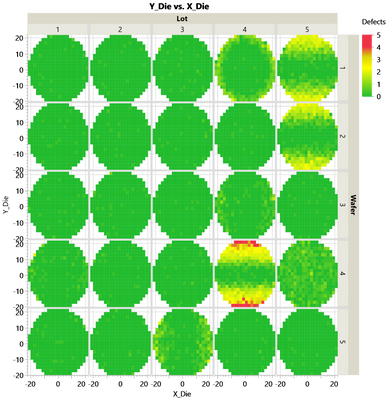
If the dies are positioned in a rectangular pattern -or if it is acceptable to generate the plot in a rectangular pattern, then you could use the die x/y position as X/Y group - and use the intra-die position on the X/Y-Axis.
The example below uses lots/wafers and x_die/y_die
instead of x_die/y_die and x_intra_die/y_intra_die - but I hope that the basic idea is visible:
dt = Open( "$SAMPLE_DATA/Wafer Stacked.jmp" );

dt << Graph Builder(

	Show Control Panel( 0 ),
	Variables(
		X( :X_Die ),
		Y( :Y_Die ),
		Group X( :Lot ),
		Group Y( :Wafer ),
		Color( :Defects )
	),
	Elements( Heatmap( X, Y, Legend( 9 ) ) )
);Recommended Articles
- © 2026 JMP Statistical Discovery LLC. All Rights Reserved.
- Terms of Use
- Privacy Statement
- Contact Us

