- JMP User Community
- :
- Discussions
- :
- Re: Long shot: How to use numpy.polyfit to reproduce Vec Quadratic() results?
- Subscribe to RSS Feed
- Mark Topic as New
- Mark Topic as Read
- Float this Topic for Current User
- Bookmark
- Subscribe
- Printer Friendly Page
- Mark as New
- Bookmark
- Subscribe
- Mute
- Subscribe to RSS Feed
- Get Direct Link
- Report Inappropriate Content
Long shot: How to use numpy.polyfit to reproduce Vec Quadratic() results?
Apologies for the transgression, which is; ironically; a direct result of my personal progress in JSL.
A very helpful computer scientist in my organization is trying to translate something initially written in JSL to Python. Specifically, the challenge is how to reproduce what the JSL function 'Vec Quadratic()' is doing? See also the attached example table .
Background:
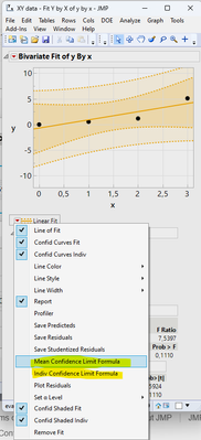
The JSL application to be translated creates formula columns for the confidence and prediction intervals. The formulas are then used to calculate the values of the confidence and prediction intervals for some user specified value of x, aka independent variable.
Questions:
- Is numpy.polyfit (https://numpy.org/doc/stable/reference/generated/numpy.polyfit.html) the right choice for this?
- If it is, anyone who knows how to use numpy.polyfit to reproduce the results for Lower & Upper 95% Mean & Indiv columns in the attached table or can point us into the right direction?
Screenshots for orientation:
- What we want to achieve in Python (results inside the red frame)
- How the columns shown above were generated
Accepted Solutions
- Mark as New
- Bookmark
- Subscribe
- Mute
- Subscribe to RSS Feed
- Get Direct Link
- Report Inappropriate Content
Re: Long shot: How to use numpy.polyfit to reproduce Vec Quadratic() results?
If anyone's interested, the below Python code looks like it will exactly reproduce what JMP is doing in terms of calculating the confidence interval around a regression. This code block can be pasted into a Jupyter notebook directly. Besides calculating the Y- coordinates of the confidence interval for every X in the linear regression it does also create a plot, calculates the regression coefficient, intercept, associated uncertainties and tabulates the results.
Don't believe I wrote this myself, but still useful for learning.
import numpy as np
from scipy.optimize import curve_fit
import matplotlib.pyplot as plt

# the data as array
x_coordinate = np.array([0, 1, 2, 3])
y_coordinate = np.array([0.0, 0.5, 1.2, 5.1])

# linear model
func = lambda x, a, b: a * x + b

# model fit
best_fit_ab, covar = curve_fit(func, x_coordinate, y_coordinate)
sigma_ab = np.sqrt(np.diagonal(covar))

# extract fitted parameters and uncertainties
a, b = best_fit_ab
a_err, b_err = sigma_ab
text_res = f"Best fit parameters:\na = {a:.10f} ± {a_err:.10f}\nb = {b:.10f} ± {b_err:.10f}"
print(text_res)

# calculate the standard error of the regression
residuals = y_coordinate - func(x_coordinate, a, b)
s_err = np.sqrt(np.sum(residuals**2) / (len(x_coordinate) - 2))

# define a function to calculate the confidence intervals
def predict_ci(x, func, popt, pcov, s_err, alpha=0.05): # adjust alpha here
    from scipy.stats import t
    df = len(x_coordinate) - 2
    t_val = t.ppf(1 - alpha / 2, df)  # t-value for the given confidence level and degrees of freedom
    y = func(x, *popt)
    ci = t_val * s_err * np.sqrt(1/len(x_coordinate) + (x - np.mean(x_coordinate))**2 / np.sum((x_coordinate - np.mean(x_coordinate))**2))
    return y - ci, y + ci

# generate points for high-resolution x-axis
hires_x = np.linspace(x_coordinate.min(), x_coordinate.max(), 100)

# calculate confidence intervals
ci_lower_orig, ci_upper_orig = predict_ci(x_coordinate, func, best_fit_ab, covar, s_err)

# tabulate the original data and confidence intervals
table_orig = np.column_stack((x_coordinate, y_coordinate, ci_lower_orig, ci_upper_orig))
print("\nTabulated values (original data):")
print("X Coordinate\tY Coordinate\t\tCI Lower\t\tCI Upper")
for row in table_orig:
    print(f"{row[0]:.2f}\t\t{row[1]:.10f}\t\t{row[2]:.10f}\t{row[3]:.10f}") # adjust decimals for tabulation

# plotting the data
plt.scatter(x_coordinate, y_coordinate, label='Data', color='blue')

# plotting the fitted model
plt.plot(hires_x, func(hires_x, *best_fit_ab), 'black', label='Fitted model')

# plotting the confidence intervals
ci_lower, ci_upper = predict_ci(hires_x, func, best_fit_ab, covar, s_err)
plt.fill_between(hires_x, ci_lower, ci_upper, color='black', alpha=0.15, label='Confidence interval')

# adding text with parameters
plt.text(x_coordinate.min() + 0.5, y_coordinate.max() - 0.5, text_res)

# customize plot
plt.xlabel('X Coordinate')
plt.ylabel('Y Coordinate')
plt.title('Y Coordinate vs. X Coordinate')
plt.legend()
plt.show()
- Mark as New
- Bookmark
- Subscribe
- Mute
- Subscribe to RSS Feed
- Get Direct Link
- Report Inappropriate Content
Re: Long shot: How to use numpy.polyfit to reproduce Vec Quadratic() results?
Have you ask the Python community about this. Personally, it seems counter productive to the JMP Community to put effort into assisting in moving someone away from JMP.
- Mark as New
- Bookmark
- Subscribe
- Mute
- Subscribe to RSS Feed
- Get Direct Link
- Report Inappropriate Content
Re: Long shot: How to use numpy.polyfit to reproduce Vec Quadratic() results?
True on the one hand. On the other hand, though, Python is integrated into JMP18, which suggests there must be people getting to terms with this reality. I was hoping for someone in the community being able to explain, since I consider it infinitely more likely that a JSL user would know the Python equivalent of 'Vec Quadratic()', rather than vice versa. (And what will the Python community tell me when I ask them?)
- Mark as New
- Bookmark
- Subscribe
- Mute
- Subscribe to RSS Feed
- Get Direct Link
- Report Inappropriate Content
Re: Long shot: How to use numpy.polyfit to reproduce Vec Quadratic() results?
While the jmp.DataTable object will enable some user's an easier path to export JMP data, the improved Python integration is focused on benefiting the JMP user.
- It provides an environment that users new to JMP, but familiar with Python can be productive immediately.
- The design of the Python integration focuses on improving JMP's capability at being the hub of the workflow. At reducing the need to leave JMP to get the job done. The hope / desire is that the JMP environment becomes more convenient, more enticing, that work will be brought into JMP rather than exported away from JMP. That JMP / Python integration becomes greater than simply the aggregation of JMP and Python. For example:
- File formats not yet supported by JMP can be opened using external Python packages, parquet, hdf5, ...
- Allow JMP users to utilize desktop GPUs through packages such as pyopencl, and pyCUDA.
- Additional statistical capabilities such as hierarchical density clustering (HDBSCAN)
- Additional plotting and graphing capabilities with packages such as matplotlib, plotly, ...
- Integration with other software systems through the Python interface. SAS, MatLab, R, ...
The JMP statisticians and testers put a lot of effort into creating code that is reliable, accurate and well tested. That is the value proposition. We focus on the statistics so you can focus on your application, rather than having to reinvent the statistical 'wheel'.
- Mark as New
- Bookmark
- Subscribe
- Mute
- Subscribe to RSS Feed
- Get Direct Link
- Report Inappropriate Content
Re: Long shot: How to use numpy.polyfit to reproduce Vec Quadratic() results?
I don't doubt that JMP statisticians put a lot of effort into creating reliable code. What I doubt is the expectation to keep this forum free from Python related questions.
- Mark as New
- Bookmark
- Subscribe
- Mute
- Subscribe to RSS Feed
- Get Direct Link
- Report Inappropriate Content
Re: Long shot: How to use numpy.polyfit to reproduce Vec Quadratic() results?
Maybe the
NormalContour = sqrt(ChiSquare Quantile( 0.95, 2 ));idea from Ellipse will point you in the right direction. I do pictures, not statistics, so I might be way off. But to make the ellipse picture I had to answer a similar question.
- Mark as New
- Bookmark
- Subscribe
- Mute
- Subscribe to RSS Feed
- Get Direct Link
- Report Inappropriate Content
Re: Long shot: How to use numpy.polyfit to reproduce Vec Quadratic() results?
Thanks, that's very kind! It is possible we found a solution: https://numpy.org/doc/stable/reference/generated/numpy.cov.html
Edit: The title of this posting is misleading. numpy.polyfit is probably no suitable for emulating 'Vec Quadratic()'.
- Mark as New
- Bookmark
- Subscribe
- Mute
- Subscribe to RSS Feed
- Get Direct Link
- Report Inappropriate Content
Re: Long shot: How to use numpy.polyfit to reproduce Vec Quadratic() results?
We welcome Python questions in the JMP blogs. I have been answering a lot of them lately. Including sample code, and discussions on how best to use Python in JMP to its best advantage.
@txnelson comment on asking the Python community is a valid one, as would asking statistical blogs. Though instead of asking how to replicate JSL's 'Vec Quadratic()' you phrase it in terms of asking how to graph the results you want, how to do the statistics you want in Python.
As for answering this specific ask, I can't help you. I have no knowledge of how 'Vec Quadratic()' works internally. But I can tell you what the Scripting Index says. The scripting index definition of Vec Quadratic( S, X ) states it evaluates as Vec Diag ( X * S * X ). Vec Diag( X ) description in the Scripting index is Returns the diagonal elements of the square matrix as a vector. Unless I'm missing something that appears to be straightforward matrix math.
As for how do I call 'Vec Quadriatic()' from my Python program running in JMP so I can further process the results... That is the kind of question that would be interesting.
You can use a numpy array for S and X and you can do the Python Get(S), Python Get(X) to get the numpy array values into JSL environment as a JSL Matrix. And you can call jmp.run_jsl( 'Vec Quadratic( S, X)' ). Then from Python in JMP you can get the column results directly from the data table in Python. See the Scripting Index on jmp.DataTable and jmp.DataTable.Column objects.
Derived from the JSL "Vec Quadratic()' example in the Scripting Index.
import jmp
import numpy as np

s = np.array( [[1,3,5],[3,2,6], [5,6,1] ])
x = np.array( [[1,3,5],[2,4,6] ])
jmp.run_jsl('''
S = Python Get(s);
X = Python Get(x);
show(Vec Quadratic(S, X));
''')
giving results
/*:

//:*/

S = Python Get(s);
X = Python Get(x);
show(Vec Quadratic(S, X));

/*:

Vec Quadratic(S, X) = [292, 528];
- Mark as New
- Bookmark
- Subscribe
- Mute
- Subscribe to RSS Feed
- Get Direct Link
- Report Inappropriate Content
Re: Long shot: How to use numpy.polyfit to reproduce Vec Quadratic() results?
@Paul_Nelson, thank you. I already knew what the JSL function 'Vec Quadratic()' did before posting. Apologies for inadequately phrasing my question in this post. Not everyone is this forum is an English native speaker. And just for completeness:
Your comment:
Though instead of asking how to replicate JSL's 'Vec Quadratic()' ...
My original question:
How to use numpy.polyfit to reproduce Vec Quadratic() results?
Is it the use of "reproduce" that is offensive?
- Mark as New
- Bookmark
- Subscribe
- Mute
- Subscribe to RSS Feed
- Get Direct Link
- Report Inappropriate Content
Re: Long shot: How to use numpy.polyfit to reproduce Vec Quadratic() results?
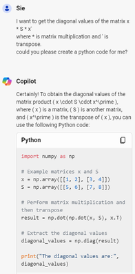
if you ask Copilot:
- © 2025 JMP Statistical Discovery LLC. All Rights Reserved.
- Terms of Use
- Privacy Statement
- Contact Us


