- New to JMP? Let the Data Analysis Director guide you through selecting an analysis task, an analysis goal, and a data type. Available now in the JMP Marketplace!
- See how to install JMP Marketplace extensions to customize and enhance JMP.
- Subscribe to RSS Feed
- Mark Topic as New
- Mark Topic as Read
- Float this Topic for Current User
- Bookmark
- Subscribe
- Mute
- Printer Friendly Page
Discussions
Solve problems, and share tips and tricks with other JMP users.- JMP User Community
- :
- Discussions
- :
- Line fit in graph builder
- Mark as New
- Bookmark
- Subscribe
- Mute
- Subscribe to RSS Feed
- Get Direct Link
- Report Inappropriate Content
Line fit in graph builder
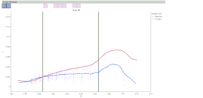
I am wanting to fit a straight line in graph builder, but only for a specified range of data. I want my chart to show the whole spectrum of data and the smoother line (as shown below), but also a fit line only using the range of the data between the black lines. I would also like to get the equation of the line and show it on the graph if possible.
Accepted Solutions
- Mark as New
- Bookmark
- Subscribe
- Mute
- Subscribe to RSS Feed
- Get Direct Link
- Report Inappropriate Content
Re: Line fit in graph builder
Three possibilities come to mind for the main part (lacking the line equation).
1) Add a weighting column to your data table, set to 1 in the middle area and 0 elsewhere. Then use GB and assign the new variable to the Freq role.
2) Split your Y column into two columns, Y1 and Y2, with Y1 missing in the middle area and Y2 missing elsewhere. Now put both Y1 and Y2 into the Y role in GB. Add a Line of Fit, Right-click in graph > Line Of Fit > Y > Y1 to turn off Y1 for the Line of Fit.
3) Mark the rows for the outer points as excluded (but not hidden) and use Fit Y by X. Use Group By to get the overlay effect there.
Only the third option readily gives you an equation for the fit, though Graph Builder will show it in the graph for JMP 11 due out in September.
- Mark as New
- Bookmark
- Subscribe
- Mute
- Subscribe to RSS Feed
- Get Direct Link
- Report Inappropriate Content
Re: Line fit in graph builder
Great. Thank you very much. I think I am going with option 2 with a slight modification.
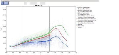
I couldn't get option 1 to show both sets of data on the same Y axis at the same time in GB. With option 3, I couldn't find a way to get a smoother line in the Fit Y by X (and if I could it didn't seem like it would include the excluded data, which I wanted for the smoother line). I ended up going with option 2, except instead of adding 2 additional columns I only added 1 that only had the data I wanted to fit the line to. Then I put my original Y and my new Y into GB and fit a line only to the new Y as you described. If I did 2 new columns the smoother line was not correct for the middle section.
I look forward to JMP 11 when I can get my equation on the graph.
Recommended Articles
- © 2026 JMP Statistical Discovery LLC. All Rights Reserved.
- Terms of Use
- Privacy Statement
- Contact Us


