- New to JMP? Let the Data Analysis Director guide you through selecting an analysis task, an analysis goal, and a data type. Available now in the JMP Marketplace!
- See how to install JMP Marketplace extensions to customize and enhance JMP.
- Subscribe to RSS Feed
- Mark Topic as New
- Mark Topic as Read
- Float this Topic for Current User
- Bookmark
- Subscribe
- Mute
- Printer Friendly Page
Discussions
Solve problems, and share tips and tricks with other JMP users.- JMP User Community
- :
- Discussions
- :
- Re: Life distribution interval censoring compare distributions plot
- Mark as New
- Bookmark
- Subscribe
- Mute
- Subscribe to RSS Feed
- Get Direct Link
- Report Inappropriate Content
Life distribution interval censoring compare distributions plot
Hi,
I have a question regarding Life Distribution platform, precisely using compare distribution outline box with interval censored data.
I would like illustrate my question with an example. I created some dummy numbers and tried to fit a Weibull distribution to it. The behaviors that I will describe below repeat as I am using actual data.
My general question is how JMP calculates Y-axis (probability) positions for interval censored data?
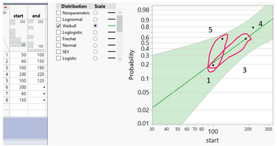
I wonder why two points with start value of 120 and 200 are plotted on the same height on Y axis?
Next, why sometimes an uncensored observation is marked on a plot using single marker (ex. point 4), some marked using 2 markers (ex. points 1 and 3, as shown with red ellipses) and some are not marked at all (ex. missing point 2)?
Finally, I would like to ask, why I can only select on this plot point 1 (using cursor) and other points cannot be selected in any way, except, when using data table directly. Additionally, I can only move label of point 1, other are inactive.
Thank you for your help,
Regards,
Ceg1
- Mark as New
- Bookmark
- Subscribe
- Mute
- Subscribe to RSS Feed
- Get Direct Link
- Report Inappropriate Content
Re: Life distribution interval censoring compare distributions plot
Hi,
It is good to hear that we are not talking over a faulty software.
Then I can think of three options:
1) Use "Step Function". It represents unmodified KME, and it preserves the complete meaning of the nonparametric estimate, i.e. you can point to any place on a step, and say this is an estimate of probability at this time point. And even more import, pay attention to the confidence bands around KME. They add valuable information that you need to convey. The appropriate use case for this option is that you only want to talk about the nonparametric estimate.
2) Use "Point" but turn off "Nonparametric"; see screenshot below. The appropriate use case for this option is that you want to emphasize the parametric fit. The adjusted KME points help you to evaluate the quality of parametric fit while using the "point" convention to convey the information.
3) Use the table under "Nonparametric Estimate", you can plot original KME using your preferred style in Graph Builder. But be prepared to explain why it looks "off" if overlaid on the top of a parametric fit, as I have explained previously. I won't recommend this approach, this is not a correct way for reliability data analysis, but it is an option for you.
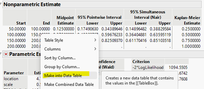
To do that, right click in the table and choose "Make into Data Table":
The generated table looks like this:
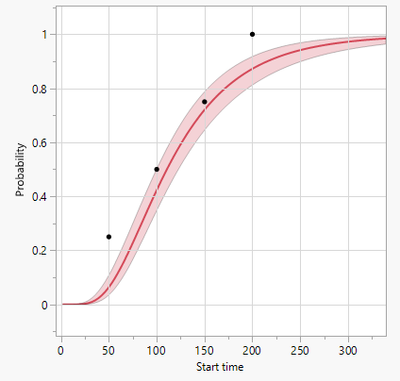
Then using Graph Build to produce a scatter plot, with Start on x-axis, and KME on y-axis. Then right click in the graph and copy the content:
Then paste to any place that you need, e.g. back into Life Distribution:
And turn off all other Nonparametric related plot options, and you get this:
- Mark as New
- Bookmark
- Subscribe
- Mute
- Subscribe to RSS Feed
- Get Direct Link
- Report Inappropriate Content
Re: Life distribution interval censoring compare distributions plot
A use case for approach #3:
a colleague asks about the chance for devices to survive 200h. From the KME plot points, the user will conclude:
none of the test devices survived. the chance is low to get a significant survival rate with the actual (full) distribution.
From the midpoints and the fit curve he might get a different impression ...
Same thing for: "how many devices will fail at t=50 and below"?
from KME: 1/4 of the population
from the fit: < 10%
This mind-twisting offset between fitting a distribution and calculating survival rates might be the reason why @Doraemon214 talks about "exact failure rates":
@Doraemon214 wrote:
the exact failure rate at each exact failure time.
On the other hand, in reality it will be surprising if 25 of the units die exactly "at 50" (i.e. between 50 and 50).
Just imagine intermediate readouts at 10, 20, 30, 40 ...
in reality there will be first failures already at t=10, 20, 30, 400 - and not a sudden increase of +25 fails at t=50.
Concerning:
@Ceg1 wrote:
and some are not marked at all (ex. missing point 2)?
... I still wonder why there are some rows with no associated plotting point.
I noticed that plot points disappear if an interval overlaps with an interval of another row.
- Mark as New
- Bookmark
- Subscribe
- Mute
- Subscribe to RSS Feed
- Get Direct Link
- Report Inappropriate Content
Re: Life distribution interval censoring compare distributions plot
Thank you for bringing up new use cases or different perspectives on same use cases, hogi. Before I respond to yours, I would like to hear response from Doraemon214, so the thread can remain within the same context.
- « Previous
-
- 1
- 2
- Next »
Recommended Articles
- © 2026 JMP Statistical Discovery LLC. All Rights Reserved.
- Terms of Use
- Privacy Statement
- Contact Us


