- New to JMP? Let the Data Analysis Director guide you through selecting an analysis task, an analysis goal, and a data type. Available now in the JMP Marketplace!
- See how to install JMP Marketplace extensions to customize and enhance JMP.
- Subscribe to RSS Feed
- Mark Topic as New
- Mark Topic as Read
- Float this Topic for Current User
- Bookmark
- Subscribe
- Mute
- Printer Friendly Page
Discussions
Solve problems, and share tips and tricks with other JMP users.- JMP User Community
- :
- Discussions
- :
- Re: Life distribution: The failure rate/probability plot does not match with the...
- Mark as New
- Bookmark
- Subscribe
- Mute
- Subscribe to RSS Feed
- Get Direct Link
- Report Inappropriate Content
Life distribution: The failure rate/probability plot does not match with the table
Hello,
I am new to the JMP life distribution plot.
I think it is a basic understanding issue.
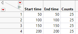
The below is the test table I made.
According to the description: https://www.jmp.com/support/help/en/18.1/index.shtml#page/jmp/event-plot.shtml#ww1386833
I think it meas there are total 100 samples.
And exactly at 4 readings: 50, 100, 150 and 200, there are 25 new failures happened.
So the failure rate I expected will be:
50, 25%
100, 50%,
150, 75%
200,100%.
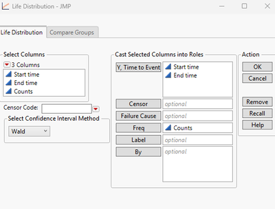
Then I lauch the life distribution with setting as below:
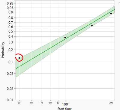
However, the dots in the Weibull plot are very different from the failure rate I expected.
For example, the first read point at time 50 has failure rate as ~13%.
I don't understand why.
Could you help me with this?
Thank you very much for your help!
I am using JMP17
Accepted Solutions
- Mark as New
- Bookmark
- Subscribe
- Mute
- Subscribe to RSS Feed
- Get Direct Link
- Report Inappropriate Content
Re: Life distribution: The failure rate/probability plot does not match with the table
Sorry, my first guess was wrong.
I just checked the probability values in Life Distribution for tables with different numbers of rows. *)
Seems that life distribution uses Hazen (Midpoint) plotting positions - independent of the number of data points:
prob = (rank - 0.5) / N
aka "Weibull" is what you get when you use the right click "new formula column" menu in the data table:
Here is an overview of different plotting positions which are available in MatPlotLib (via the "postype" argument)
from: https://matplotlib.org/mpl-probscale/tutorial/closer_look_at_plot_pos.html
seg = current report () ["Compare Distributions",FrameBox(1)] << find seg (Marker Seg( 1 ));
data= seg <<Get Y Values;

col = current data table() << new column ("prob");
col << set values(data)
*) get Y positions from a Marker Seg
- Mark as New
- Bookmark
- Subscribe
- Mute
- Subscribe to RSS Feed
- Get Direct Link
- Report Inappropriate Content
Re: Life distribution: The failure rate/probability plot does not match with the table
For large N the estimated percent is
rank/ ( N + 1)For N=4 you would get 0.2, 0.4, 0.6 and 0.8.
(instead of the 0.25, 0.5, 0.75, 1 which you expected)
For small N the estimated percent is "corrected". There are several approaches for the correction.
I have seen an overview in Wikipedia - I will try to find it ...
- Mark as New
- Bookmark
- Subscribe
- Mute
- Subscribe to RSS Feed
- Get Direct Link
- Report Inappropriate Content
Re: Life distribution: The failure rate/probability plot does not match with the table
It's kind of surprising that "N" is just 4 - because of 4 rows?
And not 100 - because of Freq = 25+25+25+25.
So, users should not be lazy, an use multiple lines instead of aggregating results via Freq : )
the same input, using 100 rows:
- Mark as New
- Bookmark
- Subscribe
- Mute
- Subscribe to RSS Feed
- Get Direct Link
- Report Inappropriate Content
Re: Life distribution: The failure rate/probability plot does not match with the table
Hi Hogi,
Thank you for your reply.
I think you meant the probability is an estimate instead of a measured value, so the it won't be the same as the actual failure rate in the test.
Is that correct?
In that case, I wonder if there is a document explains the thoughts and math behind it? I tried the JMP document but had no luck.
And if I want to do the plot as my acual failure rate, is there a way to do it in JMP?
Thank you.
- Mark as New
- Bookmark
- Subscribe
- Mute
- Subscribe to RSS Feed
- Get Direct Link
- Report Inappropriate Content
Re: Life distribution: The failure rate/probability plot does not match with the table
Sorry, my first guess was wrong.
I just checked the probability values in Life Distribution for tables with different numbers of rows. *)
Seems that life distribution uses Hazen (Midpoint) plotting positions - independent of the number of data points:
prob = (rank - 0.5) / N
aka "Weibull" is what you get when you use the right click "new formula column" menu in the data table:
Here is an overview of different plotting positions which are available in MatPlotLib (via the "postype" argument)
from: https://matplotlib.org/mpl-probscale/tutorial/closer_look_at_plot_pos.html
seg = current report () ["Compare Distributions",FrameBox(1)] << find seg (Marker Seg( 1 ));
data= seg <<Get Y Values;

col = current data table() << new column ("prob");
col << set values(data)
*) get Y positions from a Marker Seg
- Mark as New
- Bookmark
- Subscribe
- Mute
- Subscribe to RSS Feed
- Get Direct Link
- Report Inappropriate Content
Re: Life distribution: The failure rate/probability plot does not match with the table
Thank you Hogi.
I will read into it.
- Mark as New
- Bookmark
- Subscribe
- Mute
- Subscribe to RSS Feed
- Get Direct Link
- Report Inappropriate Content
Re: Life distribution: The failure rate/probability plot does not match with the table
@Doraemon214 wrote:I think you meant the probability is an estimate instead of a measured value, so the it won't be the same as the actual failure rate in the test.
So, we can take the measurement values of the measured samples and guess / estimate the actual failure rate of the whole population. There are just readouts at 50, 100, 150 and 200 which add another error.
I use the Life Distribution platform to fit Distributions - mainly Normal Distributions. Sometimes: get a visual impression for the deviation from normal distributions. like a Q-Q Plot fith a fit line and nice looking confidence intervals.
In addition:
a) little chance to get 2 samples with the same value
b) concerning curve fitting it feels somehow "right" to place the fit curve at the center of the points
But when you think ...
especially about lifetimes - and "Survival" rates - indeed surprising that
"25 out of 100 units fail at 50 (or earlier)" is implicitly converted to
"cumulative probability up to the value 50 is 12.5%".
and with
it sounds even more surprising:
if 25 of the 100 units fail at 50, "probability" of survival at 50 is close to 90%:
Still many open questions ...
I asked JMP support: TS-00196267
I hope there is a white paper which tells us the details : )
NB:
according to Life Distribution plot points should default to Kaplan-Meier or Turnbull estimates with option to se...
there was a change between JMP16 and JMP17 how Life distribution calculates the probabilities.
Maybe there is a documentation{motivation which can add more insights ...
- Mark as New
- Bookmark
- Subscribe
- Mute
- Subscribe to RSS Feed
- Get Direct Link
- Report Inappropriate Content
Re: Life distribution: The failure rate/probability plot does not match with the table
Your data set is set up with exact fail times. It essentially says that 25% of the population fails at exactly t=50. Perhaps this is correct, but in my experience a more accurate description is that 25% of the population fails sometime between t=0 and t=50. To represent this in JMP you need to use interval censoring. If I modify your original table so Start time = [0, 50, 100, 150] and End time remains the same [50, 100, 150, 200], then I think the Weibull from Life Distribution matches your expectations:
- Mark as New
- Bookmark
- Subscribe
- Mute
- Subscribe to RSS Feed
- Get Direct Link
- Report Inappropriate Content
Re: Life distribution: The failure rate/probability plot does not match with the table
It helped me to consider non.equal frequency values, e.g. bunched data like
When you think of a (e.g. normal) distribution with maximum weight at 50 -> midplint.
and when you think of "100 out of 111 entries failed at 50 or below" -> Kaplan Meier.
- Mark as New
- Bookmark
- Subscribe
- Mute
- Subscribe to RSS Feed
- Get Direct Link
- Report Inappropriate Content
Re: Life distribution: The failure rate/probability plot does not match with the table
Thank you TomH.
I think you are right. I have to tweek the way my data is formatted so JMP can process it as I expected.
I wondering if it's statistically incorrect to do the weibull fit in the way I understood.
From Hogi's reply, I think that is true.
Feels like the measured data is not a direct representation of the true cumulative distribution function, but a math transform.
Is that why JMP does not allow weibul fit and probability plot using the Kaplan-Meier estimate?
Recommended Articles
- © 2026 JMP Statistical Discovery LLC. All Rights Reserved.
- Terms of Use
- Privacy Statement
- Contact Us


