- New to JMP? Let the Data Analysis Director guide you through selecting an analysis task, an analysis goal, and a data type. Available now in the JMP Marketplace!
- See how to install JMP Marketplace extensions to customize and enhance JMP.
- Subscribe to RSS Feed
- Mark Topic as New
- Mark Topic as Read
- Float this Topic for Current User
- Bookmark
- Subscribe
- Mute
- Printer Friendly Page
Discussions
Solve problems, and share tips and tricks with other JMP users.- JMP User Community
- :
- Discussions
- :
- Legend for Bubble Chart
- Mark as New
- Bookmark
- Subscribe
- Mute
- Subscribe to RSS Feed
- Get Direct Link
- Report Inappropriate Content
Legend for Bubble Chart
Hi,
Is it possible to create a legend for the size of the bubbles in the bubble chart?
I can fake it with creating some dummy data points but an interesting in something that does mess with underlying data table.
Andy
Accepted Solutions
- Mark as New
- Bookmark
- Subscribe
- Mute
- Subscribe to RSS Feed
- Get Direct Link
- Report Inappropriate Content
Re: Legend for Bubble Chart
Hi Andy,
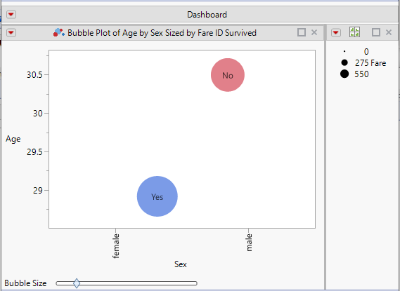
This may not be what you want, but maybe it will inspire someone to offer a better idea.
To build the legend:
- I built a Graph Builder graph with a size role using the same column as the bubble plot.
- I shrunk the graph and removed the border and title.
- I deleted the Graph Builder title, which removed the Graph Builder Outline box.
Then I combined windows to create a dashboard.
If this works for you, please let me know if you need more details steps.
~John
- Mark as New
- Bookmark
- Subscribe
- Mute
- Subscribe to RSS Feed
- Get Direct Link
- Report Inappropriate Content
Re: Legend for Bubble Chart
Hi,
Thanks for the idea.
What I am playing with is this where I have created dummy datapoints, red circles, (again not my preferred option) and placed them in line with the Y axis grid. So the one cross at 1 is 1, crossing at 10 = 10,.... I will need to add text in presentation deck to explain.
Andy
- Mark as New
- Bookmark
- Subscribe
- Mute
- Subscribe to RSS Feed
- Get Direct Link
- Report Inappropriate Content
Re: Legend for Bubble Chart
Hi Andy,
This may not be what you want, but maybe it will inspire someone to offer a better idea.
To build the legend:
- I built a Graph Builder graph with a size role using the same column as the bubble plot.
- I shrunk the graph and removed the border and title.
- I deleted the Graph Builder title, which removed the Graph Builder Outline box.
Then I combined windows to create a dashboard.
If this works for you, please let me know if you need more details steps.
~John
- Mark as New
- Bookmark
- Subscribe
- Mute
- Subscribe to RSS Feed
- Get Direct Link
- Report Inappropriate Content
Re: Legend for Bubble Chart
Hi,
Thanks for the idea.
What I am playing with is this where I have created dummy datapoints, red circles, (again not my preferred option) and placed them in line with the Y axis grid. So the one cross at 1 is 1, crossing at 10 = 10,.... I will need to add text in presentation deck to explain.
Andy
Recommended Articles
- © 2026 JMP Statistical Discovery LLC. All Rights Reserved.
- Terms of Use
- Privacy Statement
- Contact Us


