- Subscribe to RSS Feed
- Mark Topic as New
- Mark Topic as Read
- Float this Topic for Current User
- Bookmark
- Subscribe
- Mute
- Printer Friendly Page
Discussions
Solve problems, and share tips and tricks with other JMP users.- JMP User Community
- :
- Discussions
- :
- Re: Latent class analysis: how to display a conditional item probability graphic...
- Mark as New
- Bookmark
- Subscribe
- Mute
- Subscribe to RSS Feed
- Get Direct Link
- Report Inappropriate Content
Latent class analysis: how to display a conditional item probability graphic (in class probability)?
Hello everyone!
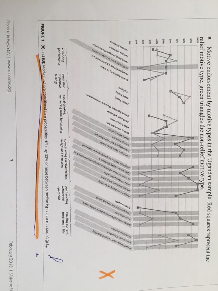
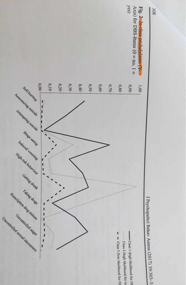
I calculated a Latent Class Analysis with JMP in the context of an validation of a questionnaire. A three class solution revealed to fit the data best. Now I have to display the “conditional item probabilities” or also called “in class probabilities” in a graphic. The aim is to obtain a graph where the individual items of the questionnaire are located on the X axis (a total of 23 items) and where the probability of affirming the item in dependence of the cluster (1/2/3) is located on the Y axis.
I will attach two screenshots of graphics I found that are exactly what I am aiming for with my dataset.
In one of the
Who can help me? Since it is relatively urgent, I am happy about any idea!
Thanks a lot, best regards
Anne My
- Mark as New
- Bookmark
- Subscribe
- Mute
- Subscribe to RSS Feed
- Get Direct Link
- Report Inappropriate Content
Re: Latent class analysis: how to display a conditional item probability graphic (in class probabili
You will use the ability to save the results from one platform to the data table or as a new data table, prepare it for plotting, and then make your chart.
- Click the red triangle next to the fitted cluster model (not the red triangle at the top of the platform) and select Model Reports > Transposed Parameter Estimates.
- Right-click on this new table and select Make Into Data Table.
- Change the name of the first data column from Column to something like Question.
- Right-click on an instance of Category = No and choose Select Matching Cells.
- Select Rows > Delete Rows.
- You can delete the Category data column now if you like.
- Select Tables > Stack.
- Select the data columns with the conditional probabilites (Cluster 1 to Cluster N) and click Stack Columns.
- Type Conditional Probability for the Data column name.
- Type Cluster for the Label data column name.
- Click OK.
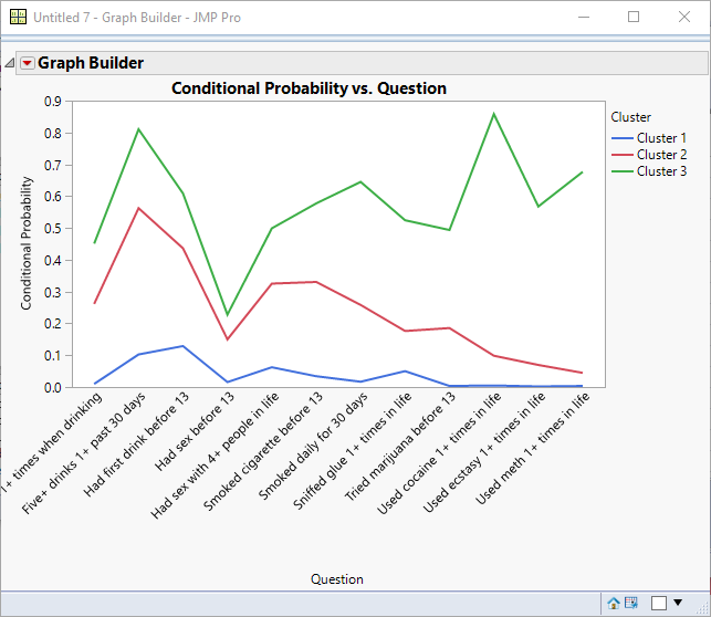
- Select Graph > Graph Builder.
- Drag Conditional Probability to the Y drop zone.
- Drag Question to the X drop zone.
- Drag Cluster to the Overlay drop zone.
- Click the Line Chart element.
- Click Done.
Here is the result of this process following the example from Help > Books > Multivariate Methods > Latent Class Analysis chapter with Health Risk.
- Mark as New
- Bookmark
- Subscribe
- Mute
- Subscribe to RSS Feed
- Get Direct Link
- Report Inappropriate Content
Re: Latent class analysis: how to display a conditional item probability graphic (in class probabili
Thanks a lot for your fast response. Unfortunately I fail already on step 2 because with a right click on the transposed parameter estimates table no option " make it into data table" appears but only the options "copy" "paste" and "select everything" what did I wrong?
Best regards,
Anne My
- Mark as New
- Bookmark
- Subscribe
- Mute
- Subscribe to RSS Feed
- Get Direct Link
- Report Inappropriate Content
Re: Latent class analysis: how to display a conditional item probability graphic (in class probabili
It worked out now, thanks so much!!!
Do you also know how to mark in gray the items in case of differing significantly between the different classes (in case of differing at least 30% or more)?
Best regards
- Mark as New
- Bookmark
- Subscribe
- Mute
- Subscribe to RSS Feed
- Get Direct Link
- Report Inappropriate Content
Re: Latent class analysis: how to display a conditional item probability graphic (in class probabili
you might find what you want by right clicking on the axes and click on axes settings. There you have on the right lower side the ability to add reference lines as well as ranges (allow ranges check box). Entering the values you want to highlight in grey, selecting the color grey and add it, you'll see already the result in the axes within this window.
PS: I'm glad you got the answer you searched for from Mark :)
Recommended Articles
- © 2026 JMP Statistical Discovery LLC. All Rights Reserved.
- Terms of Use
- Privacy Statement
- Contact Us


