- Instantly extract effect sizes, F-ratios, and FDR-adjusted p-values from your models with the Calculate Effects Sizes extension, available now in the JMP Marketplace!
- New to JMP? Join us Sept. 23-24 for the Early User Edition of Discovery Summit, tailor-made for new users. Register now for free!
- Your voice matters! Tell us how you prefer to receive JMP updates, so we can tailor our communication to your needs. Take short survey.
- Subscribe to RSS Feed
- Mark Topic as New
- Mark Topic as Read
- Float this Topic for Current User
- Bookmark
- Subscribe
- Mute
- Printer Friendly Page
Discussions
Solve problems, and share tips and tricks with other JMP users.- JMP User Community
- :
- Discussions
- :
- Re: Is there a way to generate box plot with multiple y axes (left and right)? O...

- Mark as New
- Bookmark
- Subscribe
- Mute
- Subscribe to RSS Feed
- Get Direct Link
- Report Inappropriate Content
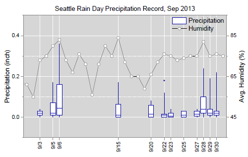
Is there a way to generate box plot with multiple y axes (left and right)? Or to have a box plot on left y -axis and a trendline on the secondary yaxis?
Accepted Solutions

- Mark as New
- Bookmark
- Subscribe
- Mute
- Subscribe to RSS Feed
- Get Direct Link
- Report Inappropriate Content
Re: Is there a way to generate box plot with multiple y axes (left and right)? Or to have a box plot on left y -axis and a trendline on the secondary yaxis?
The type of graph you show in your example is fairly easy to do in Graph Builder once you know how to add all of the elements you want. I have never had to generate a graph like this since we started using JMP here, but I used an existing data set from one of my projects to see just how such a graph could be set up and it was pretty straightforward. (Well, straightforward in as much as I have learned much more about how Graph Builder works beyond basic functionality over the past few months.)

In the example above I plotted read rate and exclusion rate statistics for multiples replicates of a study. As in your example above, I have boxplots for the read rates—the metric that our client is most interested in—and a line graph of mean exclusion rates—a metric that the survey team quickly realized could bias performance. Creating this graph required the following steps:
- Drag the Replication variable to the x-axis.
- Drag the Read Rate and Exclusion Rate variables to the y-axis as the responses.
- Select Box Plot as the graph type.
- In the Elements Properties panel for Box Plot uncheck the variable Exclusion Rate.
- Right-click on the y-axis title and select Move Right > Exclusion Rate. The exclusion rate will appear as a second y-axis on the right of the graph.
- Right-click in the plot area and select Add > Line (right) to add a line chart of the mean exclusion rates.
- Right-click in the plot area and select Add > Points (right) to add the exclusion rate data points.
- In the Elements Properties panel for Points (right) change the Summary Statistic to Mean.
That procedure was the basic setup for the graph producing a box plot for read rates and a line graph with points of the mean exclusion rates. I cleaned the graph up by balancing the y-axes so that the gridlines were in sync and there was minimum interference between the two responses. I also contrasted the read rate and exclusion rate graphs by making the boxplots and outliers blue for the read rates and, then the points and line for the mean exclusion rates red.
- Mark as New
- Bookmark
- Subscribe
- Mute
- Subscribe to RSS Feed
- Get Direct Link
- Report Inappropriate Content
Re: Is there a way to generate box plot with multiple y axes (left and right)? Or to have a box plot on left y -axis and a trendline on the secondary yaxis?
Experiment with Graph Builder. When you have multiple Ys you can right click and send one over to the right.
- Mark as New
- Bookmark
- Subscribe
- Mute
- Subscribe to RSS Feed
- Get Direct Link
- Report Inappropriate Content
Re: Is there a way to generate box plot with multiple y axes (left and right)? Or to have a box plot on left y -axis and a trendline on the secondary yaxis?
The type of graph you show in your example is fairly easy to do in Graph Builder once you know how to add all of the elements you want. I have never had to generate a graph like this since we started using JMP here, but I used an existing data set from one of my projects to see just how such a graph could be set up and it was pretty straightforward. (Well, straightforward in as much as I have learned much more about how Graph Builder works beyond basic functionality over the past few months.)
In the example above I plotted read rate and exclusion rate statistics for multiples replicates of a study. As in your example above, I have boxplots for the read rates—the metric that our client is most interested in—and a line graph of mean exclusion rates—a metric that the survey team quickly realized could bias performance. Creating this graph required the following steps:
- Drag the Replication variable to the x-axis.
- Drag the Read Rate and Exclusion Rate variables to the y-axis as the responses.
- Select Box Plot as the graph type.
- In the Elements Properties panel for Box Plot uncheck the variable Exclusion Rate.
- Right-click on the y-axis title and select Move Right > Exclusion Rate. The exclusion rate will appear as a second y-axis on the right of the graph.
- Right-click in the plot area and select Add > Line (right) to add a line chart of the mean exclusion rates.
- Right-click in the plot area and select Add > Points (right) to add the exclusion rate data points.
- In the Elements Properties panel for Points (right) change the Summary Statistic to Mean.
That procedure was the basic setup for the graph producing a box plot for read rates and a line graph with points of the mean exclusion rates. I cleaned the graph up by balancing the y-axes so that the gridlines were in sync and there was minimum interference between the two responses. I also contrasted the read rate and exclusion rate graphs by making the boxplots and outliers blue for the read rates and, then the points and line for the mean exclusion rates red.
Recommended Articles
- © 2026 JMP Statistical Discovery LLC. All Rights Reserved.
- Terms of Use
- Privacy Statement
- Contact Us