- Subscribe to RSS Feed
- Mark Topic as New
- Mark Topic as Read
- Float this Topic for Current User
- Bookmark
- Subscribe
- Mute
- Printer Friendly Page
Discussions
Solve problems, and share tips and tricks with other JMP users.- JMP User Community
- :
- Discussions
- :
- Is there a way to display 95th, 90th 75th, 50th, 25th, 10th and 5th percentiles ...
- Mark as New
- Bookmark
- Subscribe
- Mute
- Subscribe to RSS Feed
- Get Direct Link
- Report Inappropriate Content
Is there a way to display 95th, 90th 75th, 50th, 25th, 10th and 5th percentiles in box plots in graph builder or one way plots
In my work we display 95th, 90th 75th, 50th, 25th, 10th and 5th percentiles + the mean in our box plots in excel (which is painful and time consuming) – is there a way of replicating this in JMP oneway or graph builder?
andrew.botfield@geochemistry.com.au
- Mark as New
- Bookmark
- Subscribe
- Mute
- Subscribe to RSS Feed
- Get Direct Link
- Report Inappropriate Content
Re: Is there a way to display 95th, 90th 75th, 50th, 25th, 10th and 5th percentiles in box plots in graph builder or one way plots
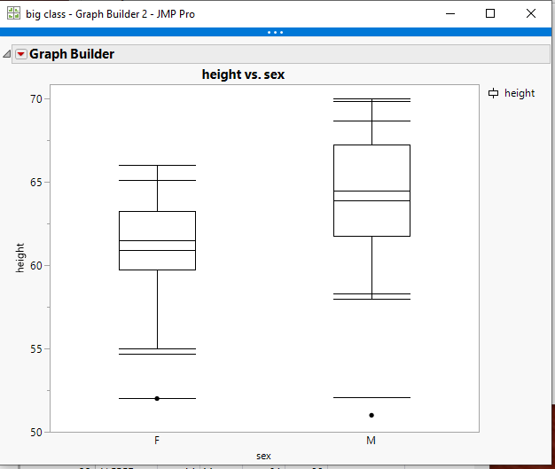
There is not a selectable way to do this, but by adding a simple script to the output, it can be done. Below is a script that adds in the .05,.10,mean,.90 & .95 lines. The .25, .5 and .75 are automatically generated with the Box Plot
Here is the script
names default to here(1);
dt=open("$SAMPLE_DATA/big class.jmp");

// Get the statistics
Summarize(
	dt,
	byGroup = By( :sex ),
	p05 = Quantile( :height, .05 ),
	p10 = Quantile( :height, .10 ),
	p90 = Quantile( :height, .90 ),
	p95 = Quantile( :height, .95 ),
	mean = Mean( :height )
);

gb = Graph Builder(
	Size( 528, 450 ),
	Show Control Panel( 0 ),
	Variables( X( :sex ), Y( :height ) ),
	Elements( Box Plot( X, Y, Legend( 6 ) ) )
);

statList = {"p05", "p10", "mean", "p90",
"p95"};


Report( gb )[FrameBox( 1 )] <<
Add Graphics Script(
	Pen Color( Black );
	For( s = 1, s <= N Items( statList ), s++,
		myMat = Eval( Parse( statList[s] ) );
		For( i = 1, i <= 2, i++,
			matx = [0, 0];
			matx[1] = Matrix( i - 1 - .18 );
			matx[2] = i - 1 + .18;
			maty = [0, 0];
			matY[1] = Matrix( myMat[i] );
			matY[2] = Matrix( myMat[i] );
			Line( matx, maty );
		);
	);
);- Mark as New
- Bookmark
- Subscribe
- Mute
- Subscribe to RSS Feed
- Get Direct Link
- Report Inappropriate Content
Re: Is there a way to display 95th, 90th 75th, 50th, 25th, 10th and 5th percentiles in box plots in graph builder or one way plots
- Mark as New
- Bookmark
- Subscribe
- Mute
- Subscribe to RSS Feed
- Get Direct Link
- Report Inappropriate Content
Re: Is there a way to display 95th, 90th 75th, 50th, 25th, 10th and 5th percentiles in box plots in graph builder or one way plots
1. How to specify different colours for different groups of stats added? (e.g. mean versus the quantile values)
2. How to change thickness of displayed lines?
3. Is there an easy way to display the newly added stats on the graph? (i.e. as captions, etc)
4. Is there an easy way to remove the outlier whiskers and replace with new stat whiskers?
- Mark as New
- Bookmark
- Subscribe
- Mute
- Subscribe to RSS Feed
- Get Direct Link
- Report Inappropriate Content
Re: Is there a way to display 95th, 90th 75th, 50th, 25th, 10th and 5th percentiles in box plots in graph builder or one way plots
All of your questions, except for the whiskers question are answered in the Scripting Index.
Help==>Scripting Index
If you scroll down the list of objects and functions on the left hand side, you will find a selection called Graphics. If you click on it, it will expose all of the graphical functions that can be used.
Concerning the Whiskers, they can only be changed in color and line thickness, and the color and thickness will be for the entire box plot.
If you chose to do so, you can just use a Graph Box() and draw your own box plots.
- Mark as New
- Bookmark
- Subscribe
- Mute
- Subscribe to RSS Feed
- Get Direct Link
- Report Inappropriate Content
Re: The script only displays whiskers on one of the X variables - but the same script example displays for both sexes
Hi Jim,
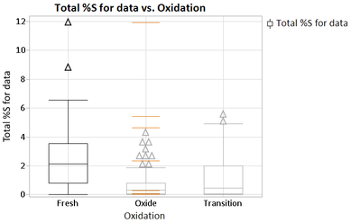
Using the text below I only get whiskers on one of the X variables - what modifications would you make to the script below to make it display on all of X variables - also see attached - thanks in advance for your help!
Names Default To Here( 1 );

dt = Open( "Insitu Compiled.jmp" );

// Get the statistics
Summarize(
    dt,
    byGroup = By( :Oxidation ),
    p05 = Quantile( :Total %S for data, .05 ),
    p10 = Quantile( :Total %S for data, .10 ),
    p90 = Quantile( :Total %S for data, .90 ),
    p95 = Quantile( :Total %S for data, .95 ),
    Mean = Mean( :Total %S for data, ),
    Min = Min( :Total %S for data, ),
    Max = Max( :Total %S for data, )
);

gb = Graph Builder(
    Size( 528, 450 ),
    Show Control Panel( 0 ),
    Variables( X( :Oxidation ), Y( :Total %S for data ) ),
    Elements( Box Plot( X, Y, Legend( 6 ) ) )
);

statList = {"p05", "p10", "p90", "p95", "Mean", "Min", "Max"};

Report( gb )[FrameBox( 1 )] << Add Graphics Script(
    Pen Color( orange );
    Pen Size( 1 );
    Line Style( "Solid" );
    For( s = 1, s <= N Items( statList ), s++,
        myMat = Eval( Parse( statList[s] ) );
        For( i = 1, i <= 2, i++,
            matx = [0, 0];
            matx[1] = Matrix( i - 1 - .18 );
            matx[2] = i - 1 + .18;
            maty = [0, 0];
            matY[1] = Matrix( myMat[i] );
            matY[2] = Matrix( myMat[i] );
            Line( matx, maty );
        );
    );
);
- Mark as New
- Bookmark
- Subscribe
- Mute
- Subscribe to RSS Feed
- Get Direct Link
- Report Inappropriate Content
Re: The script only displays whiskers on one of the X variables - but the same script example displays for both sexes
I figured it out – needed to delete rows at the bottom of the table and make the number 3 instead of 2 (which I assume is the number of X axis displays) – whoo!
For( i = 1, i <= 3, i++,
matx = [0, 0];
matx[1] = Matrix( i - 1 - .18 );
matx[2] = i - 1 + .18;
maty = [0, 0];
matY[1] = Matrix( myMat[i] );
matY[2] = Matrix( myMat[i] );
Line( matx, maty );
);
);
);
- Mark as New
- Bookmark
- Subscribe
- Mute
- Subscribe to RSS Feed
- Get Direct Link
- Report Inappropriate Content
Re: The script only displays whiskers on one of the X variables - but the same script example displays for both sexes
Change it to ......N Items(byGroup).....it will then become a generic setting
For( i = 1, i <= N Items( byGroup ), i++,
	matx = [0, 0];
	matx[1] = Matrix( i - 1 - .18 );
	matx[2] = i - 1 + .18;
	maty = [0, 0];
	matY[1] = Matrix( myMat[i] );
	matY[2] = Matrix( myMat[i] );
	Line( matx, maty );
);
- Mark as New
- Bookmark
- Subscribe
- Mute
- Subscribe to RSS Feed
- Get Direct Link
- Report Inappropriate Content
Re: The script only displays whiskers on one of the X variables - but the same script example displays for both sexes
excellent - thank you!
Recommended Articles
- © 2026 JMP Statistical Discovery LLC. All Rights Reserved.
- Terms of Use
- Privacy Statement
- Contact Us


