- Subscribe to RSS Feed
- Mark Topic as New
- Mark Topic as Read
- Float this Topic for Current User
- Bookmark
- Subscribe
- Mute
- Printer Friendly Page
Discussions
Solve problems, and share tips and tricks with other JMP users.- JMP User Community
- :
- Discussions
- :
- Is there a simple way to compare the density of response location (XY coordinate...
- Mark as New
- Bookmark
- Subscribe
- Mute
- Subscribe to RSS Feed
- Get Direct Link
- Report Inappropriate Content
Is there a simple way to compare the density of response location (XY coordinates on a touchscreen)?
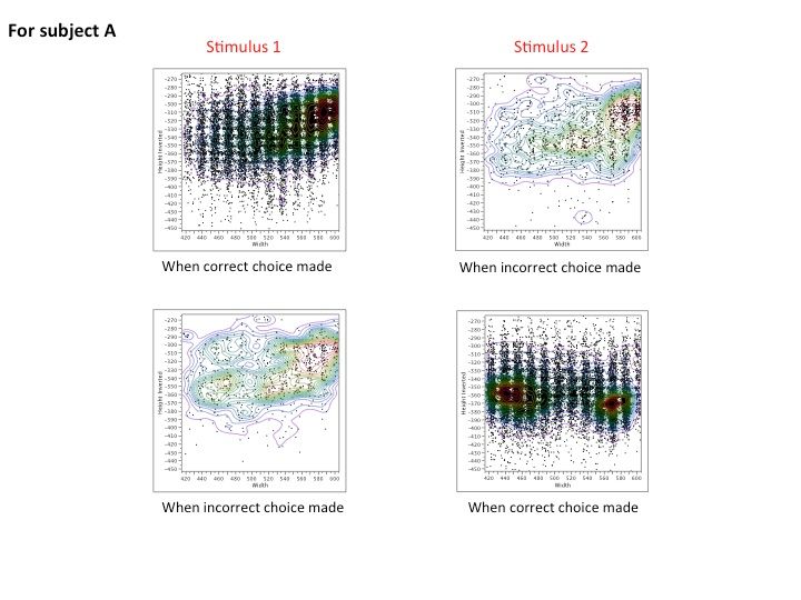
I have a data set made up of X and Y coordinates of responses made on a touchscreen when stimulus x, y, or z are presented. I have plotted these as three different scatterplots in JMP and have been able to get JMP to display nonpar density (colored "rings" denoting of 5% quantiles) to get an idea of response location density across the touchscreen. These appear as a kind of "heat map" that indicate there are differences in response location based on what stimulus you present a subject. How do I test this empirically? My advanced stats knowledge and R abilities are not so developed, so detailed responses would be very helpful.
As of now, I have run ANOVAs to compare the X coords between stimuli and the y coords between stimuli, but having these as separate comparisons seems a bit silly and is complicated to turn into an explanation of these response location plots.
I have attached an image showing the kind of plots I have generated in JMP. You can see that the shapes of the distributions are noticeably different.
- Mark as New
- Bookmark
- Subscribe
- Mute
- Subscribe to RSS Feed
- Get Direct Link
- Report Inappropriate Content
Re: Is there a simple way to compare the density of response location (XY coordinates on a touchscre
Stating the obvious perhaps, but ooking at the images, the dispersion of the points is complex. The nonparametric contors seem to be a good way to help tame this complexity. To my eyes at least, the difference for 'Stimulus 2' seem much more clear than that for 'Stimulus 1' (for Subject A at least). Which raises the question, how many subjects and stimuli do you have results for?
Before thinking about any empirical tests, I would look for consistencies in the difference between a 'correct' and an 'incorrect' choice, possibly for subsets of subjects and stimuli. Additionally, how is this classification made? The use of language suggests that there is only one correct choice, but possibly many incorrect choices.
- Mark as New
- Bookmark
- Subscribe
- Mute
- Subscribe to RSS Feed
- Get Direct Link
- Report Inappropriate Content
Re: Is there a simple way to compare the density of response location (XY coordinates on a touchscre
So I'll give you a brief rundown of the experiment itself. There are four subjects, each trained to discriminate beween two images (stim 1 and 2). They are presented with the image, make an observing response on the touch screen (from which we take the location data), and then two different colored choice keys appear on either side of the image. Correct choices (i.e. the green key for stim 1) are "rewarded" and incorrect choices (i.e. the red key for stim 1) are followed by a correction/repetition trial.
I am looking to see if the touch patterns from the observing response are indicative of the upcoming choice response. This seems plausible as there are distinct distributions between stimuli, and even (to a lesser extent) between correct and incorrect responses for each stimulus. The ideal would be that correct choice response distributions differ in location. It would also be interesting if the incorrect choice response distributions then matched the correct choice for the other stimulus (like a misclassification).
At this point, different response distributions have arisen for each subject, making this a within subjects "analysis." The only between subjects investigation is whether all subjects display some sort of predictive response pattern.
I hope this makes sense, please let me know if you have follow-up questions.
Recommended Articles
- © 2026 JMP Statistical Discovery LLC. All Rights Reserved.
- Terms of Use
- Privacy Statement
- Contact Us

