- New to JMP? Let the Data Analysis Director guide you through selecting an analysis task, an analysis goal, and a data type. Available now in the JMP Marketplace!
- See how to install JMP Marketplace extensions to customize and enhance JMP.
- Subscribe to RSS Feed
- Mark Topic as New
- Mark Topic as Read
- Float this Topic for Current User
- Bookmark
- Subscribe
- Mute
- Printer Friendly Page
Discussions
Solve problems, and share tips and tricks with other JMP users.- JMP User Community
- :
- Discussions
- :
- Is it possible to create a many-to-many slope graph in JMP?
- Mark as New
- Bookmark
- Subscribe
- Mute
- Subscribe to RSS Feed
- Get Direct Link
- Report Inappropriate Content
Is it possible to create a many-to-many slope graph in JMP?
Hi everyone. I have attached a really cool graphic from a book by Tim Leong called Super Graphic: A Visual Guide to the Comic Book Universe. I think this type of graphic is called a "slope graph", although there may be other names. This graphic uses lines to illustrate either: a) the membership of single individuals to multiple groups, or b) the multi-individual composition of different groups.
In this example, the individuals are super heroes (e.g., Iron Man, Wolverine) and the groups are teams (e.g., the Avengers, X-men). This is a static graphic from a book, but I could imagine that this would be a very powerful way to interactively explore complex classification schemes that are hard to visualize otherwise. For example, I would love to create a graph like this to show habitat relationships between different animal species (the individuals) and different forest types (the groups).
I'm wondering if there is a way to create something like this in JMP. @russ_wolfinger , you crushed the Venn Diagram challenge, I'm wondering if something like this might be of interest to you (or anyone else on this board).
Below is a small wish list of 5 desired characteristics for a graph like this. The most important feature would be for it to have two way interactivity (numbers 1 and 2 below). The other features would just make things ever easier to visualize (3) or to add additonal information about specific relationships (4-5):
1) clicking on an invididual (e.g., Wolverine), should highlight the lines that connect to all the groups Wolverine is a member of (X-Men, Avengers, etc.)
2) clicking on a group (e.g., X-men) should highlight the lines that connet to each of the invididuals in that group (e.g., Wolverine, Cyclops, Storm, etc.).
3) standard interactivity found in graph builder would be very helpful (selection links to the data table, local data filters, etc.).
4) it would be great to be able to color the lines by the value of a categorical variable other than the ones used to make lists (e.g., line colors could indicate the sex or age group of individuals OR, from the group side, line colors could indicate whether groups are from the Marvel or DC universe).
5) it would be great to be able to use the value of a continuous variable to alter line width in order to illustrate the strength of a relationship (e.g., from the individual side, a thicker line would indicate more frequent membership in one group versus another OR, from the group size line thickness could indicate some quantitiative attribute associated with the group, like number of issues).
Check out the attached graphic. If something like this can already be built in JMP, and I just haven't figured it out yet, I'd love any advice.
Cheers,
Casey Lott
- Mark as New
- Bookmark
- Subscribe
- Mute
- Subscribe to RSS Feed
- Get Direct Link
- Report Inappropriate Content
Re: An updated question about slope graphs/parallel plots with multiple response data
This is very strange indeed! Are you using a Mac or Windows machine? Perhaps there is some difference in how that forced blank is rendered.
- Mark as New
- Bookmark
- Subscribe
- Mute
- Subscribe to RSS Feed
- Get Direct Link
- Report Inappropriate Content
Re: An updated question about slope graphs/parallel plots with multiple response data
Thanks to anyone who can help.
- Mark as New
- Bookmark
- Subscribe
- Mute
- Subscribe to RSS Feed
- Get Direct Link
- Report Inappropriate Content
Re: An updated question about slope graphs/parallel plots with multiple response data
Interesting, this must be a mac and windows difference in how that character is rendered. Here's something to try: edit the formula for that column. It will appear as though there is no special characters, but double click in the formula to edit the jsl. There will appear to be a special character in there. Here's how it looks on my mac:
Delete that character and replace it with the escape character blank
Close the formula and try the plot again. I'm thinking that windows and mac resolve that special space in their own way, and aren't functionally equivalent cross platform.
As for changing the size, the easiest way in this case is to scale all fonts using the view menu > decrease font size.
- Mark as New
- Bookmark
- Subscribe
- Mute
- Subscribe to RSS Feed
- Get Direct Link
- Report Inappropriate Content
Re: An updated question about slope graphs/parallel plots with multiple response data
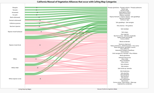
Hello again. With the help of @jules I've been able to accomplish most of what I'd like with this graph (see below). I still haven't been able to figure out how to get the escape character to STOP showing up in the graph. I tried the suggestion of replacing it with a blank space, but this just removed all of the category labels. Bummer.
There are two more things I noticed as I worked on this graph that I'll probably add to the wish list for this graph type... If I'm missing something here and what I am suggesting really can be done, please let me know how, and I won't put it on the suggestion list...
First, I couldn't find any way to control line width. I think this graph would be easier to read if the lines were thinner than what I ended up with. The graph> marker size controls didn't work for this and I couldn't think of any other way to do this. It would be nice if there was a "line size" slider for this type of graph located right next to the "line curve" slider.
Second. I had pre-determined sort orders that I wanted to apply, independently, to both x variables. Because the "sort" drop zone in graph builder only seems to work for the left x variable in this graph type I had to use value ordering, which took a while, to achieve the desired sort order. If there was a way to use one column value to sort the left x variable and another column value to sort the right x variable, this would have saved some time and been less prone to the type of manual sort errors that can creep in with long lists when using value ordering. The built in arrows to reverse the sort order for both the left and right x variables suggests that they can be sorted independently. I just couldn't figure out how to use column variables to do this.
I've attached the JMP table, with the graph script save to it, in case anyone with a windows machine wants to see if they can replicate the escape character problem or look for solutions to the other issues raised here. As usual, this community is really fantastic when it comes to figuring things out like this. Thank you, all.
- Mark as New
- Bookmark
- Subscribe
- Mute
- Subscribe to RSS Feed
- Get Direct Link
- Report Inappropriate Content
Re: An updated question about slope graphs/parallel plots with multiple response data
Hi @caseylott,
In your table it looks like the escape character isn't entered correctly --
But, perhaps that was intentional as a holding space as you try other things? It's strange that adding the special space to the text would result in it being entirely blank. When you typed in the jsl in the formula editor jsl window, was it exactly this?
:CalVegName || " \!b"As for changing the line width, normally with a parallel plot this is controlled by right clicking the graph > Customize, then change the settings for the Parallel Plot item. This does not appear to work in this case because with only categorical variables jmp is combining the sets and sizing automatically to fill the available space. Accordingly, you could affect the relative sizing of the lines to text by expanding or contracting the window, and then changing the font size.
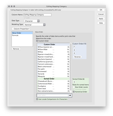
Finally, the ordering of categorical columns is always controlled datatable-wide with the column property of Value Ordering. Right click in the data table whichever column you wish to set ordering for, go to column properties, then value order. There you can set the custom order, or allow the ordering to be sorted naturally (via an alpha sort).
I hope this helps get you closer!
- Mark as New
- Bookmark
- Subscribe
- Mute
- Subscribe to RSS Feed
- Get Direct Link
- Report Inappropriate Content
Re: An updated question about slope graphs/parallel plots with multiple response data
You were right. The text in my formula editor was something I was trying out. When it looks exactly as you specified, I get the empty rectangle in the graph instead of the characters. See below. Either way, I can't seem to get an absence of characters to show up. Every time I type in \!b and apply the change in formula editor, this ends up being replaced by the following when I open the formula editor...
:CalVegName || " "
When I double click to edit this, I see the following...
:CalVegName || " BS"
- Mark as New
- Bookmark
- Subscribe
- Mute
- Subscribe to RSS Feed
- Get Direct Link
- Report Inappropriate Content
Re: An updated question about slope graphs/parallel plots with multiple response data
- Mark as New
- Bookmark
- Subscribe
- Mute
- Subscribe to RSS Feed
- Get Direct Link
- Report Inappropriate Content
Re: Is it possible to create a many-to-many slope graph in JMP?
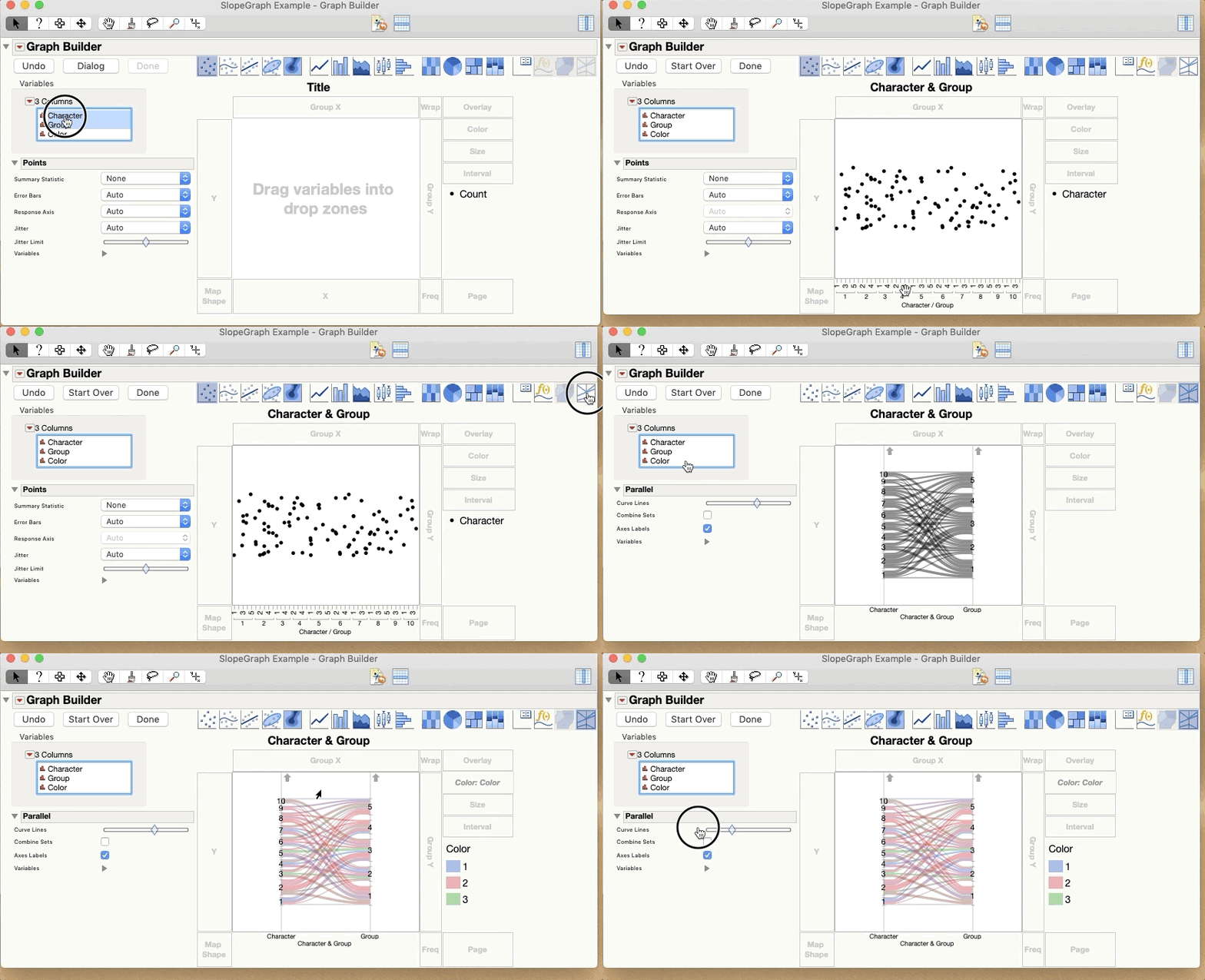
Sure, another name for this is a Parallel Plot. Graph Builder makes these already.
Drag Character and Group to the X axis and then click the Parallel Plot element 
Attached is a sample data table with a script to create this graph.Sorry I couldn't get the actual data for superheroes and teams.
- Mark as New
- Bookmark
- Subscribe
- Mute
- Subscribe to RSS Feed
- Get Direct Link
- Report Inappropriate Content
Re: Is it possible to create a many-to-many slope graph in JMP?
That's a good idea.
- « Previous
-
- 1
- 2
- Next »
Recommended Articles
- © 2026 JMP Statistical Discovery LLC. All Rights Reserved.
- Terms of Use
- Privacy Statement
- Contact Us


