- New to JMP? Join us Sept. 23-24 for the Early User Edition of Discovery Summit, tailor-made for new users. Register now for free!
- Your voice matters! Tell us how you prefer to receive JMP updates, so we can tailor our communication to your needs. Take short survey.
- See how to access JMP Marketplace - and - find, create & share add-ins to extend your JMP. Watch video.
- Subscribe to RSS Feed
- Mark Topic as New
- Mark Topic as Read
- Float this Topic for Current User
- Bookmark
- Subscribe
- Mute
- Printer Friendly Page
Discussions
Solve problems, and share tips and tricks with other JMP users.- JMP User Community
- :
- Discussions
- :
- Is it possible to create a many-to-many slope graph in JMP?

- Mark as New
- Bookmark
- Subscribe
- Mute
- Subscribe to RSS Feed
- Get Direct Link
- Report Inappropriate Content
Is it possible to create a many-to-many slope graph in JMP?
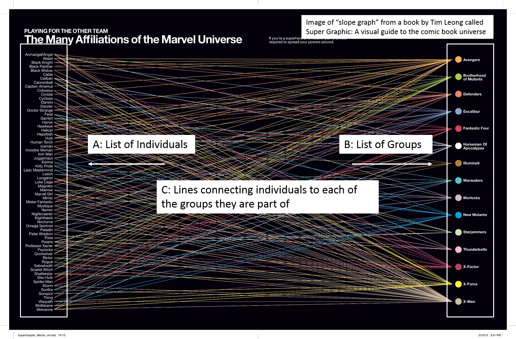
Hi everyone. I have attached a really cool graphic from a book by Tim Leong called Super Graphic: A Visual Guide to the Comic Book Universe. I think this type of graphic is called a "slope graph", although there may be other names. This graphic uses lines to illustrate either: a) the membership of single individuals to multiple groups, or b) the multi-individual composition of different groups.
In this example, the individuals are super heroes (e.g., Iron Man, Wolverine) and the groups are teams (e.g., the Avengers, X-men). This is a static graphic from a book, but I could imagine that this would be a very powerful way to interactively explore complex classification schemes that are hard to visualize otherwise. For example, I would love to create a graph like this to show habitat relationships between different animal species (the individuals) and different forest types (the groups).
I'm wondering if there is a way to create something like this in JMP. @russ_wolfinger , you crushed the Venn Diagram challenge, I'm wondering if something like this might be of interest to you (or anyone else on this board).
Below is a small wish list of 5 desired characteristics for a graph like this. The most important feature would be for it to have two way interactivity (numbers 1 and 2 below). The other features would just make things ever easier to visualize (3) or to add additonal information about specific relationships (4-5):
1) clicking on an invididual (e.g., Wolverine), should highlight the lines that connect to all the groups Wolverine is a member of (X-Men, Avengers, etc.)
2) clicking on a group (e.g., X-men) should highlight the lines that connet to each of the invididuals in that group (e.g., Wolverine, Cyclops, Storm, etc.).
3) standard interactivity found in graph builder would be very helpful (selection links to the data table, local data filters, etc.).
4) it would be great to be able to color the lines by the value of a categorical variable other than the ones used to make lists (e.g., line colors could indicate the sex or age group of individuals OR, from the group side, line colors could indicate whether groups are from the Marvel or DC universe).
5) it would be great to be able to use the value of a continuous variable to alter line width in order to illustrate the strength of a relationship (e.g., from the individual side, a thicker line would indicate more frequent membership in one group versus another OR, from the group size line thickness could indicate some quantitiative attribute associated with the group, like number of issues).
Check out the attached graphic. If something like this can already be built in JMP, and I just haven't figured it out yet, I'd love any advice.
Cheers,
Casey Lott

Accepted Solutions

- Mark as New
- Bookmark
- Subscribe
- Mute
- Subscribe to RSS Feed
- Get Direct Link
- Report Inappropriate Content
Re: Is it possible to create a many-to-many slope graph in JMP?
Hi @caseylott,
Perhaps a Parallel Coordinate plot in Graph Builder? Drag two or more variables to the X-axis, and click the Parallel Coordinate Plot element at the end of the ribbon. Here's an example with data far less interesting than super heros:

All the native graph builder functionality, and with some basic modifications you can get it looking a bit snappier.

*Update: I couldn't resist going out to find some superhero data. Here's an example with the 72 Marvel characters who make more than 500 appearances, showing their hair color, with lines colored by that color (as best I could).

- Mark as New
- Bookmark
- Subscribe
- Mute
- Subscribe to RSS Feed
- Get Direct Link
- Report Inappropriate Content
An updated question about slope graphs/parallel plots with multiple response data
Hello @jules , @Jeff_Perkinson , @Chris_Kirchberg , and others.
I loved Julian's solution to this original question. Now, I have a wrinkle. I would like to create a set of graphs that illustrate differences between different classification systems for vegetation that have different thematic resolutions and numbers of categories. The issue here is that relationships among classification systems can be one to one (rarely), one to many, or even many to many. The parallel plot such a nice solution to this problem. I've attached a jmp data table with a graph builder script illustrating my first attempt (an image of the graph is below). The way that my data have been compiled, each row has information for a single "plant alliance" according to the California Manual of Vegetation. The columns then have a number of different multiple response fields that record relationships between CMV plant alliances and other vegetation classification systems. When I drag two multiple response fields to the x axis to make a parallel plot, I'd like each value on the parallel x axes to represent a single category (e.g., "Riparian Mixed Shrub" on the left x axis or "Valley Foothill Riparian" on the right x axis). Instead, each combination of multiple response values is showing up as a unique value (e.g., the right x axis has values for "Valley foothill riparian", "Montane riparian, Valley Foothill Riparian", "Fresh emergent wetland, Valley Foothill riparian", etcetera). Is there an easy way to get graph builder to group each axis by the values in multiple response fields, no matter where they appear in the comma delimited sequence? Thanks in advance to anyone who can help. Casey


- Mark as New
- Bookmark
- Subscribe
- Mute
- Subscribe to RSS Feed
- Get Direct Link
- Report Inappropriate Content
Re: Is it possible to create a many-to-many slope graph in JMP?
Hi @caseylott ,
Why yes there is. In Graph Builder you can use the Parallel Plot option. Put two variables on the X-axis at the same time and then click this button. See example (very simple version) below.

Or use the Parallel Plot platform under Graph. See below example:

Best,
Data Scientist, Life Sciences - Global Technical Enablement
JMP Statistical Discovery, LLC. - Denver, CO
Tel: +1-919-531-9927 ▪ Mobile: +1-303-378-7419 ▪ E-mail: [email protected]
www.jmp.com
- Mark as New
- Bookmark
- Subscribe
- Mute
- Subscribe to RSS Feed
- Get Direct Link
- Report Inappropriate Content
Re: Is it possible to create a many-to-many slope graph in JMP?
Hi @caseylott,
Perhaps a Parallel Coordinate plot in Graph Builder? Drag two or more variables to the X-axis, and click the Parallel Coordinate Plot element at the end of the ribbon. Here's an example with data far less interesting than super heros:
All the native graph builder functionality, and with some basic modifications you can get it looking a bit snappier.
*Update: I couldn't resist going out to find some superhero data. Here's an example with the 72 Marvel characters who make more than 500 appearances, showing their hair color, with lines colored by that color (as best I could).
- Mark as New
- Bookmark
- Subscribe
- Mute
- Subscribe to RSS Feed
- Get Direct Link
- Report Inappropriate Content
Re: Is it possible to create a many-to-many slope graph in JMP?
Wow. Thank you @jules and @Chris_Kirchberg and JMP for being so awesome! If only all of the questions I had in life could be answered so promptly! Much gratitude.
Casey
- Mark as New
- Bookmark
- Subscribe
- Mute
- Subscribe to RSS Feed
- Get Direct Link
- Report Inappropriate Content
An updated question about slope graphs/parallel plots with multiple response data
Hello @jules , @Jeff_Perkinson , @Chris_Kirchberg , and others.
I loved Julian's solution to this original question. Now, I have a wrinkle. I would like to create a set of graphs that illustrate differences between different classification systems for vegetation that have different thematic resolutions and numbers of categories. The issue here is that relationships among classification systems can be one to one (rarely), one to many, or even many to many. The parallel plot such a nice solution to this problem. I've attached a jmp data table with a graph builder script illustrating my first attempt (an image of the graph is below). The way that my data have been compiled, each row has information for a single "plant alliance" according to the California Manual of Vegetation. The columns then have a number of different multiple response fields that record relationships between CMV plant alliances and other vegetation classification systems. When I drag two multiple response fields to the x axis to make a parallel plot, I'd like each value on the parallel x axes to represent a single category (e.g., "Riparian Mixed Shrub" on the left x axis or "Valley Foothill Riparian" on the right x axis). Instead, each combination of multiple response values is showing up as a unique value (e.g., the right x axis has values for "Valley foothill riparian", "Montane riparian, Valley Foothill Riparian", "Fresh emergent wetland, Valley Foothill riparian", etcetera). Is there an easy way to get graph builder to group each axis by the values in multiple response fields, no matter where they appear in the comma delimited sequence? Thanks in advance to anyone who can help. Casey
- Mark as New
- Bookmark
- Subscribe
- Mute
- Subscribe to RSS Feed
- Get Direct Link
- Report Inappropriate Content
Re: An updated question about slope graphs/parallel plots with multiple response data
Hi @caseylott,
At this time Graph Builder does not support the Multiple Response modeling type, but, we can restructure your table to expand those multiple responses fairly quickly using a few different features of jmp. Here's where we are headed, a table with each combination that occurred:

Which will let us build your Parallel Plot in Graph Builder as before, but now with all levels represented uniquely:

Here's how I can think to get there (and maybe others have a faster solution I didn't think of!):
1. After selecting CWHR and CalVeg, I subset your original table to include just the columns of interest (it's much less confusing this way the first time):

2. With both columns selected, I used Col > Utilities > Text to Columns, and put in "," as the delimiter, to separate out the entries in each column:

This gives us:

3. We need to do two separate stacks to get the rows now in the right format (and we cannot do this as a multiple series stack). First, let's tackle CWHR. Here is the exact setup:

This gives us:

Don't worry about the blank rows, we'll tackle those in a minute. Let's do the next stack for CalVeg:

This gives us:

You will have blanks cells, so let's clear those out. I like to right click an empty cell > select matching, and then delete the selected rows. Do that for a blank cell in each column, and have the final, clean data table of the 91 combinations of occurrences.


Is this what you were aiming for? I hope it helps!
- Mark as New
- Bookmark
- Subscribe
- Mute
- Subscribe to RSS Feed
- Get Direct Link
- Report Inappropriate Content
Re: An updated question about slope graphs/parallel plots with multiple response data
Hey @jules . Thanks for your response. I've been using JMPs many table manipulation features to do this kind of data restructuring for years and the path you suggest makes perfect sense to me. However, it would be really great if graph builder could support multi-response data types to avoid this extra work. If this hasn't been suggested as a new feature, I'd love to see this happen. I've been increasingly asked to store data in this type of multi-response format instead of the type of staked tables you illustrate, which I've been using most of my career. When I was younger, I was told that storing more than one piece of data in any one field was a sin. Somewhere along the way, this sin seems to have either been forgiven or embraced. Consequently, I've been grateful for this new data type in JMP in all contexts where I've been able to apply it so far. I'd be really happy that plans are in place to make this data type functional in graph builder, and not just for JMP Pro or Genomics :). Thanks again for your help.
- Mark as New
- Bookmark
- Subscribe
- Mute
- Subscribe to RSS Feed
- Get Direct Link
- Report Inappropriate Content
Re: An updated question about slope graphs/parallel plots with multiple response data
Thanks again for this. I can seem to figure how to have the left x axis labels appear entirely to the left of the graph lines and the right axis label entirely to the right. This seems like it should be simple. Any suggestions?
- Mark as New
- Bookmark
- Subscribe
- Mute
- Subscribe to RSS Feed
- Get Direct Link
- Report Inappropriate Content
Re: An updated question about slope graphs/parallel plots with multiple response data
HI @caseylott
I do not believe there are any controls available for the alignment of labels in the Parallel Plot. This, and your other suggestion for adding Multiple Response modeling type support for Graph Builder, are great JMP Wish List suggestions and I'd encourage you to submit them there.
As a temporary solution for the label alignment, you could add blank spaces to the beginning or ends of the labels to force a particular alignment, but I think that's a rather bad solution. Nonetheless, here that is in the attached table, which gives you this:

Just be sure to use the special blank space escape character ( \!b ) in the formula for the column that adds the spaces to the end of the string, otherwise, JMP will ignore them when plotting the labels.
- Mark as New
- Bookmark
- Subscribe
- Mute
- Subscribe to RSS Feed
- Get Direct Link
- Report Inappropriate Content
Re: An updated question about slope graphs/parallel plots with multiple response data
Thanks again @jules ,
Your solution will definitely work for now. I'll make the suggestion on the Wish List.
Quick question... when I ran the graph builder script on the table Expanded2 I ended up with a graph that looks different from yours. There is a unwanted rectangle character where the escape character \!b is applied (see below). Is there any way to get rid of this rectangle in the graph?
Casey

Recommended Articles
- © 2026 JMP Statistical Discovery LLC. All Rights Reserved.
- Terms of Use
- Privacy Statement
- Contact Us