- New to JMP? Let the Data Analysis Director guide you through selecting an analysis task, an analysis goal, and a data type. Available now in the JMP Marketplace!
- See how to install JMP Marketplace extensions to customize and enhance JMP.
- Subscribe to RSS Feed
- Mark Topic as New
- Mark Topic as Read
- Float this Topic for Current User
- Bookmark
- Subscribe
- Mute
- Printer Friendly Page
Discussions
Solve problems, and share tips and tricks with other JMP users.- JMP User Community
- :
- Discussions
- :
- Re: How to set changing upper/lower limit lines on graph builder
- Mark as New
- Bookmark
- Subscribe
- Mute
- Subscribe to RSS Feed
- Get Direct Link
- Report Inappropriate Content
How to set changing upper/lower limit lines on graph builder
Hello,
I have a simple Y vs X graph that the upper limit and lower limit are changing at different X values. Does anyone know how to do this on Graph Builder? or if there's a better way to do it?
Thanks,
Gary
- Mark as New
- Bookmark
- Subscribe
- Mute
- Subscribe to RSS Feed
- Get Direct Link
- Report Inappropriate Content
Re: How to set changing upper/lower limit lines on graph builder
Can you provide an example with Fit Y by X that you want to reproduce in Graph Builder? I'm not sure what you're referring to.
- Mark as New
- Bookmark
- Subscribe
- Mute
- Subscribe to RSS Feed
- Get Direct Link
- Report Inappropriate Content
Re: How to set changing upper/lower limit lines on graph builder
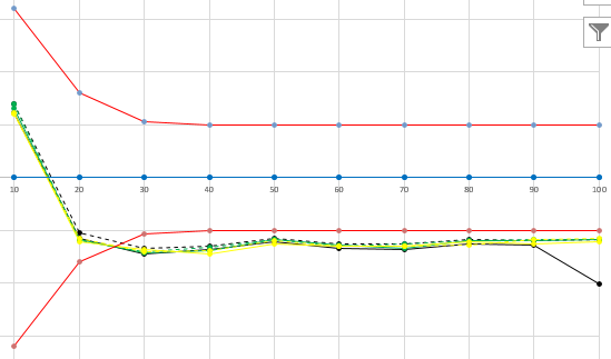
I'd like to produce something like attached with the two red lines being the reference lines changing against X.
- Mark as New
- Bookmark
- Subscribe
- Mute
- Subscribe to RSS Feed
- Get Direct Link
- Report Inappropriate Content
Re: How to set changing upper/lower limit lines on graph builder
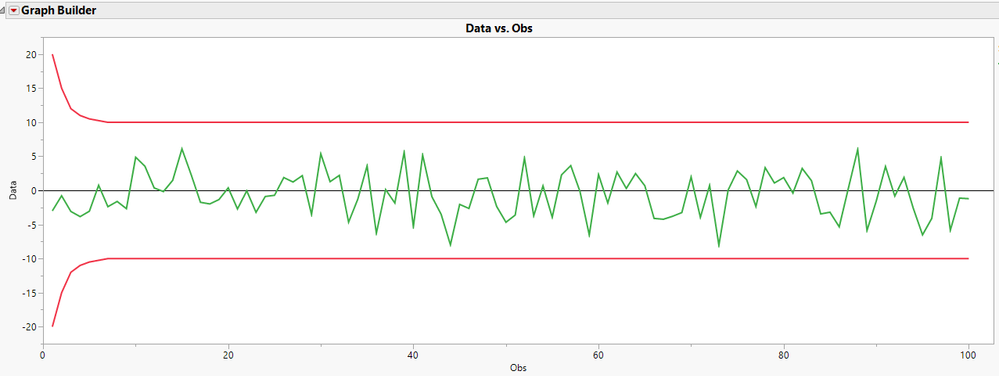
This looks like an UWMA control chart. You can get something like this in Graph Builder if you make the limits of X another series along with the actual data. Here's what the result looks like.
I made the series for the upper and lower limits and simulated data, then I stacked them to get them into a single column with labels. See the attached data tables.
- Mark as New
- Bookmark
- Subscribe
- Mute
- Subscribe to RSS Feed
- Get Direct Link
- Report Inappropriate Content
Re: How to set changing upper/lower limit lines on graph builder
Good idea! this should work for me! thanks!
Recommended Articles
- © 2026 JMP Statistical Discovery LLC. All Rights Reserved.
- Terms of Use
- Privacy Statement
- Contact Us


