- New to JMP? Let the Data Analysis Director guide you through selecting an analysis task, an analysis goal, and a data type. Available now in the JMP Marketplace!
- See how to install JMP Marketplace extensions to customize and enhance JMP.
- Subscribe to RSS Feed
- Mark Topic as New
- Mark Topic as Read
- Float this Topic for Current User
- Bookmark
- Subscribe
- Mute
- Printer Friendly Page
Discussions
Solve problems, and share tips and tricks with other JMP users.- JMP User Community
- :
- Discussions
- :
- Re: How to plot subset of rows together with different subset of same rows?
- Mark as New
- Bookmark
- Subscribe
- Mute
- Subscribe to RSS Feed
- Get Direct Link
- Report Inappropriate Content
How to plot subset of rows together with different subset of same rows?
Note: I'm trying to do this with the interface only. Haven't tried scripting yet.
I have multiple objects that have a bunch of measurements within each object. There are 6 objects total, numbered 1-6. Per each object, there are a few dozen rows. And the columns list various attributes. The short version of what I want to achieve is that I'd like to have the grouping feature, but instead of one group for each of the 6 objects, I'd like to split the groups up differently.
Longer description is as follows. I want to plot one of the attributes (values in one of the columns) for one of the objects and compare that same attribute for all the other objects on the same plot. Let's say I want to plot the values for object 1 in a scatter plot. I have the variable for the value I'm interested in on the y-axis and "Object 1" on the x-axis. Next to it I want to plot the values of all the other 5 objects in the same manner, but I want them clearly separated, so that it's obvious that Object 1 is in a separate group, while the other 5 objects are in a different group. This separation should be at least visual and ideally also allow me to apply separate statistics, like obtaining separate mean, etc., like how the grouping feature functions--the one that is activated by dragging a label to the top x-axis in Graph Builder.
Is the only method to come up with some new column and create a label for all the 5 objects as one category, and the 1 other object as another category, and then group them by those categories using the grouping feature?
- Mark as New
- Bookmark
- Subscribe
- Mute
- Subscribe to RSS Feed
- Get Direct Link
- Report Inappropriate Content
Re: How to plot subset of rows together with different subset of same rows?
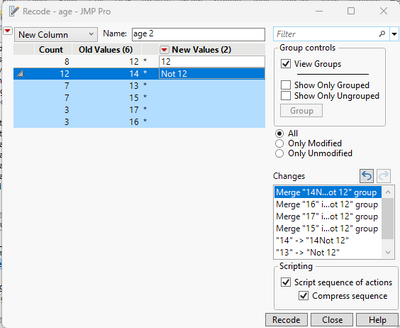
All you need to do is to create a new column, and in the new column. Try using Recode to do that
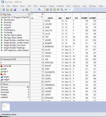
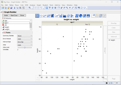
Here is an example using the Sample data table Big Class. The objective is to display all 12 year olds vs all non 12 year olds.
Then open Graph Builder and create your graph. Then drag the new column Age 2 to the X Group drop area
- Mark as New
- Bookmark
- Subscribe
- Mute
- Subscribe to RSS Feed
- Get Direct Link
- Report Inappropriate Content
Re: How to plot subset of rows together with different subset of same rows?
As a dynamic extension to what Jim recommends, my favorite way to do this is as follows:
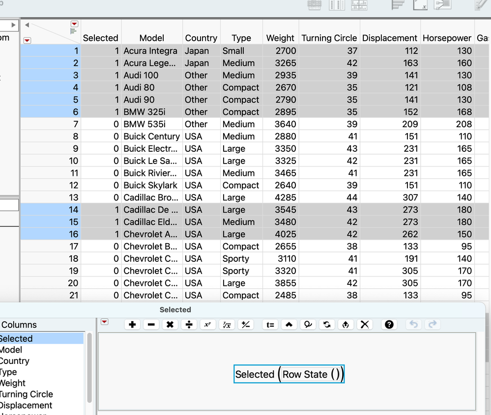
1) add a new column to the table, name it "Selected", make it nominal, and add to it the formula
Selected ( Row State ( ) )
This column will have 1 for any selected row, and 0 for any unselected row, and will update automatically as you make various selections.
2) In graph builder, drag this new "Selected" column to the x-axis.
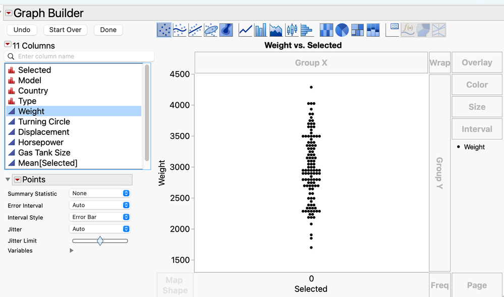
If you have no rows selected in your table, you'll get something like this:
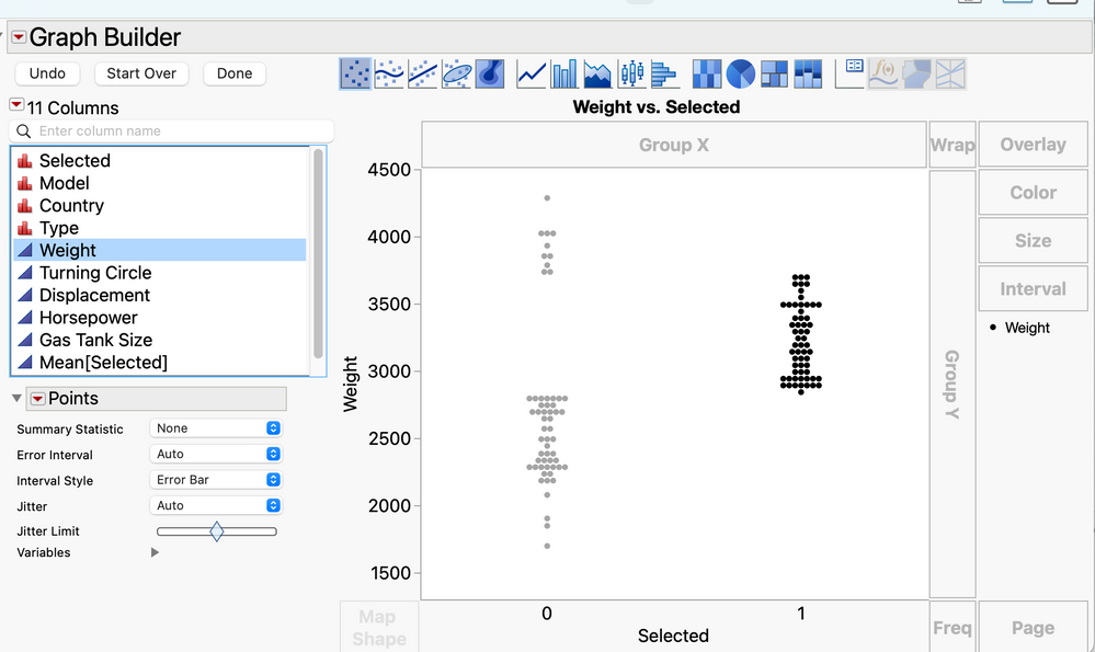
3) As soon as you select anything (even within this very graph), you'll get this:
Exactly HOW you make the selection, is completely up to you. You can make the selection whatever you wish, and you'll always see what you've selected, vs everything else.
- Mark as New
- Bookmark
- Subscribe
- Mute
- Subscribe to RSS Feed
- Get Direct Link
- Report Inappropriate Content
Re: How to plot subset of rows together with different subset of same rows?
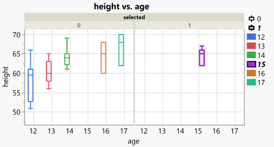
And if you want to compare one group with many others, you could put the selected() into GroupX to separate the selected group clearly from the other 5.
Names Default To Here( 1 );
dt = Open( "$SAMPLE_DATA/Big Class.jmp" );
New Column( "selected", Numeric, "Nominal", Formula( Selected() ) );
Graph Builder(
	Show Control Panel( 0 ),
	Variables(
		X( :age ),
		Y( :height ),
		Group X( :selected ),
		Overlay( :selected ),
		Color( :age )
	),
	Elements( Box Plot( X, Y, Legend( 14 ) ) ),
);Recommended Articles
- © 2026 JMP Statistical Discovery LLC. All Rights Reserved.
- Terms of Use
- Privacy Statement
- Contact Us

