- New to JMP? Let the Data Analysis Director guide you through selecting an analysis task, an analysis goal, and a data type. Available now in the JMP Marketplace!
- See how to install JMP Marketplace extensions to customize and enhance JMP.
- Subscribe to RSS Feed
- Mark Topic as New
- Mark Topic as Read
- Float this Topic for Current User
- Bookmark
- Subscribe
- Mute
- Printer Friendly Page
Discussions
Solve problems, and share tips and tricks with other JMP users.- JMP User Community
- :
- Discussions
- :
- How to plot data from two tables without combining the tables
- Mark as New
- Bookmark
- Subscribe
- Mute
- Subscribe to RSS Feed
- Get Direct Link
- Report Inappropriate Content
How to plot data from two tables without combining the tables
Hello World,
We do measurements in our lab and we always end up with multiple data tables which contain measured data and filtered data. For some practical reasons we do not want to combine the tables in order to plot the measured data and filtered data. Is it possible to plot the x y data from one table and the x y data from the other table on the same axis in a "Fit y by x" (jmp graph type) like scatter plot?
I am looking for the same flexibility Matlab offers with the plot function.
Scripting or explaination of how to acchief this with the JMP gui are both appreciated.
Accepted Solutions
- Mark as New
- Bookmark
- Subscribe
- Mute
- Subscribe to RSS Feed
- Get Direct Link
- Report Inappropriate Content
Re: How to plot data from two tables without combining the tables
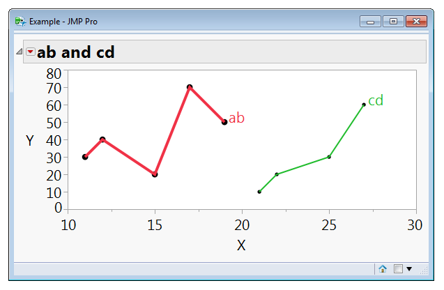
You can make your own graphs with JSL like this. Selecting points in the graphs will not select rows in the tables because copies of the data are used. If you need a legend you'll have to make that too, perhaps using text(...) as shown. You'll be missing some other features provided by different platforms (splines, fits) which may make other ideas that temporarily combine the tables look a lot better.
ab = New Table( "ab data",
    Add Rows( 4 ),
    New Column( "a", Numeric, "Continuous", Format( "Best", 12 ), Set Values( [11, 12, 15, 17, 19] ) ),
    New Column( "b", Numeric, "Continuous", Format( "Best", 12 ), Set Values( [30, 40, 20, 70, 50] ) )
);

cd = New Table( "cd data",
    Add Rows( 4 ),
    New Column( "c", Numeric, "Continuous", Format( "Best", 12 ), Set Values( [21, 22, 25, 27] ) ),
    New Column( "d", Numeric, "Continuous", Format( "Best", 12 ), Set Values( [10, 20, 30, 60] ) )
);

New Window( "Example",
    Graph Box(
        Y Scale( 0, 80 ),
        X Scale( 10, 30 ),
        FrameSize(500,200),
        Title( "ab and cd" ),
        // comma delimited parameters above, semicolon delimited statements below
        Pen Color( "red" );
        Text Color( "red" );
        Pen Size( 4 );
        Marker Size( 6 );
        Marker( ab:a[1 :: N Rows( ab )], ab:b[1 :: N Rows( ab )] );
        Line( ab:a[1 :: N Rows( ab )], ab:b[1 :: N Rows( ab )] );
        Text( {ab:a[N Rows( ab )], ab:b[N Rows( ab )]}, " ab" );
        Pen Color( "green" );
        Text Color( "green" );
        Pen Size( 2 );
        Marker Size( 3 );
        Marker( cd:c[1 :: N Rows( cd )], cd:d[1 :: N Rows( cd )] );
        Line( cd:c[1 :: N Rows( cd )], cd:d[1 :: N Rows( cd )] );
        Text( {cd:c[N Rows( cd )], cd:d[N Rows( cd )]}, " cd" );
    )
);
(There's a lot of repetition in this example; it is simpler than it looks.)

- Mark as New
- Bookmark
- Subscribe
- Mute
- Subscribe to RSS Feed
- Get Direct Link
- Report Inappropriate Content
Re: How to plot data from two tables without combining the tables
- Mark as New
- Bookmark
- Subscribe
- Mute
- Subscribe to RSS Feed
- Get Direct Link
- Report Inappropriate Content
Re: How to plot data from two tables without combining the tables
Thank you for the reaction,
unfortunately this is not what I am looking for, in my measurements there is not always a relation with the filtered data. Some values are excluded and considered as outliers. But I still would like to plot them and be aware of the outliers.
- Mark as New
- Bookmark
- Subscribe
- Mute
- Subscribe to RSS Feed
- Get Direct Link
- Report Inappropriate Content
Re: How to plot data from two tables without combining the tables
Something like this might work. The example below has 2 data tables, one with valid data and one with outliers. Then to use the 2 together, a new, "Private" data table is created, and the chart is run from it.
Names Default To Here( 1 );

// Create the data table with the good data
New Table( "Big Class",
	Add Rows( 36 ),
	New Column( "name",
		Character,
		"Nominal",
		Set Values(
			{"KATIE", "LOUISE", "JANE", "JACLYN", "LILLIE", "TIM", "JAMES", "BARBARA", "ALICE",
			"SUSAN", "JOHN", "JOE", "MICHAEL", "DAVID", "LESLIE", "CAROL", "PATTY", "FREDERICK",
			"HENRY", "LEWIS", "EDWARD", "CHRIS", "JEFFREY", "MARY", "AMY", "ROBERT", "WILLIAM",
			"CLAY", "MARK", "DANNY", "MARTHA", "MARION", "PHILLIP", "LINDA", "KIRK", "LAWRENCE"}
		)
	),
	New Column( "age",
		Numeric,
		"Ordinal",
		Set Values(
			[12, 12, 12, 12, 12, 12, 12, 13, 13, 13, 13, 13, 13, 13, 14, 14, 14, 14, 14, 14, 14,
			14, 14, 15, 15, 15, 15, 15, 15, 15, 16, 16, 16, 17, 17, 17]
		)
	),
	New Column( "sex",
		Character( 1 ),
		"Nominal",
		Set Values(
			{"F", "F", "F", "F", "F", "M", "M", "F", "F", "F", "M", "M", "M", "M", "F", "F", "F",
			"M", "M", "M", "M", "M", "M", "F", "F", "M", "M", "M", "M", "M", "F", "F", "M", "F",
			"M", "M"}
		)
	),
	New Column( "height",
		Numeric,
		"Continuous",
		Format( "Fixed Dec", 5, 0 ),
		Set Values(
			[59, 61, 55, 66, 52, 60, 61, 60, 61, 56, 65, 63, 58, 59, 65, 63, 62, 63, 65, 64, 68,
			64, 69, 62, 64, 67, 65, 66, 62, 66, 65, 60, 68, 62, 68, 70]
		)
	),
	New Column( "weight",
		Numeric,
		"Continuous",
		Format( "Fixed Dec", 5, 0 ),
		Set Values(
			[95, 123, 74, 145, 64, 84, 128, 112, 107, 67, 98, 105, 95, 79, 142, 84, 85, 93, 119,
			92, 112, 99, 113, 92, 112, 128, 111, 105, 104, 106, 112, 115, 128, 116, 134, 172]
		)
	),
	New Column( "source",
		Character,
		"Nominal",
		Set Values(
			{"Valid", "Valid", "Valid", "Valid", "Valid", "Valid", "Valid", "Valid", "Valid",
			"Valid", "Valid", "Valid", "Valid", "Valid", "Valid", "Valid", "Valid", "Valid",
			"Valid", "Valid", "Valid", "Valid", "Valid", "Valid", "Valid", "Valid", "Valid",
			"Valid", "Valid", "Valid", "Valid", "Valid", "Valid", "Valid", "Valid", "Valid"}
		)
	)
);

// Create the outlier data table
New Table( "Outliers",
	Add Rows( 4 ),
	New Column( "name",
		Character,
		"Nominal",
		Set Values( {"ROBERT", "JUDY", "ELIZABETH", "ALFRED"} )
	),
	New Column( "age",
		Numeric,
		"Ordinal",
		Format( "Fixed Dec", 5, 0 ),
		Set Values( [12, 14, 14, 14] )
	),
	New Column( "sex", Character( 1 ), "Nominal", Set Values( {"M", "F", "F", "M"} ) ),
	New Column( "height",
		Numeric,
		"Continuous",
		Format( "Fixed Dec", 5, 0 ),
		Set Values( [51, 61, 62, 64] )
	),
	New Column( "weight",
		Numeric,
		"Continuous",
		Format( "Fixed Dec", 5, 0 ),
		Set Values( [79, 81, 91, 99] )
	),
	New Column( "source",
		Character,
		"Nominal",
		Set Values( {"Outlier", "Outlier", "Outlier", "Outlier"} )
	)
);

// Display chart by creating a nondisplayed data table
p1 = Data Table( "Big Class" ) << Concatenate( Data Table( "Outliers" ), private );
p1 << color by column( :source );
p1 << Bivariate( Y( :height ), X( :weight ), Fit Line( {Line Color( {213, 72, 87} )} ) );
- Mark as New
- Bookmark
- Subscribe
- Mute
- Subscribe to RSS Feed
- Get Direct Link
- Report Inappropriate Content
Re: How to plot data from two tables without combining the tables
Jim, Thanks for the proposed sollution, this only works when the two columns in both tables have the same name. Actually I am looking for a solution where this is not the case. I can hear you ask why not change the column names :) I work with a lot of datasets containing in many cases different column names per project. I which there will be a jmp plotting function in the future which makes it possible to choose multiple x and y columns from multiple datatables.
- Mark as New
- Bookmark
- Subscribe
- Mute
- Subscribe to RSS Feed
- Get Direct Link
- Report Inappropriate Content
Re: How to plot data from two tables without combining the tables
You can make your own graphs with JSL like this. Selecting points in the graphs will not select rows in the tables because copies of the data are used. If you need a legend you'll have to make that too, perhaps using text(...) as shown. You'll be missing some other features provided by different platforms (splines, fits) which may make other ideas that temporarily combine the tables look a lot better.
ab = New Table( "ab data",
    Add Rows( 4 ),
    New Column( "a", Numeric, "Continuous", Format( "Best", 12 ), Set Values( [11, 12, 15, 17, 19] ) ),
    New Column( "b", Numeric, "Continuous", Format( "Best", 12 ), Set Values( [30, 40, 20, 70, 50] ) )
);

cd = New Table( "cd data",
    Add Rows( 4 ),
    New Column( "c", Numeric, "Continuous", Format( "Best", 12 ), Set Values( [21, 22, 25, 27] ) ),
    New Column( "d", Numeric, "Continuous", Format( "Best", 12 ), Set Values( [10, 20, 30, 60] ) )
);

New Window( "Example",
    Graph Box(
        Y Scale( 0, 80 ),
        X Scale( 10, 30 ),
        FrameSize(500,200),
        Title( "ab and cd" ),
        // comma delimited parameters above, semicolon delimited statements below
        Pen Color( "red" );
        Text Color( "red" );
        Pen Size( 4 );
        Marker Size( 6 );
        Marker( ab:a[1 :: N Rows( ab )], ab:b[1 :: N Rows( ab )] );
        Line( ab:a[1 :: N Rows( ab )], ab:b[1 :: N Rows( ab )] );
        Text( {ab:a[N Rows( ab )], ab:b[N Rows( ab )]}, " ab" );
        Pen Color( "green" );
        Text Color( "green" );
        Pen Size( 2 );
        Marker Size( 3 );
        Marker( cd:c[1 :: N Rows( cd )], cd:d[1 :: N Rows( cd )] );
        Line( cd:c[1 :: N Rows( cd )], cd:d[1 :: N Rows( cd )] );
        Text( {cd:c[N Rows( cd )], cd:d[N Rows( cd )]}, " cd" );
    )
);
(There's a lot of repetition in this example; it is simpler than it looks.)

- Mark as New
- Bookmark
- Subscribe
- Mute
- Subscribe to RSS Feed
- Get Direct Link
- Report Inappropriate Content
Re: How to plot data from two tables without combining the tables
Thanks for your response Craige_Hales,
As you already pointed out it is not possible to use the awsome feature of making selections in the graphs and directly see the corresponding relations in other graphs. I start to believe that there is not easy solution except for renaming the columns and merge the tables in order to get the data with all the features in a single graph.
Hopefully there will be a easy solution in a future release of jmp :)
- Mark as New
- Bookmark
- Subscribe
- Mute
- Subscribe to RSS Feed
- Get Direct Link
- Report Inappropriate Content
Re: How to plot data from two tables without combining the tables
Hi Craige,@Craige_Hales
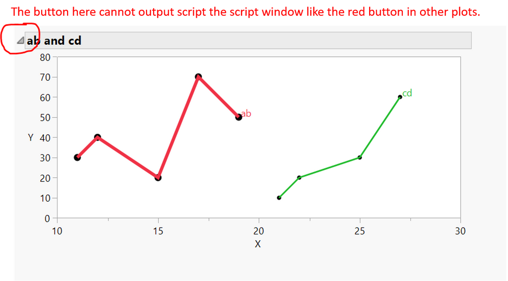
In this example, if we want to add the major grid and minor grid, how can we do it in the script? It seems that this new window graph cannot output the script. A picture is attached to show my question. My plot does not have the red triangle button like in your plot.
- Mark as New
- Bookmark
- Subscribe
- Mute
- Subscribe to RSS Feed
- Get Direct Link
- Report Inappropriate Content
Re: How to plot data from two tables without combining the tables
I like to use the xaxis() or yaxis() setters to pass the axis script to a graph. The video shows trimming the script to leave out the default bits so it doesn't look as complicated. Add Ref Lines to Graphs shows the xaxis and yaxis setters with a platform. Also this one .
Recommended Articles
- © 2026 JMP Statistical Discovery LLC. All Rights Reserved.
- Terms of Use
- Privacy Statement
- Contact Us


