- New to JMP? Let the Data Analysis Director guide you through selecting an analysis task, an analysis goal, and a data type. Available now in the JMP Marketplace!
- See how to install JMP Marketplace extensions to customize and enhance JMP.
- Subscribe to RSS Feed
- Mark Topic as New
- Mark Topic as Read
- Float this Topic for Current User
- Bookmark
- Subscribe
- Mute
- Printer Friendly Page
Discussions
Solve problems, and share tips and tricks with other JMP users.- JMP User Community
- :
- Discussions
- :
- Re: How to make control/trend charts with multiple x axis variables?
- Mark as New
- Bookmark
- Subscribe
- Mute
- Subscribe to RSS Feed
- Get Direct Link
- Report Inappropriate Content
How to make control/trend charts with multiple x axis variables?
Hi all,
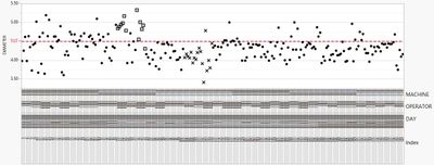
I want to create a "control chart-like" graph. Essentially, it is like a control chart, but the x variables can be as many as I like. It is like the graph I attached, but with a line passing through all the points.
Here are some solutions I tried but failed:
- Variability Chart ==> I can't draw the connecting line across the points.
- Line Chart ==> The x variable number is limited to two.
- Graph builder ==> Too tedious with its unpredictable drag and drop mechanism. Also, my third variable is a date (numeric type) which is not added, no matter how hard I try to drag it at x-axis.
Any suggestions?
Thank you,
Shaira
Accepted Solutions
- Mark as New
- Bookmark
- Subscribe
- Mute
- Subscribe to RSS Feed
- Get Direct Link
- Report Inappropriate Content
Re: How to make control/trend charts with multiple x axis variables?
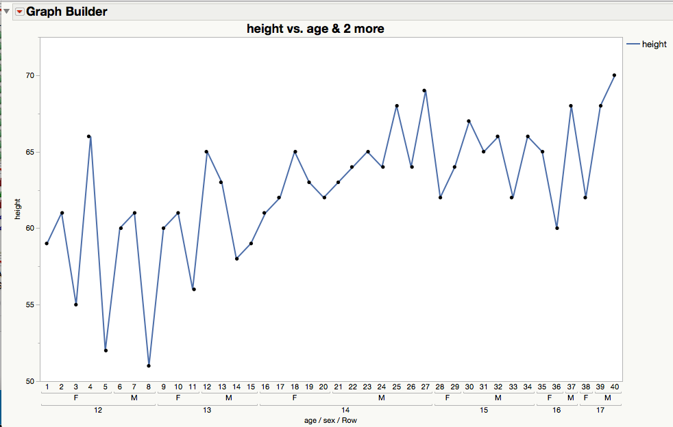
GraphBuilder is predictable once you get used to how the drop zones work. Take a look here. Running the script below shows the result in a simple case.
NamesDefaultToHere(1);
dt = Open("$SAMPLE_DATA/Big Class.jmp");
dt << Graph Builder(
			Size( 894, 595 ),
			Show Control Panel( 0 ),
			Variables(
				X( :age ),
				X( :sex, Position( 1 ) ),
				X( Transform Column( "Row", Ordinal, Formula( Row() ) ), Position( 1 ) ),
				Y( :height )
			),
			Elements(
				Line( X( 1 ), X( 2 ), X( 3 ), Y, Legend( 6 ) ),
				Points( X( 1 ), X( 2 ), X( 3 ), Y, Legend( 7 ) )
			)
		);
- Mark as New
- Bookmark
- Subscribe
- Mute
- Subscribe to RSS Feed
- Get Direct Link
- Report Inappropriate Content
Re: How to make control/trend charts with multiple x axis variables?
Thank you Ian! This is exactly what I need. Let me try this with my own data.
Best Regards,
Shaira
- Mark as New
- Bookmark
- Subscribe
- Mute
- Subscribe to RSS Feed
- Get Direct Link
- Report Inappropriate Content
Re: How to make control/trend charts with multiple x axis variables?
Hi @ian_jmp and others
I am trying to modify the script you sent, hence may I ask the ff questions?
1. Regarding these lines
Elements(
				Line( X( 1 ), X( 2 ), X( 3 ), Y, Legend( 6 ) ),
				Points( X( 1 ), X( 2 ), X( 3 ), Y, Legend( 7 ) )
What does the number arguments mean? I.e. What do the numbers 1, 2, 3, 6, 7 mean?
2. I wanted to color the points by a grouping column but maintain a single color for the connecting line, I tried doing it manually first. I ended up coloring both the points and line. I manually edited it and saved the script. The saved script looks ugly (see below). Do you know an alternative way of doing it by jsl? I am thinking of combining for loop and eval(parse(string) expressions as a backup solution.
			{Legend Model(
				6,
				Properties( 0, {Line Color( 19 )} ),
				Properties( 1, {Line Color( 19 )} ),
				Properties( 2, {Line Color( 19 )} ),
				Properties( 3, {Line Color( 19 )} ),
				Properties( 4, {Line Color( 19 )} ),
				Properties( 5, {Line Color( 19 )} ),
				Properties( 6, {Line Color( 19 )} ),
				Properties( 7, {Line Color( 19 )} ),
				Properties( 8, {Line Color( 19 )} ),
				Properties( 9, {Line Color( 19 )} ),
				Properties( 10, {Line Color( 19 )} ),
				Properties( 11, {Line Color( 19 )} ),
				Properties( 12, {Line Color( 19 )} ),
				Properties( 13, {Line Color( 19 )} ),
				Properties( 14, {Line Color( 19 )} ),
				Properties( 15, {Line Color( 19 )} ),
				Properties( 28, {Line Color( 19 )} ),
				Properties( 29, {Line Color( 19 )} ),
				Properties( 30, {Line Color( 19 )} ),
				Properties( 31, {Line Color( 19 )} ),
				Properties( 32, {Line Color( 19 )} )
			), Legend Model(
				7,
				Base( 0, 0, 0 ),
				Base( 1, 0, 0 ),
				Base( 2, 0, 0 ),
				Base( 3, 0, 0 ),
				Base( 4, 0, 0 ),
				Base( 5, 0, 0 ),
				Base( 6, 0, 0 ),
				Base( 7, 0, 0 ),
				Base( 8, 0, 0 ),
				Base( 9, 0, 0 ),
				Base( 10, 0, 0 ),
				Base( 11, 0, 0 ),
				Base( 12, 0, 0 ),
				Base( 13, 0, 0 ),
				Base( 14, 0, 0 ),
				Base( 15, 0, 0 ),
				Base( 16, 0, 0 ),
				Base( 17, 0, 0 ),
				Base( 18, 0, 0 ),
				Base( 19, 0, 0 ),
				Base( 20, 0, 0 ),
				Base( 21, 0, 0 ),
				Base( 22, 0, 0 ),
				Base( 23, 0, 0 ),
				Base( 24, 0, 0 ),
				Base( 25, 0, 0 ),
				Base( 26, 0, 0 ),
				Base( 27, 0, 0 ),
				Base( 28, 0, 0 ),
				Base( 29, 0, 0 ),
				Base( 30, 0, 0 ),
				Base( 31, 0, 0 ),
				Base( 32, 0, 0 ),
				Properties( 0, {Line Color( 0 )} )
			)}
3. The legend in graph builder is static (i.e. if I click a certain group, it does not highlight the points corresponding to it). This is a really nice feature in Bivariate and Variability graphs. Is there a workaround for this? This is just minor, I can use the JMP filter to accomplish this if there is no workaround.
Thank you very much,
Shaira
- Mark as New
- Bookmark
- Subscribe
- Mute
- Subscribe to RSS Feed
- Get Direct Link
- Report Inappropriate Content
Re: How to make control/trend charts with multiple x axis variables?
Hi @ian_jmp and others,
I am trying to edit the script above. Hence, the ff questions.
1. What does the number inputs (1, 2, 3, 6, and 7) mean?
Elements(
				Line( X( 1 ), X( 2 ), X( 3 ), Y, Legend( 6 ) ),
				Points( X( 1 ), X( 2 ), X( 3 ), Y, Legend( 7 ) )
2. How do I add legend box in graph builder where the colors are determined by grouping column, but the connector line is a single color?
Solutions I tried:
a. Manually doing it and saving the JSL script. I ended up with an ugly script below.
b. Not yet tried. Simplify the ugly script in (a) using for loops and Eval(parse()) functions.
	SendToReport(
		Dispatch(
			{},
			"X Variable Name",
			ScaleBox,
			{Show Major Grid( 1 ), Show Minor Grid( 1 ),
			Rotated Labels( "Perpendicular" )}
		),
		Dispatch(
			{},
			"400",
			ScaleBox,
			{Legend Model(
				6,
				Properties( 0, {Line Color( 19 )} ),
				Properties( 1, {Line Color( 19 )} ),
				Properties( 2, {Line Color( 19 )} ),
				Properties( 3, {Line Color( 19 )} ),
				Properties( 4, {Line Color( 19 )} ),
				Properties( 5, {Line Color( 19 )} ),
				Properties( 6, {Line Color( 19 )} ),
				Properties( 7, {Line Color( 19 )} ),
				Properties( 8, {Line Color( 19 )} ),
				Properties( 9, {Line Color( 19 )} ),
				Properties( 10, {Line Color( 19 )} ),
				Properties( 11, {Line Color( 19 )} ),
				Properties( 12, {Line Color( 19 )} ),
				Properties( 13, {Line Color( 19 )} ),
				Properties( 14, {Line Color( 19 )} ),
				Properties( 15, {Line Color( 19 )} ),
				Properties( 28, {Line Color( 19 )} ),
				Properties( 29, {Line Color( 19 )} ),
				Properties( 30, {Line Color( 19 )} ),
				Properties( 31, {Line Color( 19 )} ),
				Properties( 32, {Line Color( 19 )} )
			), Legend Model(
				7,
				Base( 0, 0, 0 ),
				Base( 1, 0, 0 ),
				Base( 2, 0, 0 ),
				Base( 3, 0, 0 ),
				Base( 4, 0, 0 ),
				Base( 5, 0, 0 ),
				Base( 6, 0, 0 ),
				Base( 7, 0, 0 ),
				Base( 8, 0, 0 ),
				Base( 9, 0, 0 ),
				Base( 10, 0, 0 ),
				Base( 11, 0, 0 ),
				Base( 12, 0, 0 ),
				Base( 13, 0, 0 ),
				Base( 14, 0, 0 ),
				Base( 15, 0, 0 ),
				Base( 16, 0, 0 ),
				Base( 17, 0, 0 ),
				Base( 18, 0, 0 ),
				Base( 19, 0, 0 ),
				Base( 20, 0, 0 ),
				Base( 21, 0, 0 ),
				Base( 22, 0, 0 ),
				Base( 23, 0, 0 ),
				Base( 24, 0, 0 ),
				Base( 25, 0, 0 ),
				Base( 26, 0, 0 ),
				Base( 27, 0, 0 ),
				Base( 28, 0, 0 ),
				Base( 29, 0, 0 ),
				Base( 30, 0, 0 ),
				Base( 31, 0, 0 ),
				Base( 32, 0, 0 ),
				Properties( 0, {Line Color( 0 )} )
			)}
		),
		Dispatch(
			{},
			"400",
			LegendBox,
			{Position(
				{-1, -1, -1, -1, -1, -1, -1, -1, -1, -1, -1, -1, -1, -1, -1, -1, -1,
				-1, -1, -1, -1, -1, -1, -1, -1, -1, -1, -1, -1, -1, -1, -1, -1, 0, 1,
				2, 3, 4, 5, 6, 7, 8, 9, 10, 11, 12, 13, 14, 15, 16, 17, 18, 19, 20,
				21, 22, 23, 24, 25, 26, 27, 28, 29, 30, 31, 32}
			)}
		)
	)
3. Is the legend box in graph builder really static? In Bivariate and Variability graphs, clicking the legend box highlights the points corresponding to clicked group. But, this is just minor concern. I can use the JMP filter as an alternative solution for this.
Thank you very much for the help,
Shaira
- Mark as New
- Bookmark
- Subscribe
- Mute
- Subscribe to RSS Feed
- Get Direct Link
- Report Inappropriate Content
Re: How to make control/trend charts with multiple x axis variables?
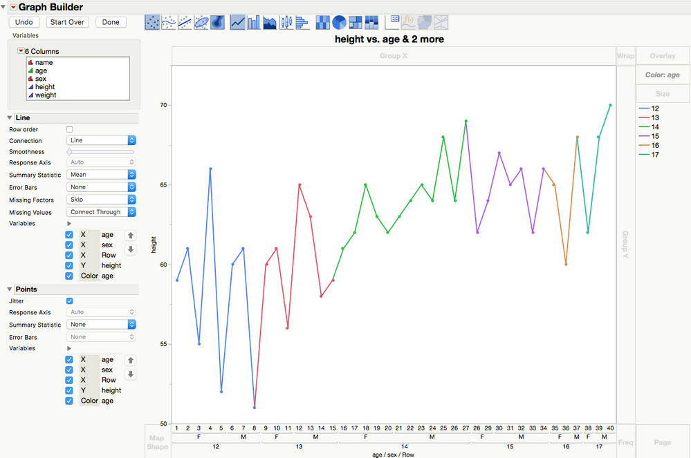
Unless I really need to, I tend not to worry about interpreting the 'low level' code that JMP generates for me.
Using the example above, exposing the Control Panel and dragging 'age' to the 'Color' drop zone, I made:
The resulting legend is selctable.
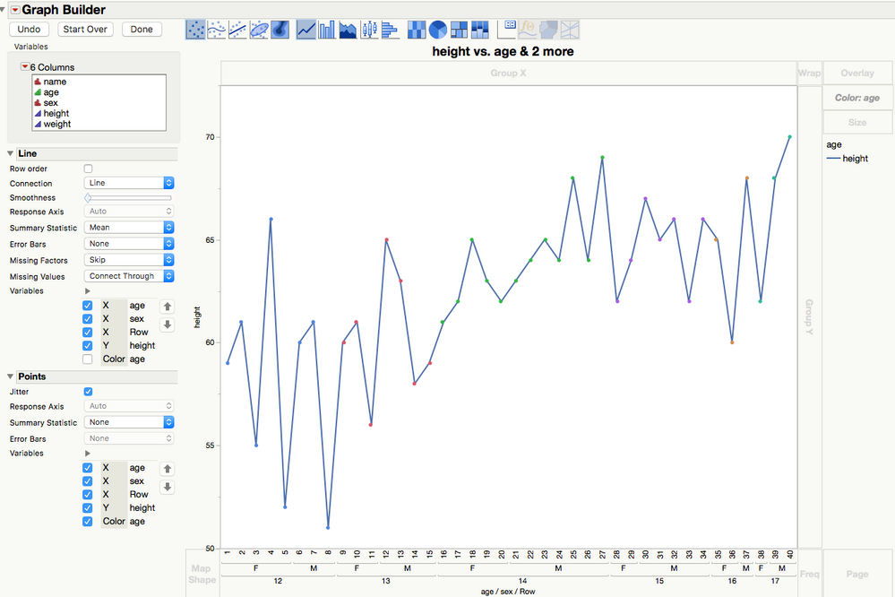
Then, looking at the options on the left and deselecting one, I made:
which (I think) is what you want
Recommended Articles
- © 2026 JMP Statistical Discovery LLC. All Rights Reserved.
- Terms of Use
- Privacy Statement
- Contact Us


