- New to JMP? Let the Data Analysis Director guide you through selecting an analysis task, an analysis goal, and a data type. Available now in the JMP Marketplace!
- See how to install JMP Marketplace extensions to customize and enhance JMP.
- Subscribe to RSS Feed
- Mark Topic as New
- Mark Topic as Read
- Float this Topic for Current User
- Bookmark
- Subscribe
- Mute
- Printer Friendly Page
Discussions
Solve problems, and share tips and tricks with other JMP users.- JMP User Community
- :
- Discussions
- :
- Re: How to make a plot of scatter with lines and markers like Excel?
- Mark as New
- Bookmark
- Subscribe
- Mute
- Subscribe to RSS Feed
- Get Direct Link
- Report Inappropriate Content
How to make a plot of scatter with lines and markers like Excel?
Hi folks,
I am having a hard time of duplicating an Excel plot of scatter with lines and markers in JMP. The Excel table and plot is shown below as an example:
I know we need to format the data table in JMP, I did the following data table, but still cannot plot the scatter with lines and markers. , could anyone advise how can I do it in JMP? Thanks.
Accepted Solutions
- Mark as New
- Bookmark
- Subscribe
- Mute
- Subscribe to RSS Feed
- Get Direct Link
- Report Inappropriate Content
Re: How to make a plot of scatter with lines and markers like Excel?
Hi @TDK_Long
Right-Click on the graph and click customize to change the maker shape.

Right-Click on the axis to add grid lines

Does this help?
cheers,
Stan
- Mark as New
- Bookmark
- Subscribe
- Mute
- Subscribe to RSS Feed
- Get Direct Link
- Report Inappropriate Content
Re: How to make a plot of scatter with lines and markers like Excel?
Hi @TDK_Long
Right-Click on the graph and click customize to change the maker shape.

Right-Click on the axis to add grid lines

Does this help?
cheers,
Stan
- Mark as New
- Bookmark
- Subscribe
- Mute
- Subscribe to RSS Feed
- Get Direct Link
- Report Inappropriate Content
Re: How to make a plot of scatter with lines and markers like Excel?
Hi Stan,
I have a problem at the first step. How do you create the two lines? I cannot connect the three points as shown below. Could you use the attached jmp file to see what I am missing? Thank you.
- Mark as New
- Bookmark
- Subscribe
- Mute
- Subscribe to RSS Feed
- Get Direct Link
- Report Inappropriate Content
Re: How to make a plot of scatter with lines and markers like Excel?
Drag Group onto the Overlay dropzone. That's it.
[x on x, y on y]:)
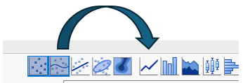
If you want to connect the lines instead of a smoother, just switch from smoother to "Line":
by right-clicking on the legend, you can adjust the colors and markers.
and via the red triangle menu, you can specify the legend position to be at the bottom.
- Mark as New
- Bookmark
- Subscribe
- Mute
- Subscribe to RSS Feed
- Get Direct Link
- Report Inappropriate Content
Re: How to make a plot of scatter with lines and markers like Excel?
Hi Hogi,
Thanks for the tips. Now I understand it. Much appreciated.
Recommended Articles
- © 2026 JMP Statistical Discovery LLC. All Rights Reserved.
- Terms of Use
- Privacy Statement
- Contact Us


