- New to JMP? Let the Data Analysis Director guide you through selecting an analysis task, an analysis goal, and a data type. Available now in the JMP Marketplace!
- See how to install JMP Marketplace extensions to customize and enhance JMP.
- Subscribe to RSS Feed
- Mark Topic as New
- Mark Topic as Read
- Float this Topic for Current User
- Bookmark
- Subscribe
- Mute
- Printer Friendly Page
Discussions
Solve problems, and share tips and tricks with other JMP users.- JMP User Community
- :
- Discussions
- :
- How to keep Graph Builder from changing markers (or, how to force Graph Builder ...
- Mark as New
- Bookmark
- Subscribe
- Mute
- Subscribe to RSS Feed
- Get Direct Link
- Report Inappropriate Content
How to keep Graph Builder from changing markers (or, how to force Graph Builder to only use row state markers and colors)
Hi JMP Community,
(W10 Enterprise, 64-bit, JMP Pro 15.0.0)
I'm trying to help a user who's using Graph Builder to visualize some data on products. The products come from different regions, different sources, and across different years.
When doing this, they Overlay and Color by a column called :Source. They also include some Data Filters and Column Switchers. The Data Filters are: year, region, source; the Column Switchers are there to allow swapping out different data on the products.
The issue that we're having is that even though we've set the row state to be a specific marker and color by :Source, when we change the Data Filter to only show data from Year 1 and change it to Year 2, Graph builder automatically overrides our row state assignments and uses the default.
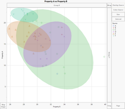
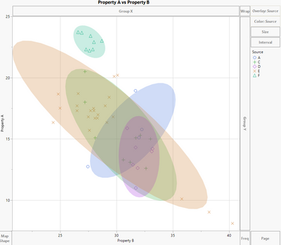
Below is the output for Year 1 (left) and Year 2 (right).
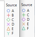
The correct marker and color scheme is on the left above, Year 1. If you look closely, you can see that for Year 2, Graph Builder change Source C from a green diamond to a green cross. D changes from a purple X to a purple diamond, E from an orange triangle to an orange X, and F from a teal Y to a teal triangle.
So, it appears that Graph Builder keeps the assigned colors that we've given to the row states, but it changes the markers to default according JMP's settings.
I've seen some similar posts, and I think I might need to use Marker Seg in Graph Builder, but having a challenging time understanding how to use that syntax to get the desired outcome. Is this a bug in 15.0 that is fixed in the latest update, and if so, can we somehow work around this issue and force Graph Builder to use the markers and colors of choice?
Thanks for any feedback!,
DS
Accepted Solutions
- Mark as New
- Bookmark
- Subscribe
- Mute
- Subscribe to RSS Feed
- Get Direct Link
- Report Inappropriate Content
Re: How to keep Graph Builder from changing markers (or, how to force Graph Builder to only use row state markers and colors)
Update:
After doing a lot of searching, it turns out the issue was too many "levels" of control in Graph Builder.
The user was setting BOTH Overlay and Color to the entries that were listed in :Source. As a result, Graph Builder would override the marker style, but not color setting. So, I guess JMP is programmed to have color as a priority and then marker.
The solution is simple: remove the :Source column from being used to "color" the Graph Builder and it maintains the marker and coloring as desired (assuming the row states for marker and color have been pre-assigned to the rows). Simple, yet so easy to overlook!
Hope this helps others!
DS
- Mark as New
- Bookmark
- Subscribe
- Mute
- Subscribe to RSS Feed
- Get Direct Link
- Report Inappropriate Content
Re: How to keep Graph Builder from changing markers (or, how to force Graph Builder to only use row state markers and colors)
Hi Diedrich,
Thank you for this solution! I have this same problem but I don't know how to remove the :Source column from being used to apply color as you described. Could you please provide some details on how to do this? Thank you!!
- Mark as New
- Bookmark
- Subscribe
- Mute
- Subscribe to RSS Feed
- Get Direct Link
- Report Inappropriate Content
Re: How to keep Graph Builder from changing markers (or, how to force Graph Builder to only use row state markers and colors)
Hi @jmv ,
Happy to help out. Would you be able to share your data (or part of it), so I can see the issue your having and see what I can do to fix it?
If you need to, you can Anonymize the data: Tables > Anonymize.
Or, if you can reproduce the issue using one of JMP's sample data tables and let me know which one and how you set up the Graph Builder, that would work too.
Thanks!,
DS
- Mark as New
- Bookmark
- Subscribe
- Mute
- Subscribe to RSS Feed
- Get Direct Link
- Report Inappropriate Content
Re: How to keep Graph Builder from changing markers (or, how to force Graph Builder to only use row state markers and colors)
Hi DS,
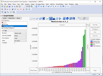
Thank you so much for helping. See the attached graph made in graph builder. I want to color code X_2 on the right so that each V2 value is one of the four "Increase Category" colors, instead of each V2 having its own color. In the data table the color of each row is set to one of these four colors based on the "Increase Category" column, but when I drag V2 to the color tab, it re-colors them. Apologies ahead of time, I don't have experience writing scripts!
Thanks!!
JV
- Mark as New
- Bookmark
- Subscribe
- Mute
- Subscribe to RSS Feed
- Get Direct Link
- Report Inappropriate Content
Re: How to keep Graph Builder from changing markers (or, how to force Graph Builder to only use row state markers and colors)
Hi @jmv ,
You shouldn't need to write a script in order to get the graph you want. Thanks for the example of what your current graph is looking like. One thing that will make a difference on how the graphs are generated and might need to be modified really depends on how your data table is organized.
Usually, the way a JMP data table is organized is to have each row is a "sample" or a unique identifier of some kind. Then, each column is like a "property" of that sample. This could be lot number, sample size (g, kg, etc.), color, property X, property Y, property Z, etc. However, sometimes the analyses are actually better when the data is "stacked" in a single column with the property being a unique identifier at each row instance.
Anyway, this is all a long way to explain that if you can share a subset of your data table -- even if it's only like 20 or 50 rows (and all columns), it would really help to see how to best represent your data. Again, this is something you can anonymize or even recode the columns (right click on a column > Recode) to give a random name to each instance of a name so that others won't know what you're really analyzing (that is, if that is important to you). Without understanding a but more your data structure, it's really hard to guess what needs to be done to get the output you want.
Hope this makes sense!,
DS
- Mark as New
- Bookmark
- Subscribe
- Mute
- Subscribe to RSS Feed
- Get Direct Link
- Report Inappropriate Content
Re: How to keep Graph Builder from changing markers (or, how to force Graph Builder to only use row state markers and colors)
Hi DS,
Yes that does make sense. See attached data table - it contains the three columns represented in the graph posted earlier (hope this is helpful!).
Thanks!
jv
- Mark as New
- Bookmark
- Subscribe
- Mute
- Subscribe to RSS Feed
- Get Direct Link
- Report Inappropriate Content
Re: How to keep Graph Builder from changing markers (or, how to force Graph Builder to only use row state markers and colors)
Hi @jmv ,
If I understand your issue, I think it's an easy fix. From what I understand, it sounds like you want to only have four levels of color, is that right? If so, then you'd want to use the column "Increase Category" to color the graph builder, not the X_2 column. The X_2 column has 53 distinct levels, so graph builder will generate 53 distinct colors.
If you wanted to split things out based on X_2 some more, you could color by Increase Category and then overlay by X_2, but this can start to get a bit messy.
I'm not sure what data the X_2 column brings to the table, but as you can note from the distributions, there are multiple X_2 levels for a given Increase Category. For example, the Going Away level is associated with V2_0, V2_45 and V2_46.
Another way that you might consider visualizing the data is using a heatmap (11th option in GB from left), with X_2 on the vertical axis, Increase Category on horizontal, and then Lot Size as color.
Hope this helps!,
DS
- Mark as New
- Bookmark
- Subscribe
- Mute
- Subscribe to RSS Feed
- Get Direct Link
- Report Inappropriate Content
Re: How to keep Graph Builder from changing markers (or, how to force Graph Builder to only use row state markers and colors)
Hi DS,
Thank you for the response. Yes correct four levels of color are desired. The original graph that was posted shows how I think the increase categories are best shown - the increase category on the x-axis and the yields on the y-axis. The X_2 column is an added level of detail, so the viewer can see what X_2 values go into which of the four color bins. Does that make sense? It's sort of a way to add extra detail but still have the data presented so they aren't too cluttered with 53 distinct colors. It looks like if Increase Category goes into the color bin, it can't also go onto the x-axis? I think if I could force the four colors onto the X-2 column it would work, but maybe there is no way to do this? Thanks again for helping!!
jv
- Mark as New
- Bookmark
- Subscribe
- Mute
- Subscribe to RSS Feed
- Get Direct Link
- Report Inappropriate Content
Re: How to keep Graph Builder from changing markers (or, how to force Graph Builder to only use row state markers and colors)
Hi @jmv ,
Yes, your description makes sense. You can use a column for both the horizontal axis and the color scheme, that's not a limitation.
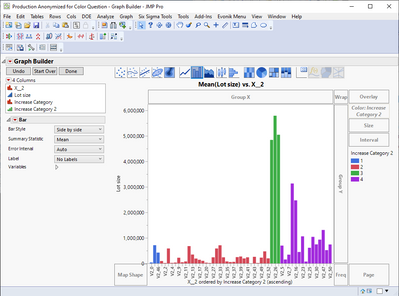
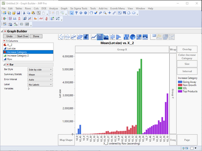
In your case, it actually sounds like to might want to slightly change the graph. In the below example, I put lot size on the y-axis, X_2 (ascending by lot size) on the x-axis, and then colored by Increase Category. This gives the viewer the added level of detail for X_2 as well as the coloring by Increase Category. Or, as the second graph shows, you could order the x-axis by the Increase Category. In this case, I recoded the Increase Category into an ordinal column with values 1, 2, 3, 4, just to get the ordering of X_2 along the x-axis. Then, in the third option, I first sorted the table by category then by lot size, and made a similar graph, coloring by the category.
In whatever way you go, I highly recommend changing the color scheme from the shades of purple to discrete color representations. You want the viewer to be able to quickly see differences and similarities when they see the graph, and coloring bar graphs with gradations in color makes that very difficult. I've attached the data tables as well.
Hope this helps!,
DS
Recommended Articles
- © 2026 JMP Statistical Discovery LLC. All Rights Reserved.
- Terms of Use
- Privacy Statement
- Contact Us

