- New to JMP? Let the Data Analysis Director guide you through selecting an analysis task, an analysis goal, and a data type. Available now in the JMP Marketplace!
- See how to install JMP Marketplace extensions to customize and enhance JMP.
- Subscribe to RSS Feed
- Mark Topic as New
- Mark Topic as Read
- Float this Topic for Current User
- Bookmark
- Subscribe
- Mute
- Printer Friendly Page
Discussions
Solve problems, and share tips and tricks with other JMP users.- JMP User Community
- :
- Discussions
- :
- How to interpret Prediction Profiler graph under Partitioning
- Mark as New
- Bookmark
- Subscribe
- Mute
- Subscribe to RSS Feed
- Get Direct Link
- Report Inappropriate Content
How to interpret Prediction Profiler graph under Partitioning
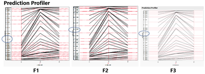
The image shows prediction probabilities for 3 x-variable levels from a partitioning modeling exercise. The x axis are 3 different types of people. The y axis are the 40 object options that people were made to choose from (single selection only). My intent is to have the object with the largest predicted probability (encircled) to represent each people type.
Question: What is the significance, if any, of the shape of the individual object lines as they go across each x. ( I couldn't find any clue in the Profiler manual).
- Mark as New
- Bookmark
- Subscribe
- Mute
- Subscribe to RSS Feed
- Get Direct Link
- Report Inappropriate Content
Re: How to interpret Prediction Profiler graph under Partitioning
The probabilities add to 1. The difference between adjacent lines is the predicted probability for a given level. The first level and third level of F1 appear to have higher probabilities for items near the top of the axis. The second level of F1 appears to have higher probabilities for items in the model of the axis. All levels of F1 have small probabilities for items near the bottom of the axis.
Selecting a level other than the first one of F1, F2, or F3 can change the overall shapes. This kind of change indicates that there is an interaction between the predictors.
- Mark as New
- Bookmark
- Subscribe
- Mute
- Subscribe to RSS Feed
- Get Direct Link
- Report Inappropriate Content
Re: How to interpret Prediction Profiler graph under Partitioning
Mark,
I do understand that for each F level (F1, F2, F3), the predicted probabilities sum up to 1.0.
I also understand that when I trace each line (say, the inverted V shape) across each F level, I am given the probability for that y-object (say Shade 31) at the F setting that I choose.
What I am questioning is why, for example, the inverted V shape of Shade 31 when the predicted probabilities are .132, .055, .113 respectively at F1, F2, F3? The shape must mean something. It certainly does not appear to correlate with the location (top, middle, bottom of the graph) of higher probability regions that you point out.
- Mark as New
- Bookmark
- Subscribe
- Mute
- Subscribe to RSS Feed
- Get Direct Link
- Report Inappropriate Content
Re: How to interpret Prediction Profiler graph under Partitioning
I do not understand what you are asking. You fit three different and separate models (F1, F2, F3) and the categorical predictor has 3 levels. Your picture is so small that I cannot see the details such as labels.
Recommended Articles
- © 2026 JMP Statistical Discovery LLC. All Rights Reserved.
- Terms of Use
- Privacy Statement
- Contact Us

