- Subscribe to RSS Feed
- Mark Topic as New
- Mark Topic as Read
- Float this Topic for Current User
- Bookmark
- Subscribe
- Mute
- Printer Friendly Page
Discussions
Solve problems, and share tips and tricks with other JMP users.- JMP User Community
- :
- Discussions
- :
- Re: How to have graph bars on the exact x value
- Mark as New
- Bookmark
- Subscribe
- Mute
- Subscribe to RSS Feed
- Get Direct Link
- Report Inappropriate Content
How to have graph bars on the exact x value
Hi,
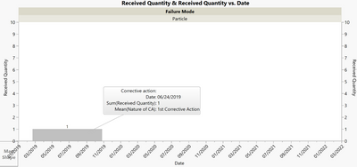
I created a graph to show the number of claims received by date.
For this case there is one claim received on the 24th June 2019.
Why is the bar not indicating the right date but showing an interval (even though bar style is side by side and width proportion is 0 )? How to change it to show the exact date? Needle bar style is not an option as the bar is too thin and not easily readable.
Thanks.
- Mark as New
- Bookmark
- Subscribe
- Mute
- Subscribe to RSS Feed
- Get Direct Link
- Report Inappropriate Content
Re: How to have graph bars on the exact x value
Hi,
Have you tried to change the date column to "nominal" instead of "continuous" data?
- Mark as New
- Bookmark
- Subscribe
- Mute
- Subscribe to RSS Feed
- Get Direct Link
- Report Inappropriate Content
Re: How to have graph bars on the exact x value
Yes i tried that but the problem is that i need to have the x-axis as continuous dates incremented by month.
- Mark as New
- Bookmark
- Subscribe
- Mute
- Subscribe to RSS Feed
- Get Direct Link
- Report Inappropriate Content
Re: How to have graph bars on the exact x value
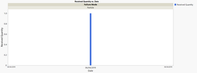
If you do want to use the needle bar you can change the width to something that might be more easily viewable by your audience:
Right click on the blue box in the legend to change the width.
- Mark as New
- Bookmark
- Subscribe
- Mute
- Subscribe to RSS Feed
- Get Direct Link
- Report Inappropriate Content
Re: How to have graph bars on the exact x value
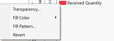
Those are the options i see when i right click on the legend:
None of those changes the width.
- Mark as New
- Bookmark
- Subscribe
- Mute
- Subscribe to RSS Feed
- Get Direct Link
- Report Inappropriate Content
Re: How to have graph bars on the exact x value
Did you first change it to a needle plot and then right click on that area? Interestingly, it seems if you have a variable in the Color section you can't change the width but if you have no Color variable or use Overlay instead it should give you the option to change the Line Width.
- Mark as New
- Bookmark
- Subscribe
- Mute
- Subscribe to RSS Feed
- Get Direct Link
- Report Inappropriate Content
Re: How to have graph bars on the exact x value
True, it works with Overlay. But Overlay doesn't provide the same color identification as color section..
- Mark as New
- Bookmark
- Subscribe
- Mute
- Subscribe to RSS Feed
- Get Direct Link
- Report Inappropriate Content
Re: How to have graph bars on the exact x value
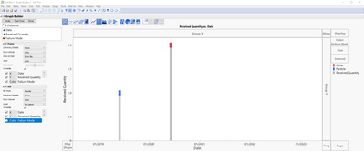
That is a good point and I can understand the challenge. Here is one additional item to consider. You could add a Marker element to your graph and only have that be the element that is colored by your variable. Then adjust the width of the needle bar and marker sizes/types to suit your preferences. I am going to call this a Matchstick plot since they look like little matchsticks:)
Recommended Articles
- © 2026 JMP Statistical Discovery LLC. All Rights Reserved.
- Terms of Use
- Privacy Statement
- Contact Us


