- Instantly extract effect sizes, F-ratios, and FDR-adjusted p-values from your models with the Calculate Effects Sizes extension, available now in the JMP Marketplace!
- New to JMP? Join us Sept. 23-24 for the Early User Edition of Discovery Summit, tailor-made for new users. Register now for free!
- Your voice matters! Tell us how you prefer to receive JMP updates, so we can tailor our communication to your needs. Take short survey.
- Subscribe to RSS Feed
- Mark Topic as New
- Mark Topic as Read
- Float this Topic for Current User
- Bookmark
- Subscribe
- Mute
- Printer Friendly Page
Discussions
Solve problems, and share tips and tricks with other JMP users.- JMP User Community
- :
- Discussions
- :
- Re: How to draw heatmap to visualize main effect and quadratic effect found in d...

- Mark as New
- Bookmark
- Subscribe
- Mute
- Subscribe to RSS Feed
- Get Direct Link
- Report Inappropriate Content
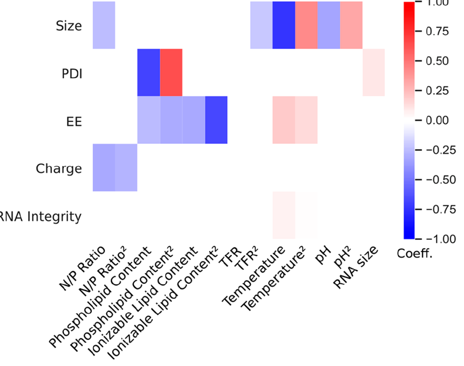
How to draw heatmap to visualize main effect and quadratic effect found in definitive screening design
Hi JMP community,
I am using DSD to find the main effect as well as quadratic effect among my factors. Specifically, my responses are multiple numerical parameters, and my factor inputs include both numerical and categorial values. Now, I have run the experiments and feed into the model. Because I am interested in the effects of all these factors to my multiple responses simultaneously, I am using prediction profiler plot to visualize the modeling results by assigning different importance levels to each response. (see attachment 1). And the model successfully predicts the best factor combinations that would generate the ideal response profiles based on my defined importance level.
But besides this prediction profiler, is there other way to draw a heap map to show regression coefficients of main and quadratic factor effects to each response? (such as the image I attached here). So that I can investigate which effect is more important to my response.

- Mark as New
- Bookmark
- Subscribe
- Mute
- Subscribe to RSS Feed
- Get Direct Link
- Report Inappropriate Content
Re: How to draw heatmap to visualize main effect and quadratic effect found in definitive screening design
You can use Graph Builder to produce the heat map. Here is a simple example, using the Big Class data table. But it shows 2 categorical columns being used as the X and Y axes and a numeric as the Color column, which give you the desired heat map.


- Mark as New
- Bookmark
- Subscribe
- Mute
- Subscribe to RSS Feed
- Get Direct Link
- Report Inappropriate Content
Re: How to draw heatmap to visualize main effect and quadratic effect found in definitive screening design
Hi @Elsie24,
Welcome in the Community !
- One possible option without manual work is to enhance your Profiler by coloring your factors in a red scale depending on their importances for each response.
In order to do this, click on the red triangle next to "Prediction Profiler", click on "Assess Variable Importance" and then choose a relevant option for you. For unconstrained designed experiments (like in the case of a DSD), "Independent Uniform Inputs" is a relevant choice. A new panel "Variable Importance: Independent Uniform Inputs" is now present, and if you click on the red triangle next to it, you'll find the option "Colorize Profiler". When clicking on it, your factors on the Profiler will be in shades of red (the more red, the higher the importance of the factor on the response) : - A second option to match the snapshot provided would require manual work.
First, you need to create a table with all coefficients from active terms in the model for each response ; you can do this by right-clicking on "Parameters Estimates" and then click on "Make Combined DataTable". A new datatable is created with all necessary information to use in GraphBuilder.
If you use the column "Y" as Y in Graphbuilder, the column "Term" as X and "Estimate" as Color property, and then using a Heatmap graph style, you end up with something similar as you expected :I used the Local Data Filter to remove the intercept estimate from the Heatmap, as its values are very high compared to other coefficients, so it may bias the colors used and make all terms similar compared to the intercept terms.


I hope this answer will help you,
"It is not unusual for a well-designed experiment to analyze itself" (Box, Hunter and Hunter)
- Mark as New
- Bookmark
- Subscribe
- Mute
- Subscribe to RSS Feed
- Get Direct Link
- Report Inappropriate Content
Re: How to draw heatmap to visualize main effect and quadratic effect found in definitive screening design
@Victor_G Thanks for your detailed explanation! I'm working on your second method. However, to only investigate "main effect" as well as "quadratic effect", instead I have to use "Fit Model", "Standard Least Squares", and then manually construct model effects. The generated models however, only list statistical parameters, like t ratio, P-value, etc (see attachment), but without regression coefficients. How should I get this parameter as well so I can draw exactly same heat map as I attached peviously? Many thanks~
- Mark as New
- Bookmark
- Subscribe
- Mute
- Subscribe to RSS Feed
- Get Direct Link
- Report Inappropriate Content
Re: How to draw heatmap to visualize main effect and quadratic effect found in definitive screening design
Hi @Elsie24,
You do have access to regression coefficients, these are the values listed in the "estimates" column from your snapshot. If you have categorical effects, you may also consider using the "Expanded estimates" so that you have the regression coefficients for all levels of your categorical factors (red triangle next to your response model fit, then "Estimates" and click on "Expanded estimates").
"It is not unusual for a well-designed experiment to analyze itself" (Box, Hunter and Hunter)
- Mark as New
- Bookmark
- Subscribe
- Mute
- Subscribe to RSS Feed
- Get Direct Link
- Report Inappropriate Content
Re: How to draw heatmap to visualize main effect and quadratic effect found in definitive screening design
Thanks again! I really appreciate your answer!
Recommended Articles
- © 2026 JMP Statistical Discovery LLC. All Rights Reserved.
- Terms of Use
- Privacy Statement
- Contact Us