- New to JMP? Let the Data Analysis Director guide you through selecting an analysis task, an analysis goal, and a data type. Available now in the JMP Marketplace!
- See how to install JMP Marketplace extensions to customize and enhance JMP.
- Subscribe to RSS Feed
- Mark Topic as New
- Mark Topic as Read
- Float this Topic for Current User
- Bookmark
- Subscribe
- Mute
- Printer Friendly Page
Discussions
Solve problems, and share tips and tricks with other JMP users.- JMP User Community
- :
- Discussions
- :
- Re: How to add Dynamic horizontal line by shared y axis among variability chart ...
- Mark as New
- Bookmark
- Subscribe
- Mute
- Subscribe to RSS Feed
- Get Direct Link
- Report Inappropriate Content
How to add Dynamic horizontal line by shared y axis among variability chart split by two conditions through JSL
Hi all,
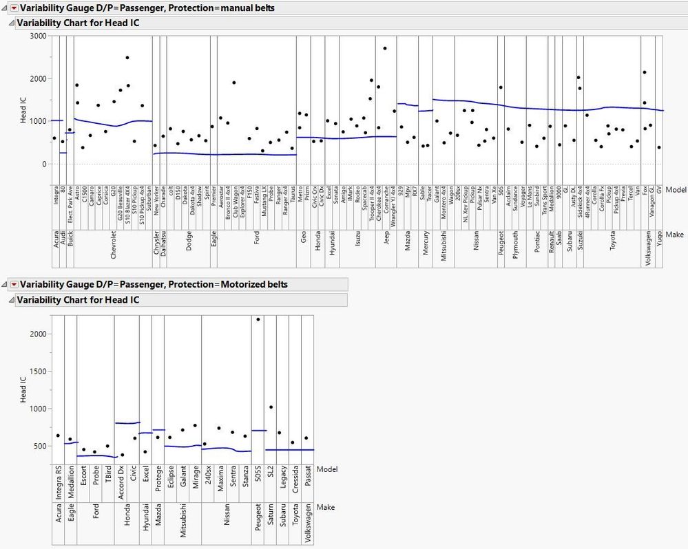
I have made a variability chart that is split by two conditions, by doing so, jmp creates a chart with a shared y axis. My issue with this shared y axis is when I add a horizontal line, it adds it across each x split rather than being able to have a different horizontal line by group. I was wondering if this is possible by a possible for each loop as the value I want the horizontal line to be a value from the original data table.
names default to here(1);
dt =
// Open Data Table: Big Class.jmp
// → Data Table( "Big Class" )
Open( "$SAMPLE_DATA/Cars.jmp" );

dt << Variability Chart(
	Y( :Head IC),
	X( :Make, :Model ),
	Analysis Type( "Choose best analysis (EMS REML Bayesian)" ),
	Show Range Bars( 0 ),
	Show Cell Means( 0 ),
	Std Dev Chart( 0 ),
	Points Jittered( 1 ),
	By( :NAME("D/P"), :Protection )
);
This is ideally how I would like it to look like based on the value in the table.
My current attempt at this is:
for each( {bygroup, i}, value,
	report(dt[i])[AxisBox(1)] << add ref line(value[i], "Dotted","Black", Char(value[i]))
For the sake of being able to with this dataset, if you are able to use the column ":Wt" to show this I would be truly grateful. Thank you!
Accepted Solutions
- Mark as New
- Bookmark
- Subscribe
- Mute
- Subscribe to RSS Feed
- Get Direct Link
- Report Inappropriate Content
Re: How to add Dynamic horizontal line by shared y axis among variability chart split by two conditions through JSL
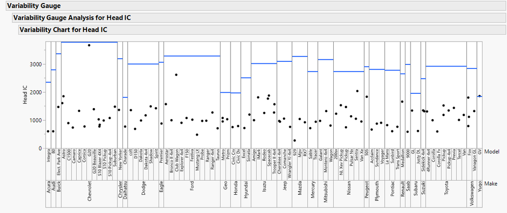
The thing to keep in mind about the VariabilityPlot is that each least-significant-group has a width of exactly 1 on the hidden x-axis, starting at zero. This makes it pretty simple to add the relevant lines.
The only slight complication is figuring out how many sub-groups each of the larger groups contains, but the Summary function of the data table can aid there.
Here is an example script that does what you ask:
names default to here(1);
dt =
// Open Data Table: Big Class.jmp
// → Data Table( "Big Class" )
Open( "$SAMPLE_DATA/Cars.jmp" );

rpt = dt << Variability Chart(
	Y( :Head IC),
	X( :Make, :Model ),
	Analysis Type( "Choose best analysis (EMS REML Bayesian)" ),
	Show Range Bars( 0 ),
	Show Cell Means( 0 ),
	Std Dev Chart( 0 ),
	Points Jittered( 1 ),
	Where( :NAME("D/P") == "Driver" & :Protection == "manual belts" ),
);

//find groupings:
rows = dt << Get Rows Where( :NAME("D/P") == "Driver" & :Protection == "manual belts" );
subt = dt << Subset( Rows( rows ), Columns( :Make, :Model, :Wt ), Not Linked, Private );
sumt = subt << Summary( Group( :Make, Model ), Mean( :Wt ), Statistics Column Name Format( "Column" ), Link to Original Data Table( 0 ), Private );
Close( subt, No Save );
subt = sumt << Summary( Group( :Make ), Mean( :Wt ), Statistics Column Name Format( "Column" ), Link to Original Data Table( 0 ), Private );
Close( sumt, No Save );

category number = [=>];
category average = [=>];
For Each Row( subt,
	category number[:Make] = :N Rows; // each least-significant category in a VariabilityPlot is exactly X=1 width on the hidden x-axis, starting at zero
	category average[:Make] = :Wt
);
Close( subt, No Save );

tree = rpt << Report;
Eval( Eval Expr(
tree[FrameBox( 1 )] << Add Graphics Script(
	Local( {values = Expr( category average ), numbers = Expr( category number ), i, items, sum = 0},
		items = numbers << Get Keys;
		Pen Size( 2 );
		Pen Color( "Blue" );
		Summation( i = 1, N Items( items ),
			Line( Eval List( {sum, values[items[i]]} ), Eval List( {sum += numbers[items[i]], values[items[i]]} ) );
			0
		)
	)
)
) )- Mark as New
- Bookmark
- Subscribe
- Mute
- Subscribe to RSS Feed
- Get Direct Link
- Report Inappropriate Content
Re: How to add Dynamic horizontal line by shared y axis among variability chart split by two conditions through JSL
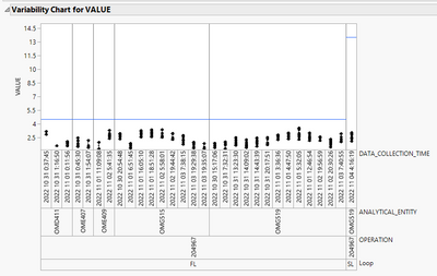
different spec limits on a variability chart this post might give some ideas. You will most likely have to use graphic script
- Mark as New
- Bookmark
- Subscribe
- Mute
- Subscribe to RSS Feed
- Get Direct Link
- Report Inappropriate Content
Re: How to add Dynamic horizontal line by shared y axis among variability chart split by two conditions through JSL
The thing to keep in mind about the VariabilityPlot is that each least-significant-group has a width of exactly 1 on the hidden x-axis, starting at zero. This makes it pretty simple to add the relevant lines.
The only slight complication is figuring out how many sub-groups each of the larger groups contains, but the Summary function of the data table can aid there.
Here is an example script that does what you ask:
names default to here(1);
dt =
// Open Data Table: Big Class.jmp
// → Data Table( "Big Class" )
Open( "$SAMPLE_DATA/Cars.jmp" );

rpt = dt << Variability Chart(
	Y( :Head IC),
	X( :Make, :Model ),
	Analysis Type( "Choose best analysis (EMS REML Bayesian)" ),
	Show Range Bars( 0 ),
	Show Cell Means( 0 ),
	Std Dev Chart( 0 ),
	Points Jittered( 1 ),
	Where( :NAME("D/P") == "Driver" & :Protection == "manual belts" ),
);

//find groupings:
rows = dt << Get Rows Where( :NAME("D/P") == "Driver" & :Protection == "manual belts" );
subt = dt << Subset( Rows( rows ), Columns( :Make, :Model, :Wt ), Not Linked, Private );
sumt = subt << Summary( Group( :Make, Model ), Mean( :Wt ), Statistics Column Name Format( "Column" ), Link to Original Data Table( 0 ), Private );
Close( subt, No Save );
subt = sumt << Summary( Group( :Make ), Mean( :Wt ), Statistics Column Name Format( "Column" ), Link to Original Data Table( 0 ), Private );
Close( sumt, No Save );

category number = [=>];
category average = [=>];
For Each Row( subt,
	category number[:Make] = :N Rows; // each least-significant category in a VariabilityPlot is exactly X=1 width on the hidden x-axis, starting at zero
	category average[:Make] = :Wt
);
Close( subt, No Save );

tree = rpt << Report;
Eval( Eval Expr(
tree[FrameBox( 1 )] << Add Graphics Script(
	Local( {values = Expr( category average ), numbers = Expr( category number ), i, items, sum = 0},
		items = numbers << Get Keys;
		Pen Size( 2 );
		Pen Color( "Blue" );
		Summation( i = 1, N Items( items ),
			Line( Eval List( {sum, values[items[i]]} ), Eval List( {sum += numbers[items[i]], values[items[i]]} ) );
			0
		)
	)
)
) )- Mark as New
- Bookmark
- Subscribe
- Mute
- Subscribe to RSS Feed
- Get Direct Link
- Report Inappropriate Content
Re: How to add Dynamic horizontal line by shared y axis among variability chart split by two conditions through JSL
Hi,
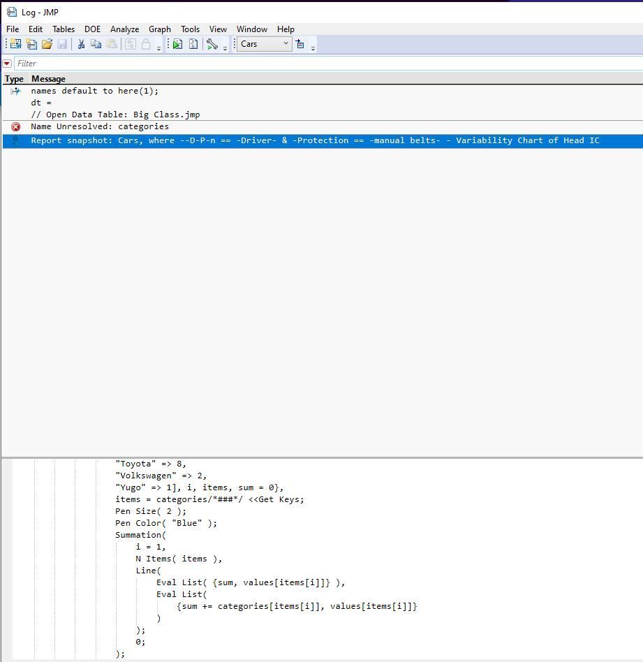
First of all, thank you so much for the information as well as the code, I am trying to go by line by line and learn just how you scripted this. When I ran the script, I am getting an error for the "cagegories << Get Keys" line it seems through the console log. Would you know how to fix this or if it's supposed to be another variable?
Thank you, I appreciate the help!
- Mark as New
- Bookmark
- Subscribe
- Mute
- Subscribe to RSS Feed
- Get Direct Link
- Report Inappropriate Content
Re: How to add Dynamic horizontal line by shared y axis among variability chart split by two conditions through JSL
Sorry about that -- I'd only partially changed the variable names. The name categories should have been numbers. I've edited by reply above.
Recommended Articles
- © 2026 JMP Statistical Discovery LLC. All Rights Reserved.
- Terms of Use
- Privacy Statement
- Contact Us
