- New to JMP? Let the Data Analysis Director guide you through selecting an analysis task, an analysis goal, and a data type. Available now in the JMP Marketplace!
- See how to install JMP Marketplace extensions to customize and enhance JMP.
- Subscribe to RSS Feed
- Mark Topic as New
- Mark Topic as Read
- Float this Topic for Current User
- Bookmark
- Subscribe
- Mute
- Printer Friendly Page
Discussions
Solve problems, and share tips and tricks with other JMP users.- JMP User Community
- :
- Discussions
- :
- How do you get individual data points to show on top of a box plot graph?
- Mark as New
- Bookmark
- Subscribe
- Mute
- Subscribe to RSS Feed
- Get Direct Link
- Report Inappropriate Content
How do you get individual data points to show on top of a box plot graph?
How do you get non outlier data points to show on a box plot graph?
Accepted Solutions
- Mark as New
- Bookmark
- Subscribe
- Mute
- Subscribe to RSS Feed
- Get Direct Link
- Report Inappropriate Content
Re: How do you get individual data points to show on top of a box plot graph?
Hi cparlett,
You can do this a few different ways. After generating the box plot in graph builder you can right click the graph, select add, then select points. Alternatively, you can add the points on top of the box plot by dragging the icon with points (in the pallete above the graph) on top of the graph. Dragging a visual (rather than clicking it) adds the visualization to the current plot (rather than replacing it).
I hope this helps,
- Mark as New
- Bookmark
- Subscribe
- Mute
- Subscribe to RSS Feed
- Get Direct Link
- Report Inappropriate Content
Re: How do you get individual data points to show on top of a box plot graph?
Suppose I'm using a box graph plot. On the X axis I have three groups: 1, 2, 3. But within each group are 3 sub-groups: a,b,c. When I add points, the points from subgroups a,b,c hover over the center of the group axis title without aliging on top of the box plot for subgroup a,b,c. How do I get the points to be in the correct sub group bin?
- Mark as New
- Bookmark
- Subscribe
- Mute
- Subscribe to RSS Feed
- Get Direct Link
- Report Inappropriate Content
Re: How do you get individual data points to show on top of a box plot graph?
Here is one way to do this -- there are definitely other possible variations on this.
What I am showing here is also covered in an example in the section “Create Nested Axes for Character Variables” in the JMP Help (https://support.sas.com/documentation/onlinedoc/jmp/13.1/EssentialGraphing.pdf) -- you can see a screenshot of the extra X-axis drop zone in Figure 3.16.
The trick is that there is a hidden drop zone in the X-axis that lets you add a second categorization variable on top of or below the variable that you already have in the x-axis. Just drag that second variable over the variable that is already in the x-axis and then move your mouse slightly up – you should see a smaller blue drop zone appear above the main x-axis drop zone, as well as a small zone appearing below the main zone.
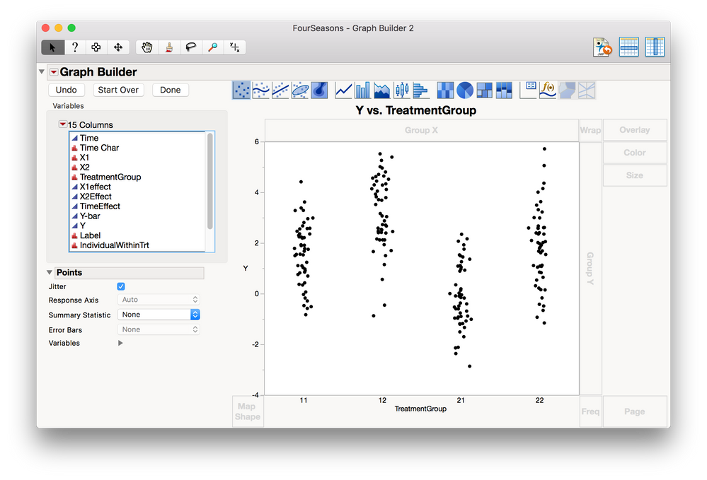
Here I have my continuous Y in the Y zone, and my categorical X in the X zone:
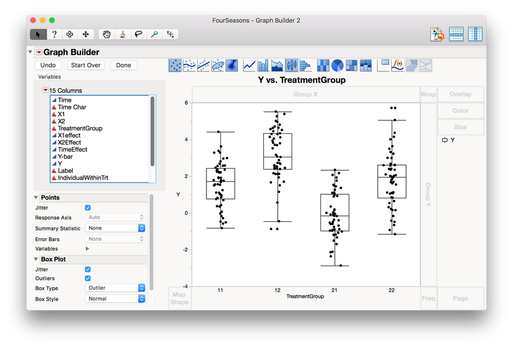
Then I add on the boxplots:
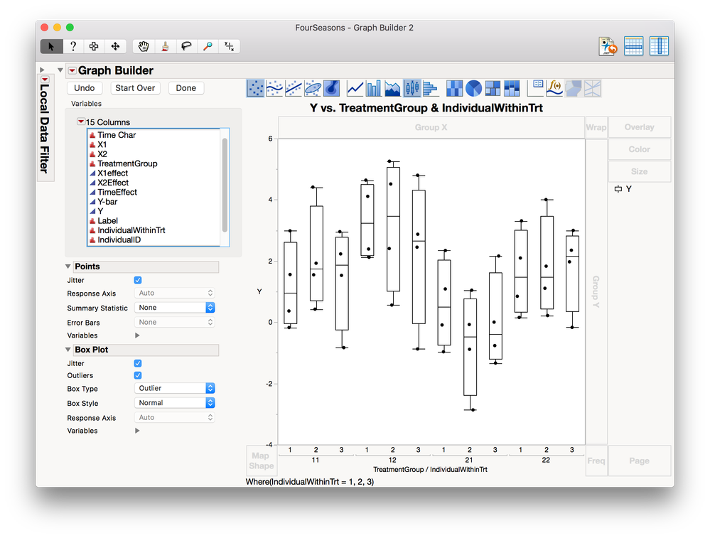
And then I drag on the second categorical X variable into that zone that appears when I hover over and then slightly above the X drop zone:
(Sorry about the “Where(IndividualWithinTrt = 1, 2, 3)” extra stuff – the example I had on hand has 13 groups within each of the four treatment groups, and that just looks way too messy.)
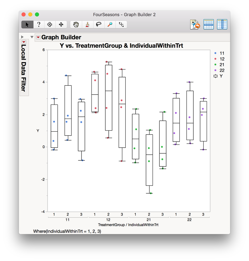
Just for extra clarity, I’ve now colored the four main treatment groups. You can see that each main group has three subgroups, which each have three points in them.
- Mark as New
- Bookmark
- Subscribe
- Mute
- Subscribe to RSS Feed
- Get Direct Link
- Report Inappropriate Content
Re: How do you get individual data points to show on top of a box plot graph?
Hi Ruth,
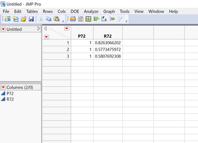
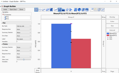
I'm having a similar problem to OP, but I can't figure out how to get my data points centered when they're over my bar graphs. My data points bunch together in between my two bar graphs rather than staying centered in the way I like. I'm very new to JMP, so I'm assuming I need to change how my data is formatted in the data table instead of the way it is now (shown below). I was wondering if you or another JMP staffer could help me figure out what I need to correct to mimick your graphs where the bars/boxes line up with the individual points. I am also showing below the graph I can currently create with the improper positioning of the points.
Thank you in advance,
Daniel
- Mark as New
- Bookmark
- Subscribe
- Mute
- Subscribe to RSS Feed
- Get Direct Link
- Report Inappropriate Content
Re: How do you get individual data points to show on top of a box plot graph?
Hi dj94364,
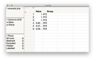
It may be easier to arrange your data like this:
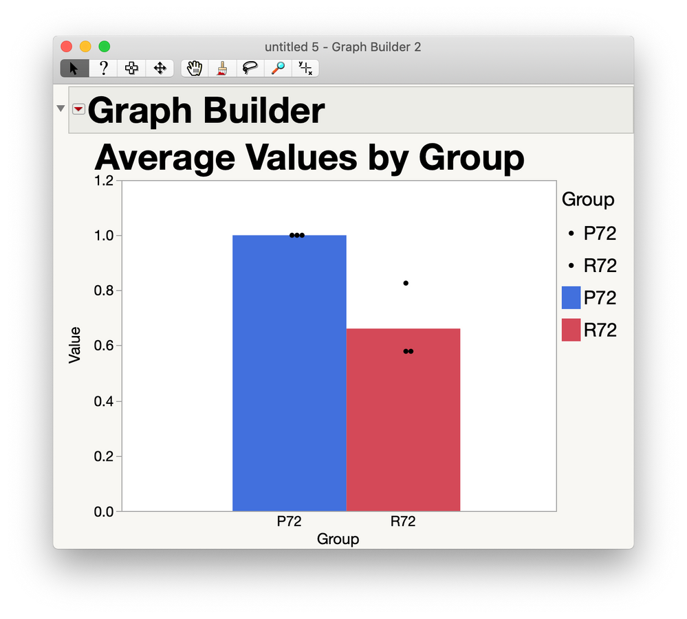
Then in Graph Builder you can just grab the Value column and drag it into the Y zone, and grab the Group column and drag it into the X zone. Then drag the bars element on top of the plot. For this final plot, I did a couple other things, too: I pulled the Group column also into Overlay in order to get the two groups colored differently. I moved the Points forward (so they aren't hidden begind the bars) by right-clicking in the plot and selecting Bar --> Move Backward. And I right-clicked on top of the dots in the legend to choose "color" and make them black (so I can see the points on top of the colored bars.) Finally, I decided to make the two bars smoosh up against each other like in your plot by right-clicking in the plot, choosing Customize, then clicking on Bar in the list on the left, and changing the Width Proportion from 0 to 1. I also clicked in the title to edit it to say "Average Values by Group."
If this isn't the plot you wanted, let me know more details about what you are looking for and I'll try again. :)
-Ruth
- Mark as New
- Bookmark
- Subscribe
- Mute
- Subscribe to RSS Feed
- Get Direct Link
- Report Inappropriate Content
Re: How do you get individual data points to show on top of a box plot graph?
That's what I'm looking for! Thank you for your help
- Mark as New
- Bookmark
- Subscribe
- Mute
- Subscribe to RSS Feed
- Get Direct Link
- Report Inappropriate Content
Re: How do you get individual data points to show on top of a box plot graph?
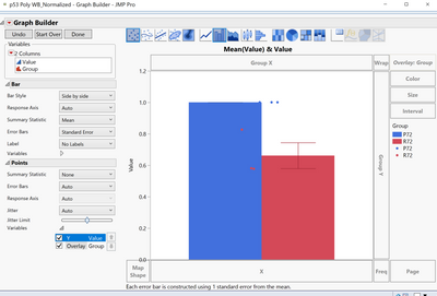
Sorry, I realized that when working with this data in this format in graph builder that it doesn't allow for the bar graph to show the standard deviation in addition to an overlay of the data points. Is there any way to change the approach to allow this or to customize/edit something in the graph builder. I've shown below what I've managed, but ideally I'd like for the data points to line up with their respective bars.
- Mark as New
- Bookmark
- Subscribe
- Mute
- Subscribe to RSS Feed
- Get Direct Link
- Report Inappropriate Content
Re: How do you get individual data points to show on top of a box plot graph?
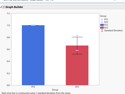
I think I figured it out by moving the Group Data into the Color section under Overlay. Thank you for your help. Resulting figure shown below.
Recommended Articles
- © 2026 JMP Statistical Discovery LLC. All Rights Reserved.
- Terms of Use
- Privacy Statement
- Contact Us


