- Instantly extract effect sizes, F-ratios, and FDR-adjusted p-values from your models with the Calculate Effects Sizes extension, available now in the JMP Marketplace!
- New to JMP? Join us Sept. 23-24 for the Early User Edition of Discovery Summit, tailor-made for new users. Register now for free!
- Your voice matters! Tell us how you prefer to receive JMP updates, so we can tailor our communication to your needs. Take short survey.
- Subscribe to RSS Feed
- Mark Topic as New
- Mark Topic as Read
- Float this Topic for Current User
- Bookmark
- Subscribe
- Mute
- Printer Friendly Page
Discussions
Solve problems, and share tips and tricks with other JMP users.- JMP User Community
- :
- Discussions
- :
- Re: How do I use both Y axis using all continuous variables?

- Mark as New
- Bookmark
- Subscribe
- Mute
- Subscribe to RSS Feed
- Get Direct Link
- Report Inappropriate Content
How do I use both Y axis using all continuous variables?
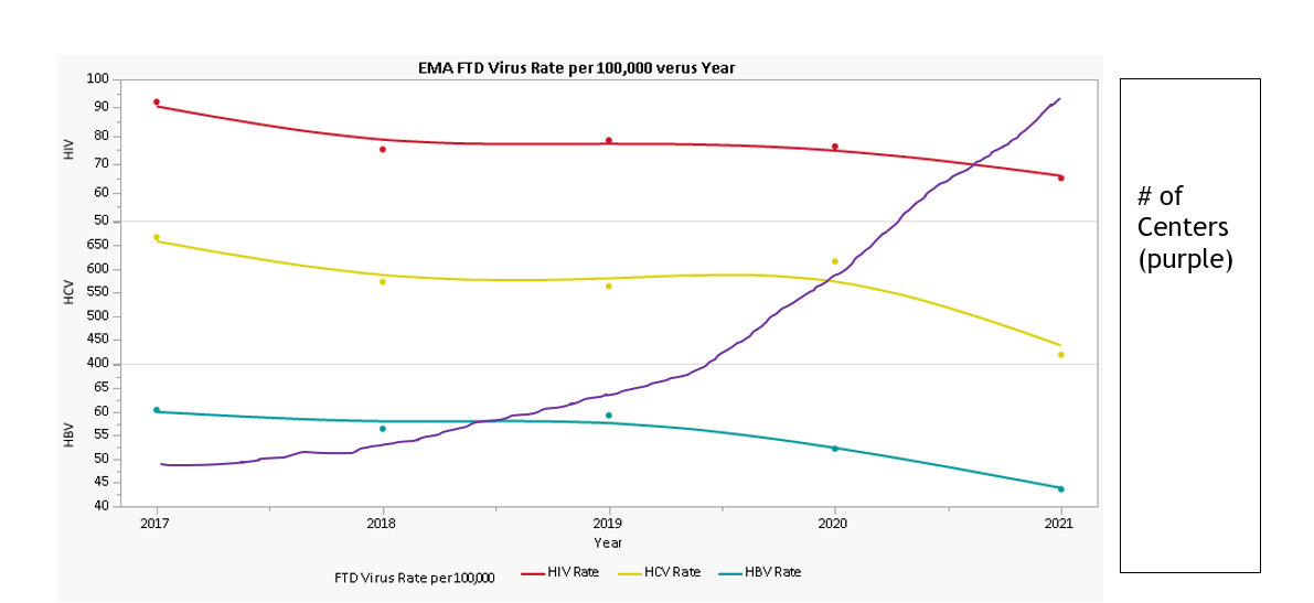
I am trying to figure out how to use both of my Y axis using all continuous variables. I know how to do it in Microsoft, and so there has to be a way JMP can do it better. I have attached the file (using JMP v 16) and it includes the 3 scripts (a center v year, an FTD, and an RTD). I want to keep the red/yellow/teal graph the exactly way it is... but I want to add the purple graph to the red/yellow/teal graph but have the purple axis on the y axis right side (label group Y in graph builder) instead of the left and have the purple line go through all 3 of the red/yellow/teal graphs. I am trying to show that rates went down as the number of centers went up. This is my first time posting a question, so please let me know if there is a problem with any files or graphics.
Thank you all!


- Tags:
- windows
Accepted Solutions

- Mark as New
- Bookmark
- Subscribe
- Mute
- Subscribe to RSS Feed
- Get Direct Link
- Report Inappropriate Content
Re: How do I use both Y axis using all continuous variables?
Hello and welcome to the community! You will want to add that Total Center # columns to the inside of the y-axis of each panel which will mean you start with the two variables on the same side. Then right-click on the y-axis and select Move Right. There you will see the columns that you can send to the other y-axis.
- Mark as New
- Bookmark
- Subscribe
- Mute
- Subscribe to RSS Feed
- Get Direct Link
- Report Inappropriate Content
Re: How do I use both Y axis using all continuous variables?
Awesome! Thank you so much!
I was able to get the total centers on the right hand y-axis... I see how to do it for each of the 3 sections, but is there a way to do it so that the total centers is all 3 together instead of individual?
- Mark as New
- Bookmark
- Subscribe
- Mute
- Subscribe to RSS Feed
- Get Direct Link
- Report Inappropriate Content
Re: How do I use both Y axis using all continuous variables?
Are you going after something like this? It makes some of the rates tough to see.

Alternatively, how about taking a ratio of your values to the initial values just to show the % of initial value? That would put them all on the same scale and make it easier to see.:

- Mark as New
- Bookmark
- Subscribe
- Mute
- Subscribe to RSS Feed
- Get Direct Link
- Report Inappropriate Content
Re: How do I use both Y axis using all continuous variables?
I am trying to do what is below (but without my poor microsoft word drawing skills).
- Mark as New
- Bookmark
- Subscribe
- Mute
- Subscribe to RSS Feed
- Get Direct Link
- Report Inappropriate Content
Re: How do I use both Y axis using all continuous variables?
Hello, I am sorry I don't think there is any good way to have one graph overlay three others like you show. Hopefully you can find plenty of other alternatives to visualize your message. Perhaps just adding a reference range to highlight the period from 2019 to 2021 when centers were increasing would help focus attention in each pane on the relevant period? Just an additional thought to consider:

Great picture though!:)
- Mark as New
- Bookmark
- Subscribe
- Mute
- Subscribe to RSS Feed
- Get Direct Link
- Report Inappropriate Content
Re: How do I use both Y axis using all continuous variables?
Thank you! Maybe this could be a feature in a new version :). Is it possible to have the left sided Y axis with a 'break' in it? EX: shows 40-100, then a 'break', then shows 400-600?
- Mark as New
- Bookmark
- Subscribe
- Mute
- Subscribe to RSS Feed
- Get Direct Link
- Report Inappropriate Content
Re: How do I use both Y axis using all continuous variables?
Sorry to say that I am not aware of a way to add in an axis break like you mention. You may be interested in the ability to change the axis to a log scale which could bring the sets of lines closer together (or at least for future reference). Double-click on the y-axis and change the "linear" scale to log. Otherwise you just might have to graph some of those lines separately which I realize isn't what you wanted to accomplish. Appreciate all the feedback and questions!
Recommended Articles
- © 2026 JMP Statistical Discovery LLC. All Rights Reserved.
- Terms of Use
- Privacy Statement
- Contact Us