- Don’t miss your chance to experience Discovery Summit Europe at our best available rate! Early bird registration through 31 Oct.
- Graph Builder Toolbar streamlines interactive graphing. Creates shortcuts on Report and GraphBuilder Helpers toolbars. Download and install the extension.
- Subscribe to RSS Feed
- Mark Topic as New
- Mark Topic as Read
- Float this Topic for Current User
- Bookmark
- Subscribe
- Mute
- Printer Friendly Page
Discussions
Solve problems, and share tips and tricks with other JMP users.- User Community
- :
- Discussions
- :
- Re: How do I make a histogram of a percentage of failing value Y as a function o...

- Mark as New
- Bookmark
- Subscribe
- Mute
- Subscribe to RSS Feed
- Get Direct Link
- Report Inappropriate Content
How do I make a histogram of a percentage of failing value Y as a function of value X
Hi,
I have a set of continuous values Y for which I have a upper limit. I am interested in the percentage of failing values as a function of a second continuous value X. I was thinking of plotting this as a histogram, but I didn't find how to get JMP to create small intervals of my value X for the analysis.
Do someone have a solution for this kind of problem please?
Accepted Solutions


- Mark as New
- Bookmark
- Subscribe
- Mute
- Subscribe to RSS Feed
- Get Direct Link
- Report Inappropriate Content
Re: How do I make a histogram of a percentage of failing value Y as a function of value X
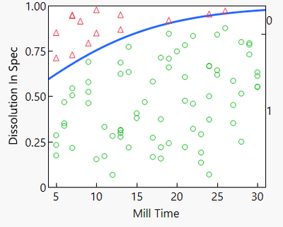
There might be a few ways to do it, but I would use a Capability Analysis (to define which points are above or below the upper limit), combined with a Logistic Fit (used to relate a Pass/Fail result to a continuous, numerical X variable). For example:
- Analyze -> Distribution, to create a histogram of "Y".
- Red Triangle -> Process Capability see what proportion of "Y" falls outside specification (above the upper limit)
- Red Triangle -> Save In Spec Indicator Formula to create a new column which equals 1 if "Y" is in spec, 0 if "Y" is out of spec.
- Analyze -> Fit Y by X using the newly created "Y in Spec" column as the Response, and "X" as the Factor.
Here's how it looks when I follow the steps above, using the "Tablet Production.jmp" sample dataset:
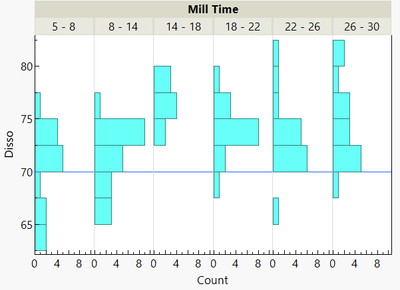
Edit: I realize I didn't address whether you can make a set of histograms. You can do this in graph builder using your "Y" variable in the Y-Axis Role, "X" in the Group X role, and the Histogram graph type. For example:
- Mark as New
- Bookmark
- Subscribe
- Mute
- Subscribe to RSS Feed
- Get Direct Link
- Report Inappropriate Content
Re: How do I make a histogram of a percentage of failing value Y as a function of value X
There might be a few ways to do it, but I would use a Capability Analysis (to define which points are above or below the upper limit), combined with a Logistic Fit (used to relate a Pass/Fail result to a continuous, numerical X variable). For example:
- Analyze -> Distribution, to create a histogram of "Y".
- Red Triangle -> Process Capability see what proportion of "Y" falls outside specification (above the upper limit)
- Red Triangle -> Save In Spec Indicator Formula to create a new column which equals 1 if "Y" is in spec, 0 if "Y" is out of spec.
- Analyze -> Fit Y by X using the newly created "Y in Spec" column as the Response, and "X" as the Factor.
Here's how it looks when I follow the steps above, using the "Tablet Production.jmp" sample dataset:
Edit: I realize I didn't address whether you can make a set of histograms. You can do this in graph builder using your "Y" variable in the Y-Axis Role, "X" in the Group X role, and the Histogram graph type. For example:
- Mark as New
- Bookmark
- Subscribe
- Mute
- Subscribe to RSS Feed
- Get Direct Link
- Report Inappropriate Content
Re: How do I make a histogram of a percentage of failing value Y as a function of value X
Thank you very much! The second solution is what I had in mind, but the first one gives a result with strong visual impact!
Recommended Articles
- © 2026 JMP Statistical Discovery LLC. All Rights Reserved.
- Terms of Use
- Privacy Statement
- Contact Us