- JMP will suspend normal business operations for our Winter Holiday beginning on Wednesday, Dec. 24, 2025, at 5:00 p.m. ET (2:00 p.m. ET for JMP Accounts Receivable).
Regular business hours will resume at 9:00 a.m. EST on Friday, Jan. 2, 2026. - We’re retiring the File Exchange at the end of this year. The JMP Marketplace is now your destination for add-ins and extensions.
- Subscribe to RSS Feed
- Mark Topic as New
- Mark Topic as Read
- Float this Topic for Current User
- Bookmark
- Subscribe
- Mute
- Printer Friendly Page
Discussions
Solve problems, and share tips and tricks with other JMP users.- JMP User Community
- :
- Discussions
- :
- Re: How do I make a graph with secondary x-axis?
- Mark as New
- Bookmark
- Subscribe
- Mute
- Subscribe to RSS Feed
- Get Direct Link
- Report Inappropriate Content
How do I make a graph with secondary x-axis?
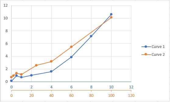
I want to make a plot of two data series with overlayed x-axes. How is this possible in JMP? It is easily done in MS Excel - see below and attached.
- Mark as New
- Bookmark
- Subscribe
- Mute
- Subscribe to RSS Feed
- Get Direct Link
- Report Inappropriate Content
Re: How do I make a graph with secondary x-axis?
@Morten ,
You can easily do that in JMP. If you wanted to do that using a script, here is an example:
dt = Open( "$SAMPLE_DATA/Big Class.jmp" );
gb1 = dt << Graph Builder(Variables( X( :sex ), X( :age, Position( 1 ) ), Y( :height ) ),
			  Elements( Points( X( 1 ), X( 2 ), Y, Legend( 24 ) ) )
			 );
If you wanted to use the interactive platform, just drop a variable on the x-axis . Then bring the second variable and hover it on the x-axis, JMP will tell you what will happen depending on where you drop it .
Uday
- Mark as New
- Bookmark
- Subscribe
- Mute
- Subscribe to RSS Feed
- Get Direct Link
- Report Inappropriate Content
Re: How do I make a graph with secondary x-axis?
No, unfortunately this is not what I want. Your solution gives me a "nested" x-axis, i.e. in reality two x-axes next to each other. I want them stacked, i.e. both scales span left to right once and each curve is represented by its own axis. Actually, I ask for the very same concept as a secondary y-axis. It just seems not to exist for an x-axis in JMP.
- Mark as New
- Bookmark
- Subscribe
- Mute
- Subscribe to RSS Feed
- Get Direct Link
- Report Inappropriate Content
Re: How do I make a graph with secondary x-axis?
I believe your assessment is correct. I do not think there currently is a way to generate a second X Axis. It is a great idea, so I encourage you to add it to the JMP Wish List.
- Mark as New
- Bookmark
- Subscribe
- Mute
- Subscribe to RSS Feed
- Get Direct Link
- Report Inappropriate Content
Re: How do I make a graph with secondary x-axis?
A bit late (4 years), I had a similar problem, mine was different time steps but the same scale, and it can be done. If you are using graph builder, drag both variables that you want into the x-axis:
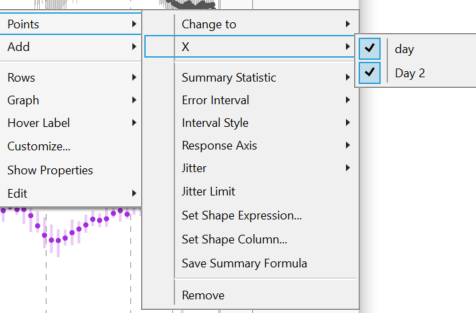
Then, right click the data points on the graph where you want to change the x-axis to display the following menu, just select the variable that you want to use for the x-axis. In my case, I had a daily and a weekly time scale.
For different scales you can merge the axes.
Recommended Articles
- © 2025 JMP Statistical Discovery LLC. All Rights Reserved.
- Terms of Use
- Privacy Statement
- Contact Us


