While doing some research to answer this question, I found this article on the JMP community that helped me get started. How do I do a combination bar and line plot using Overlay Plot?
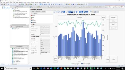
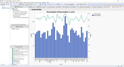
Using the big class sample data example of height and weight I was able to create a bar chart for weight and a line plot for height on the same chart using the Overlay Plot.
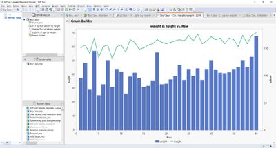 Bass_Masri_0-1588116294712.jpeg
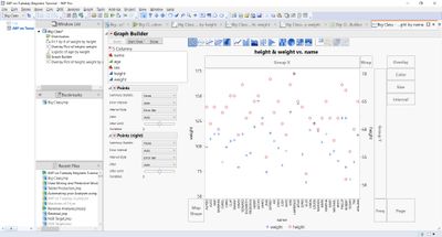
To do this, first clear the row states in the JMP table. Create the overlay plot with the two variables, one on the left axis and one on the right axis.
Then go to the Red Triangle and click Show Control Panel.
 Bass_Masri_1-1588116294733.jpeg
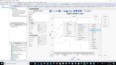
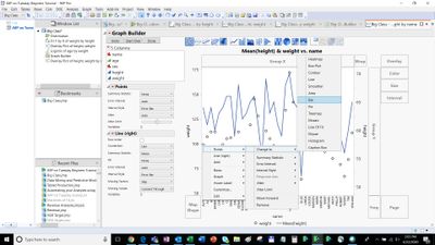
Then select a point (for Height) and then right click and select Change to > Line
 Bass_Masri_2-1588116294755.jpeg
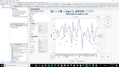
Then the circles for height change to a line.
 Bass_Masri_3-1588116294777.jpeg
Similarly select a point (for Weight) and then right click and select Change to > Bar
 Bass_Masri_4-1588116294798.jpeg
Then change the axis scale, legend location and colours to suit.
 Bass_Masri_5-1588116294821.jpeg
Final chart with x label for name.
 Bass_Masri_6-1588116294838.jpeg
Open("$SAMPLE_DATA/Big Class.jmp");

Graph Builder(
	Size( 793, 696 ),
	Show Control Panel( 0 ),
	Fit to Window( "Maintain Aspect Ratio" ),
	Variables(
		X( :name ),
		Y( :height, Side( "Right" ) ),
		Y( :weight, Position( 1 ) )
	),
	Elements( Bar( X, Y( 2 ), Legend( 7 ) ), Line( X, Y( 1 ), Legend( 6 ) ) ),
	SendToReport(
		Dispatch(
			{},
			"height",
			ScaleBox,
			{Min( -0.268537964941355 ), Max( 71.08 ), Inc( 10 ), Minor Ticks( 0 )}
		),
		Dispatch(
			{},
			"400",
			ScaleBox,
			{Legend Model(
				7,
				Properties( -1, {Marker( "Circle" )}, Item ID( "weight", 1 ) )
			), Legend Model(
				6,
				Properties( 0, {Line Color( 23 )}, Item ID( "Mean(height)", 1 ) ),
				Properties( -1, {Marker( "Circle" )}, Item ID( "height", 1 ) )
			)}
		),
		Dispatch(
			{},
			"400",
			LegendBox,
			{Legend Position( {7, [1], 6, [0]} ), Position( {1, 0} )}
		)
	)
);
Bass Masri
BSc.(Math) MStat.