- New to JMP? Let the Data Analysis Director guide you through selecting an analysis task, an analysis goal, and a data type. Available now in the JMP Marketplace!
- See how to install JMP Marketplace extensions to customize and enhance JMP.
- Subscribe to RSS Feed
- Mark Topic as New
- Mark Topic as Read
- Float this Topic for Current User
- Bookmark
- Subscribe
- Mute
- Printer Friendly Page
Discussions
Solve problems, and share tips and tricks with other JMP users.- JMP User Community
- :
- Discussions
- :
- Re: How do I generate a 'main effects' plot?
- Mark as New
- Bookmark
- Subscribe
- Mute
- Subscribe to RSS Feed
- Get Direct Link
- Report Inappropriate Content
How do I generate a 'main effects' plot?
Apologies for the trivial question.
I am interested in determining which of the twenty different variables has an effect on the %Label Claim of a drug product test (analyst, testing lab, input materials, temperature, condition, etc). I've seen 'main effects' plots generated in Minitab to be able to quickly scan which of these variables have an influence on the mean. Is this type of analysis called something else in JMP?
Thanks
Accepted Solutions
- Mark as New
- Bookmark
- Subscribe
- Mute
- Subscribe to RSS Feed
- Get Direct Link
- Report Inappropriate Content
Re: How do I generate a 'main effects' plot?
Hi marent1,
As I understand it, what Minitab calls its "Main effects plot" is really a line graph of your response paneled by different predictors. Those plots represent "main effects" because they're the average effects of each variable on the response ignoring (statistically) other variables. Unless you have completely balanced cell sizes (and thus have an orthogonal design with respect to every combination of factors) running an analysis in Fit Model with all your potential factors (as others have suggested here) will give a different result from the "main effects" plot I believe you're looking for (due to adjustments in the Least Sq Means).
I have a few suggestions:
1. Use Analyze > Fit Y by X
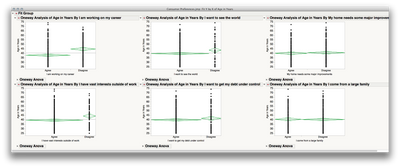
Fit Y by X will always "ignore" the levels of other factors when calculating means and plotting the results of one factor. In your case, you would put in your response (%Label Claim) as Y, and all your potential factors in as X. When you click "OK" JMP will produce completely separate outputs for each factor. To get a representation of the mean differences to allow you to scan across for differences, Click the Red Triangle and use Means/Anova. Since you will have many outputs, you will probably want to broadcast the command; hold down the control key first, then click the Red Triangle and select Means/ANOVA. Let go of the control key after you have made your selection (you will use command if you're on the mac). This will broadcast the command to every other output in that window. Here's what this will look like (after hiding the statistical output):
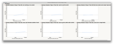
This isn't exactly like what Minitab will produce, and it's a bit harder to scan across using the mean diamonds than lines (even though the former gives more information). Rather than use Means/Anova, you could use "Connect Means" under the Red Triangle > Display Options. I would also turn off the points (also under the Red Triangle > Display Options). This will produce something a bit closer:
(I also used "Arrange in Rows" for this, from the topmost Red Triangle, and used 3 per row in order to see more on one screen)
2. Use Graph > Graph Builder
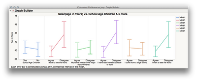
To make a "main effects" plot in which each the plotted effects ignore the other factors completely, you can use Graph Builder and add all the variables you want to the plot.
a. Graph > Graph Builder
b. Drag your response to Y
c. Drag your first Factor to X
d. Click the Line in the elements bar
e. In the panel on the left side, select "Confidence Interval" or "Error Bar" in the "Error Bars" drop down (if you want this)
f. Drag your next factor to the right-hand side of the labels for the first factor in the X axis (to add another panel to this graph).
g. Repeat the step above for all your factors.
h, Click Done to close the control panel
This will produce a plot like this:
Here's a very quick video showing those steps (sorry that this is silent -- I'm at a particularly loud conference).
I hope this helps!
- Mark as New
- Bookmark
- Subscribe
- Mute
- Subscribe to RSS Feed
- Get Direct Link
- Report Inappropriate Content
Re: How do I generate a 'main effects' plot?
No questions are trivial.
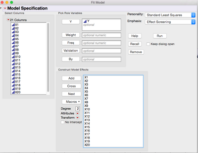
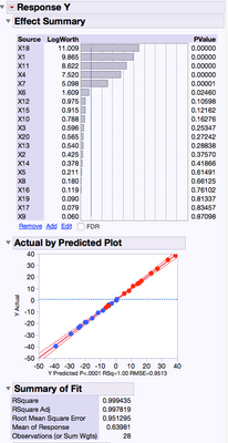
I would just use Analyze>Fit Model. In the dialog box just add your Y Response and X Factors and click Run
- Mark as New
- Bookmark
- Subscribe
- Mute
- Subscribe to RSS Feed
- Get Direct Link
- Report Inappropriate Content
Re: How do I generate a 'main effects' plot?
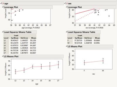
By "main effects plots", I think you're referring to the window of plots in Minitab where each plot consists of Y versus one of the X's with a sloping line showing the size of the effect of X on Y. You can get basically the same thing in JMP by requesting the LS (Least Squares) Means Plots, which are hidden in the Fit Model platform. Select Analyze > Fit Model (with Emphasis: "Effect Leverage") to run the analysis. You should see some leverage plots. Click on the red triangle above each leverage plot and select LS Means Plot.
These plots are only available if X is not continuous. Also, the plots are not grouped together.
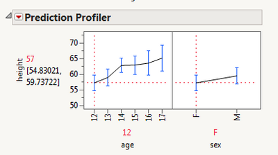
Another option is the Prediction Profiler, which is also available in the Fit Model report. Select Factor Profiling > Profiler in the Fit Model report.
The response here actually represents the predicted value from the model, with all the Xs at specified levels. This graph is interactive and you can slide the vertical red lines to change choices for the X's. You may find that the prediction profiler is more useful than the main effects plots.
Howard
- Mark as New
- Bookmark
- Subscribe
- Mute
- Subscribe to RSS Feed
- Get Direct Link
- Report Inappropriate Content
Re: How do I generate a 'main effects' plot?
This plot might not be a direct replacement for the MINITAB plot you want, but it might be useful to your analysis, none the less: https://community.jmp.com/docs/DOC-6272
Best of luck!
- Mark as New
- Bookmark
- Subscribe
- Mute
- Subscribe to RSS Feed
- Get Direct Link
- Report Inappropriate Content
Re: How do I generate a 'main effects' plot?
Hi marent1,
As I understand it, what Minitab calls its "Main effects plot" is really a line graph of your response paneled by different predictors. Those plots represent "main effects" because they're the average effects of each variable on the response ignoring (statistically) other variables. Unless you have completely balanced cell sizes (and thus have an orthogonal design with respect to every combination of factors) running an analysis in Fit Model with all your potential factors (as others have suggested here) will give a different result from the "main effects" plot I believe you're looking for (due to adjustments in the Least Sq Means).
I have a few suggestions:
1. Use Analyze > Fit Y by X
Fit Y by X will always "ignore" the levels of other factors when calculating means and plotting the results of one factor. In your case, you would put in your response (%Label Claim) as Y, and all your potential factors in as X. When you click "OK" JMP will produce completely separate outputs for each factor. To get a representation of the mean differences to allow you to scan across for differences, Click the Red Triangle and use Means/Anova. Since you will have many outputs, you will probably want to broadcast the command; hold down the control key first, then click the Red Triangle and select Means/ANOVA. Let go of the control key after you have made your selection (you will use command if you're on the mac). This will broadcast the command to every other output in that window. Here's what this will look like (after hiding the statistical output):
This isn't exactly like what Minitab will produce, and it's a bit harder to scan across using the mean diamonds than lines (even though the former gives more information). Rather than use Means/Anova, you could use "Connect Means" under the Red Triangle > Display Options. I would also turn off the points (also under the Red Triangle > Display Options). This will produce something a bit closer:
(I also used "Arrange in Rows" for this, from the topmost Red Triangle, and used 3 per row in order to see more on one screen)
2. Use Graph > Graph Builder
To make a "main effects" plot in which each the plotted effects ignore the other factors completely, you can use Graph Builder and add all the variables you want to the plot.
a. Graph > Graph Builder
b. Drag your response to Y
c. Drag your first Factor to X
d. Click the Line in the elements bar
e. In the panel on the left side, select "Confidence Interval" or "Error Bar" in the "Error Bars" drop down (if you want this)
f. Drag your next factor to the right-hand side of the labels for the first factor in the X axis (to add another panel to this graph).
g. Repeat the step above for all your factors.
h, Click Done to close the control panel
This will produce a plot like this:
Here's a very quick video showing those steps (sorry that this is silent -- I'm at a particularly loud conference).
I hope this helps!
- Mark as New
- Bookmark
- Subscribe
- Mute
- Subscribe to RSS Feed
- Get Direct Link
- Report Inappropriate Content
Re: How do I generate a 'main effects' plot?
Thank you to all that took the time to respond. These are all very helpful responses to my question. Mike
Recommended Articles
- © 2026 JMP Statistical Discovery LLC. All Rights Reserved.
- Terms of Use
- Privacy Statement
- Contact Us


