- New to JMP? Let the Data Analysis Director guide you through selecting an analysis task, an analysis goal, and a data type. Available now in the JMP Marketplace!
- See how to install JMP Marketplace extensions to customize and enhance JMP.
- Subscribe to RSS Feed
- Mark Topic as New
- Mark Topic as Read
- Float this Topic for Current User
- Bookmark
- Subscribe
- Mute
- Printer Friendly Page
Discussions
Solve problems, and share tips and tricks with other JMP users.- JMP User Community
- :
- Discussions
- :
- Histogram with filter
- Mark as New
- Bookmark
- Subscribe
- Mute
- Subscribe to RSS Feed
- Get Direct Link
- Report Inappropriate Content
Histogram with filter
Hi
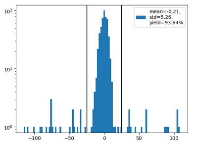
I'm trying to plot a histogram that shows the full data. on it, I want to plot two vertical lines that represent lower and upper limits. Additionally, I want to present the mean and the std of the data in these limits and the fraction of the data that is in the limit.
Something like this:
Thanks
- Mark as New
- Bookmark
- Subscribe
- Mute
- Subscribe to RSS Feed
- Get Direct Link
- Report Inappropriate Content
Re: Histogram with filter
There are a few unclear things about your question. I don't know what you mean by "filter" here since you are showing a histogram for a full data set. For the full data set, it is easy to add the vertical lines (are they for a confidence interval for the mean or for percentiles of the data?) by doubleclicking on the x axis and adding lines. The text box is also easy to add. I've attached one example with the script for the graph stored at the top left. If this isn't what you want, please explain a bit more.
- Mark as New
- Bookmark
- Subscribe
- Mute
- Subscribe to RSS Feed
- Get Direct Link
- Report Inappropriate Content
Re: Histogram with filter
Welcome to the JMP Community
The task you have specified is a very easy thing to do in JMP.
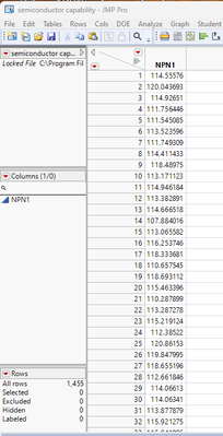
First read the data into JMP
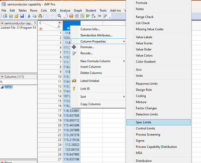
Add the Spec Limits to the Column Properties for the data column by right clicking on the header for the column and selecting Column Properties=>Spec Limits
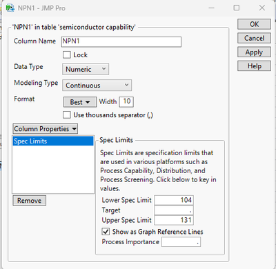
In the dialog box that opens, enter in the limits. Make sure you check the "Show as Graph Reference Lints"
Click OK and go back to the data table
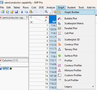
Go to the Graph pull down menu and select Graph Builder
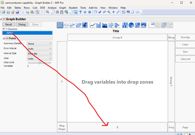
In the Graph Builder window drag the data column to the X drop area
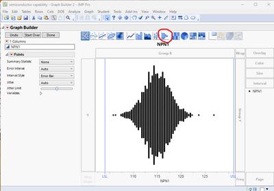
Now Click on the Histogram Icon at the top of the graph
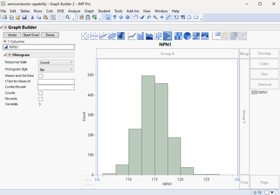
The graph will now show the histogram with the specified limits
Recommended Articles
- © 2026 JMP Statistical Discovery LLC. All Rights Reserved.
- Terms of Use
- Privacy Statement
- Contact Us
