- JMP Statement Regarding Critical PHP Remote Code Execution Vulnerabilities (CVE-2026-109618, CVE-2026-109619)
- Don’t miss your chance to experience Discovery Summit Europe at our best available rate! Early bird registration through 31 Oct.
- Graph Builder Toolbar streamlines interactive graphing. Creates shortcuts on Report and GraphBuilder Helpers toolbars. Download and install the extension.
- Subscribe to RSS Feed
- Mark Topic as New
- Mark Topic as Read
- Float this Topic for Current User
- Bookmark
- Subscribe
- Mute
- Printer Friendly Page
Discussions
Solve problems, and share tips and tricks with other JMP users.- User Community
- :
- Discussions
- :
- Re: Heat map, rows grouping

- Mark as New
- Bookmark
- Subscribe
- Mute
- Subscribe to RSS Feed
- Get Direct Link
- Report Inappropriate Content
Heat map, rows grouping
Hello everyone,
Thanks for taking time to read my question.
I'll go straight to my issue with JMP:
I have several lipidomic concentration data from 10 mice in condition A and 10 mince in condition B. Whenever I try to generate the clustering analysis and the color map, JMP keeps rearranging my rows so my condition A - mice are mixed up with my condition B - mice.
I just want a heatmap with on the Y axis my 2 groups : condition A & condition B. And that each columns would correspond to a lipid.
I can use R to do this but I would really like to use JMP as it is really quick to do.
Thank you very much for your help.
Accepted Solutions


 Community Manager
- Mark as New
- Bookmark
- Subscribe
- Mute
- Subscribe to RSS Feed
- Get Direct Link
- Report Inappropriate Content
Re: Heat map, rows grouping
Hi thomasd,
I believe you can get what you're looking for by placing both Subject and Dose in the "Label" section, rather than putting Dose in the "X, Grouping" section.
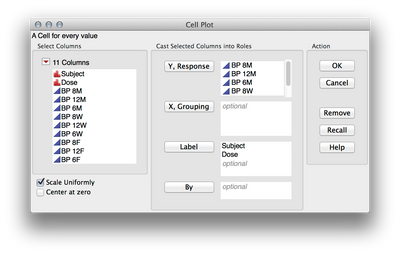
In order to get the uniform scale, check the box for "Scale Uniformly" before clicking OK.
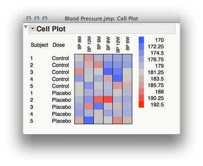
Is this closer to what you want?
Community Manager
- Mark as New
- Bookmark
- Subscribe
- Mute
- Subscribe to RSS Feed
- Get Direct Link
- Report Inappropriate Content
Re: Heat map, rows grouping
Hi thomasd,
It sounds like you're running a hierarchical cluster analysis, is that right? For that analysis output the rows are rearranged to form the dendrogram, so we'll need to do something else to form the graphic I think you want. If you're looking to preserve your row ordering and show lipidomic concentration in a heat map, perhaps Graph > Cell Plot will work for you.
Here's a simple example with the Big Class sample data set:
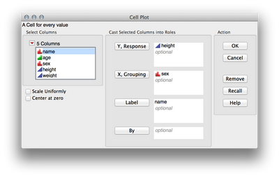
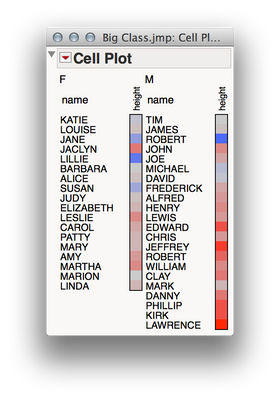
And here is a bigger example using the Blood Pressure sample dataset, with 4 levels of the experimental factor, and 6 DVs:
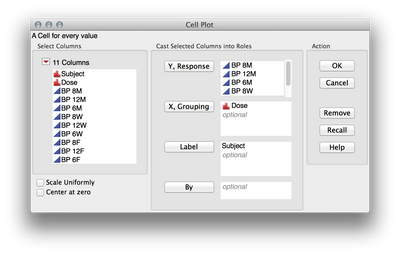
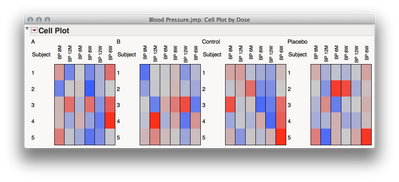
Does that get close to what you're looking for? If not, can you provide an image of the kind of plot you're looking to make? I'm sure we can find a way to make it with JMP.
Hope this helps!
- Mark as New
- Bookmark
- Subscribe
- Mute
- Subscribe to RSS Feed
- Get Direct Link
- Report Inappropriate Content
Re: Heat map, rows grouping
Hi Julian,
Thanks a lot for your well appreciated reply.
The Blood Sample pressure dataset is actually very similar to my case. In this dataset, let's say I want to make a heatmap of the data from row 11 to row 20 (2 conditions: Control / Placebo). I want on the same heatmap the 2 conditions (so Control for the first 5 rows, and Placebo for the last 5 rows) and that each columns is a condition of Blood Pressure measurement with only one unique scale by columns for the two conditions.
Please tell me if I am not making myself clear.
Have a great sunday.
Community Manager
- Mark as New
- Bookmark
- Subscribe
- Mute
- Subscribe to RSS Feed
- Get Direct Link
- Report Inappropriate Content
Re: Heat map, rows grouping
- Mark as New
- Bookmark
- Subscribe
- Mute
- Subscribe to RSS Feed
- Get Direct Link
- Report Inappropriate Content
Re: Heat map, rows grouping
Hi Julian,
This looks exactly to what I want !
Thank you very much for your help.
I also hope it will help others.
Take care,
Thomas
Community Manager
- Mark as New
- Bookmark
- Subscribe
- Mute
- Subscribe to RSS Feed
- Get Direct Link
- Report Inappropriate Content
Re: Heat map, rows grouping
Glad I could help!
In case it's helpful down the line, I wanted to show you how you can make this same plot using Graph Builder (which is more flexible, but will require that we do a tiny bit of restructuring). Here's a quick video of that process (it's straightforward, but looks more complicated as a series of steps than in a video).
Hope this helps you in the future!

- Mark as New
- Bookmark
- Subscribe
- Mute
- Subscribe to RSS Feed
- Get Direct Link
- Report Inappropriate Content
Re: Heat map, rows grouping
I understand the trick about using the Stack fonction and then using the Graph Builder. The result I got using your method is very promising but I wonder how to not scale uniformly the heatmap like I can do with the Cell Plot (which would be in this example: one scale for each time time point measurement of Blood Pressure).
I feel like a beginner with JMP, but I also feel like I'm doing pretty okay so far with the Help, User Guide available and the Youtube tutorials. But I couldn't find any information about making these heatmap prior to your reply. I think it would be very valuable for JMP to write some kind of official help about this since heatmaps are extremely popular nowadays.
Community Manager
- Mark as New
- Bookmark
- Subscribe
- Mute
- Subscribe to RSS Feed
- Get Direct Link
- Report Inappropriate Content
Re: Heat map, rows grouping
Great question! Even though Graph Builder is more flexible in general, there is only one color role, so you can only use a single, uniform scale, unlike the cell plot which allows you to have individual scales for each variable.
Great suggestion on putting together a guide for using heat maps! I will add that to the list of one page guides that we will be making in the future. If you haven't seen the current collection, you can find them at jmp.com/learn
- Mark as New
- Bookmark
- Subscribe
- Mute
- Subscribe to RSS Feed
- Get Direct Link
- Report Inappropriate Content
Re: Heat map, rows grouping
Got it! I will have to keep using Cell Plot then for my heatmaps. Thanks

- Mark as New
- Bookmark
- Subscribe
- Mute
- Subscribe to RSS Feed
- Get Direct Link
- Report Inappropriate Content
Re: Heat map, rows grouping
Hi Julian,
I am new to JMP. This example is very close to what I am trying to do. I wanted to view the graph builder tutorial but the link did not work.
Please help.
Recommended Articles
- © 2026 JMP Statistical Discovery LLC. All Rights Reserved.
- Terms of Use
- Privacy Statement
- Contact Us