- New to JMP? Let the Data Analysis Director guide you through selecting an analysis task, an analysis goal, and a data type. Available now in the JMP Marketplace!
- See how to install JMP Marketplace extensions to customize and enhance JMP.
- Subscribe to RSS Feed
- Mark Topic as New
- Mark Topic as Read
- Float this Topic for Current User
- Bookmark
- Subscribe
- Mute
- Printer Friendly Page
Discussions
Solve problems, and share tips and tricks with other JMP users.- JMP User Community
- :
- Discussions
- :
- Re: Heat Map / Aggregate Function
- Mark as New
- Bookmark
- Subscribe
- Mute
- Subscribe to RSS Feed
- Get Direct Link
- Report Inappropriate Content
Heat Map / Aggregate Function
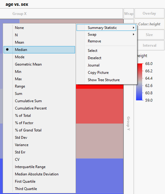
I wondered if anyone can point me in the right direction. I have a script that creates a table with Row, Column and Data fields (multiple Data field values for each (Row,Column) pair). I'd like to be able to create a Heat Map showing the Range for each Row and Column pair. By default the Mean is plotted. I can create an aggregated field (sum, median, std deviation and some others are included but not Range). Does anyone have any tips for how I might do this. Thanks, Mark
- Mark as New
- Bookmark
- Subscribe
- Mute
- Subscribe to RSS Feed
- Get Direct Link
- Report Inappropriate Content
Re: Heat Map / Aggregate Function
Please show us an example of the data table on which you are working. Do the data values go across a row or down a column?
- Mark as New
- Bookmark
- Subscribe
- Mute
- Subscribe to RSS Feed
- Get Direct Link
- Report Inappropriate Content
Re: Heat Map / Aggregate Function
- Mark as New
- Bookmark
- Subscribe
- Mute
- Subscribe to RSS Feed
- Get Direct Link
- Report Inappropriate Content
Re: Heat Map / Aggregate Function
easiest way is via Color/SummaryStatistic
https://community.jmp.com/t5/JMP-Wish-List/Add-option-to-color-heatmap-in-Graph-Builder-by-statistic...
@jthi : many thanks for this info ...
Recommended Articles
- © 2026 JMP Statistical Discovery LLC. All Rights Reserved.
- Terms of Use
- Privacy Statement
- Contact Us


